Viz Gallery
Here are a collection of Matplotlib vizzes that I sometimes post on twitter.
Scroll through some of them below
These largely comprise of projects written in python, using the matplotlib library. Much of the code used to generate these charts exisits in any one of the tutorials and posts on the site.
Featured Visuals
Links to featured visuals
If you want to have a go at re-creating them yourself please follow the link in the title of each chart, you will be directed to the relevant github repo where the visual was built.
| Order Number | GitHub Link with Alias |
|---|---|
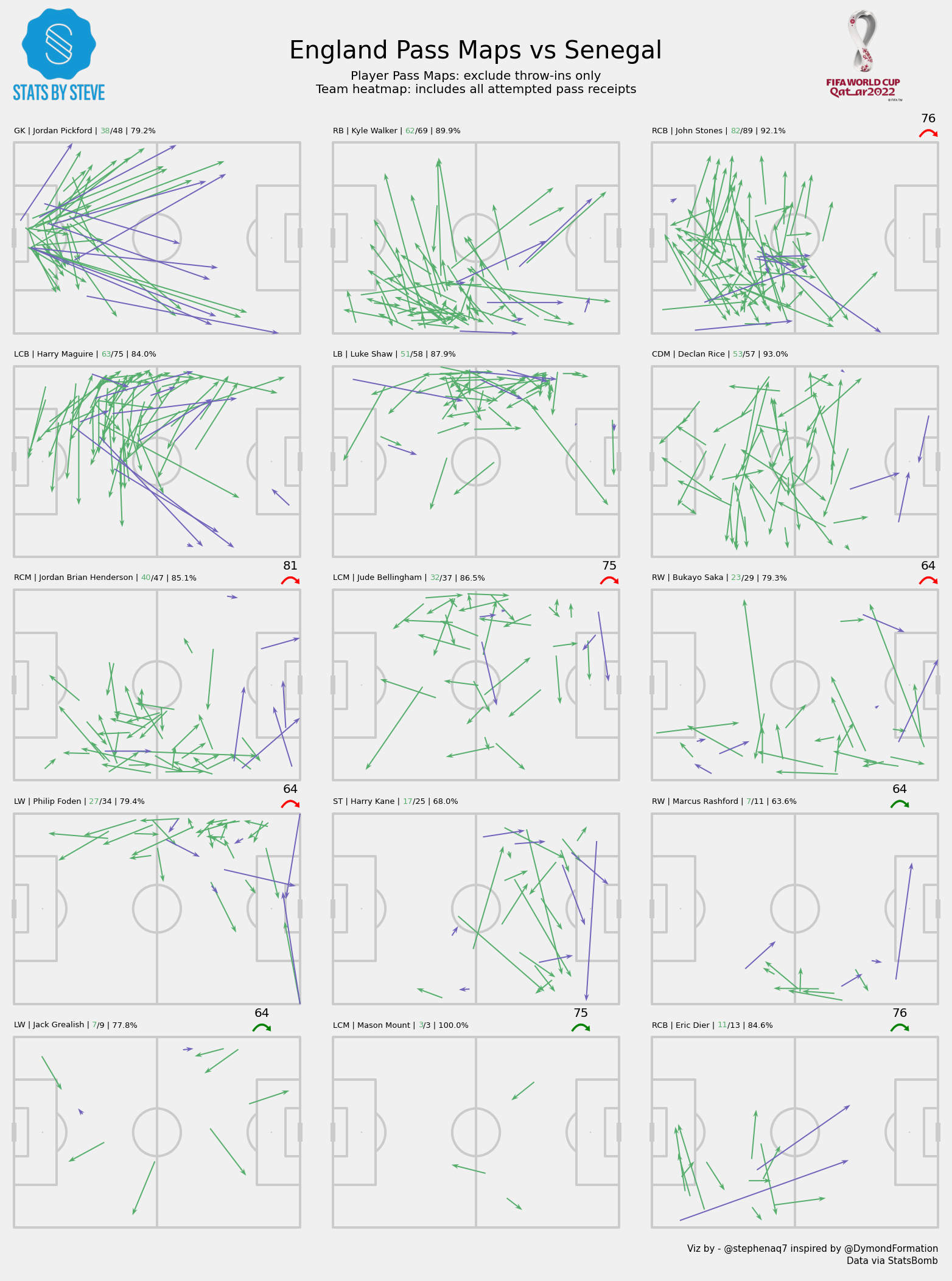
| 1 | Induvidual Player Pass Map |
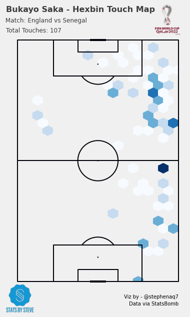
| 2 | Induvidual Player Touch Map |
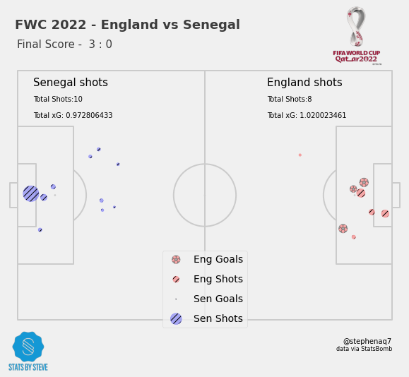
| 3 | Shot Map |
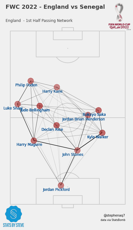
| 4 | Team Pass Map |
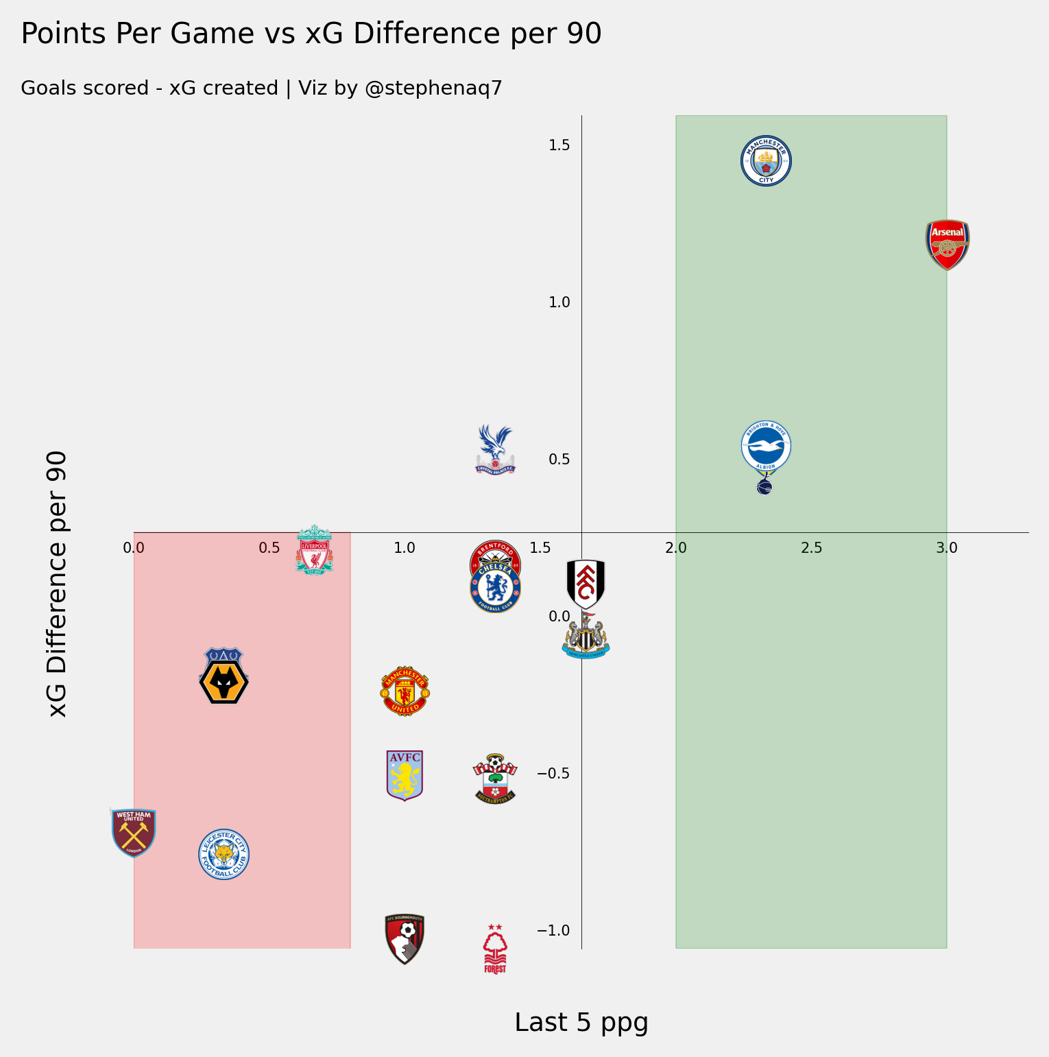
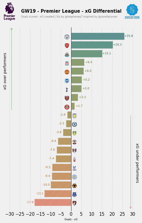
| 5 | Points-Per-Game vs xG-Diff |
| 6 | xG-Difference Tree |
| 7 | Player Rating vs Wages |
| 8 | PL Top Scorers |
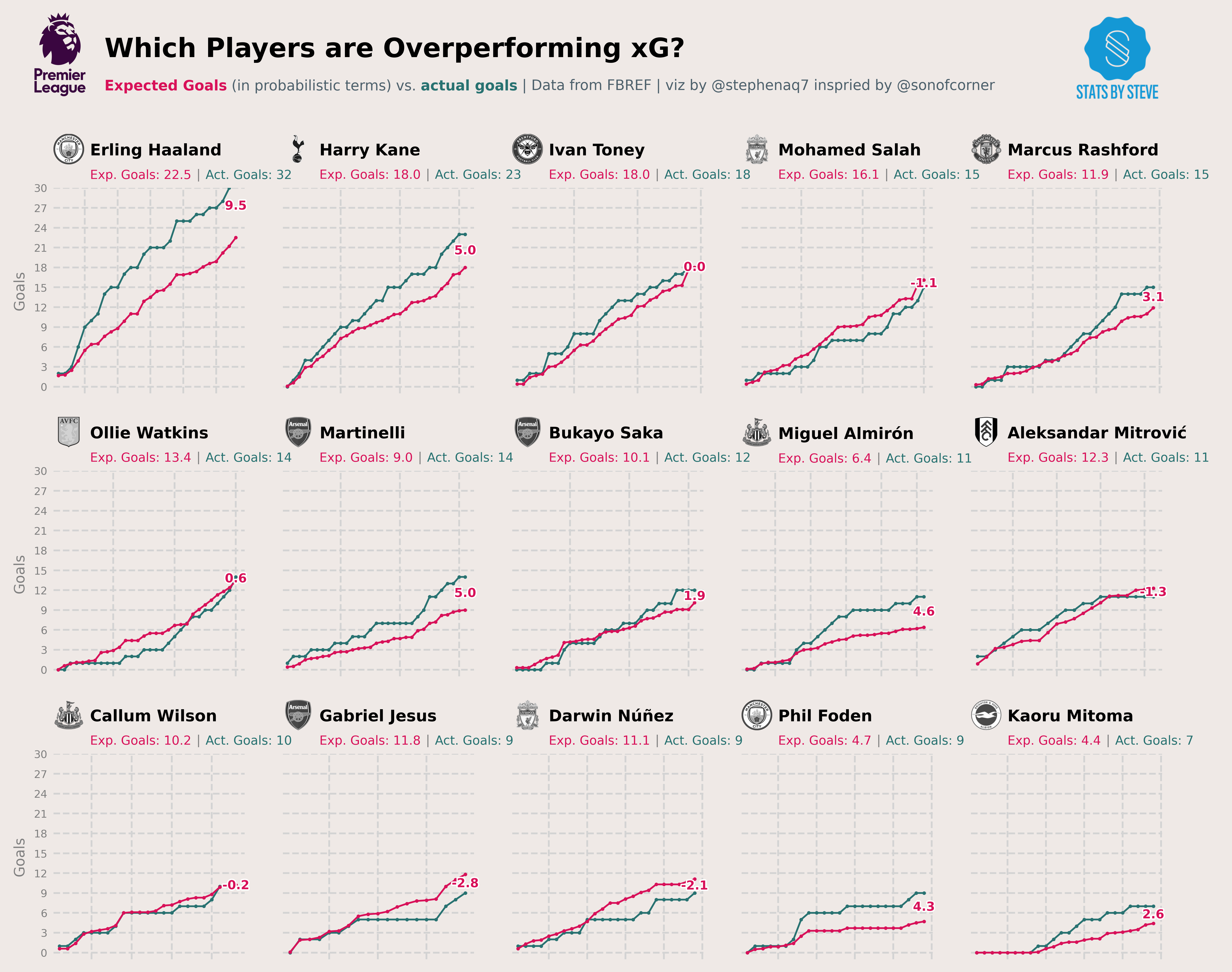
| 9 | xG Race Chart |
| 10 | On Ball Value Chart |
| 11 | Combined Pass Chart |
| 12 | Squad Age Profile |
| 13 | Performance Trend Chart |
| 14 | Radar Comparison |
