23 min to read
StatsBomb Data Exploration pt3
Extracting valuable insights from StatsBomb football data
Exploring StatsBomb Python API and Datasets for Football Analysis and Visuals (part-3)
Code and notebook for this post can be found here.
Following on from part 2, we completed the following objectives:
Develop efficient functions to aggregate data from StatsBomb python API.
Perform data manipulation tasks to transform raw data into clean, structured datasets suitable for analysis.
Create data visualizations using the obtained datasets.
Evaluate significant metrics that aid in making assertions on players & team performance.
We have now evaluted both a portion of team and player-based visualizations, now its time to go that final step further and build some intricate view and visuals that will better represent the performance of both teams and multiple players in one view.
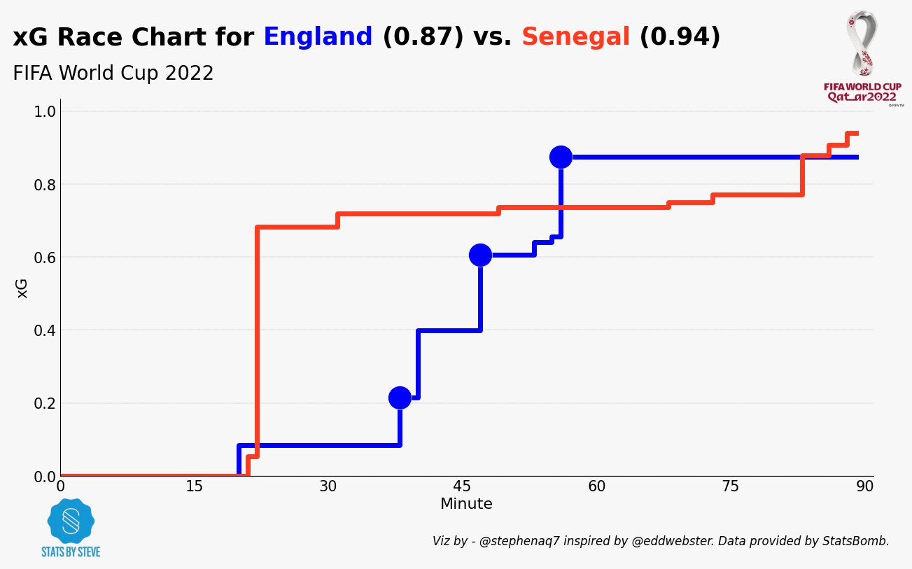
xG Race Charts
What are they?

An xG race chart is a visualization that shows how the expected goals (xG) for each team in a match changes over time. xG is a measure of the likelihood that a shot will result in a goal, and it is calculated using a variety of factors, such as the distance from goal, the angle of the shot, and the goalkeeper’s position.
An xG race chart can be used to see how the momentum of a match changes over time. For example, if one team is creating a lot of chances early in the match, but their shots are not resulting in goals, their xG will start to decrease. Conversely, if a team is not creating many chances early in the match, but their shots are starting to go in, their xG will start to increase.
xG race charts can also be used to compare the performance of different teams. For example, if two teams have the same xG at the end of a match, but one team had a higher xG earlier in the match, that team can be said to have had the better chances.
Here are some of the benefits of using xG race charts:
They can help you to understand how the momentum of a match changes over time.
They can help you to compare the performance of different teams.
They can help you to identify areas where a team needs to improve their chances creation or conversion.
Here are some of the limitations of using xG race charts:
xG is a predictive measure, not a deterministic one. This means that it is not always accurate, and it can be affected by factors that are not taken into account in the calculation.
xG race charts can be difficult to interpret if you are not familiar with the concept of xG.
Overall, xG race charts can be a useful tool for understanding and evaluating the performance of teams in football matches. The structure of the statsbomb data is a format such that, we can recreate our own version using python. Lets go ahead a build one.
Race Chart Build.
Below you find a step by step guide and explainer on how to create the race chart using statsbomb data & python.
Step 1 - Split Teams
Two variables, home_colour and
away_colour, are assigned hexadecimal color codes representing the colors of the home team and away team in the chart. The data is filtered to include only events that occurred before the 90th minute of the match. Two new DataFrames,df_shotsanddf_goals, are created by filtering the data for shots and goals, respectively. Lists and variables are initialized to store data related to home and away teams’ xG and goals.
Step 2 - Calculate Cumulative xG
The
nums_cumulative_sumfunction calculates the cumulative sum of a list of numbers. The function is applied to the home and away xG lists, creating new lists with cumulative xG values. The total xG for the home and away teams is determined by selecting the last item from the cumulative xG lists. The final cumulative xG values for the home and away teams are rounded to two decimal places.
Step 3 - Consider Time Variables
The maximum minute value from the data is stored in a variable. The last minute value is appended to the minute lists for both teams. The last cumulative xG value is appended to the cumulative xG lists for both teams. The maximum xG value (either home or away) is determined to set the height of the y-axis in the chart.
Step 4 - Transform Cumulative xG data
Lists and variables are created to store the time and cumulative xG at the moments when away and home goals were scored. The indexes of away goals are stored based on comparisons between the minute lists and the minutes of away goals. The cumulative xG values at the moments of away goals are stored based on the indexes obtained in the previous step.
Step 5 - Plotting the chart
The cumulative xG values for the home and away teams are plotted as step lines. The goals scored by the home and away teams are plotted as scatter points. The plot title, indicating the teams and their final xG values, is added.
Here is the code in full:
style.use('fivethirtyeight')

home_colour='#0000FF'
away_colour='#ff3a1e'

df = match_events.sort_values(['match_id', 'index'], ascending=[True, True])
df = df[df['minute'] < 90]
df_shots = df[(df['type'] == 'Shot')].reset_index(drop=True)
df_goals = df[(df['type'] == 'Shot') & (df['shot_outcome'] == 'Goal')].reset_index(drop=True)

h_xG = [0]
a_xG = [0]
h_min = [0]
a_min = [0]
h_min_goals = []
a_min_goals = []

hteam = teams[0]
ateam = teams[1]

for i in range(len(df_shots['shot_statsbomb_xg'])):
    if df_shots['team'][i]==hteam:
        h_xG.append(df_shots['shot_statsbomb_xg'][i])
        h_min.append(df_shots['minute'][i])
        if df_shots['shot_outcome'][i]=='Goal':
            h_min_goals.append(df_shots['minute'][i])
    if df_shots['team'][i]==ateam:
        a_xG.append(df_shots['shot_statsbomb_xg'][i])
        a_min.append(df_shots['minute'][i])
        if df_shots['shot_outcome'][i]=='Goal':
            a_min_goals.append(df_shots['minute'][i])

### Function cumulative add xG values xG. Goes through the list and adds the xG values together
def nums_cumulative_sum(nums_list):
    return [sum(nums_list[:i+1]) for i in range(len(nums_list))]

### Apply defned nums_cumulative_sum function to the home and away xG lists
h_cumulative = nums_cumulative_sum(h_xG)
a_cumulative = nums_cumulative_sum(a_xG)


### Find the total xG. Create a new variable from the last item in the cumulative list
#alast = round(a_cumulative[-1],2)
#hlast = round(h_cumulative[-1],2)
hlast = h_cumulative[-1]
alast = a_cumulative[-1]


### Determine the final cumulative xG (used for the title)
h_final_xg = round(float(hlast), 2)
a_final_xg = round(float(alast), 2)

### Determine the last minute
last_min = max(df['minute'])


### Append last minute to list
h_min.append(last_min)
a_min.append(last_min)


### Append last (final) xG to
h_cumulative.append(hlast)
a_cumulative.append(alast)


### Determine the maximum xG (used to determine the height of the y-axis)
xg_max = max(alast, hlast)


### Create lists of the time and cumulative xG at the time Away goals were scored

#### Empty list for the indexes of Away goals
a_goals_indexes = []

#### Create list of the indexes for Away goals
for i in range(len(a_min)):
    if a_min[i] in a_min_goals:
        a_goals_indexes.append(i)

#### Empty list for the cumulative xG at the moment Away goals are scored
a_cumulative_goals = []

#### Create list of the cumulative xG at the moment Away goals are scored
for i in a_goals_indexes:
    a_cumulative_goals.append(a_cumulative[i])


### Create lists of the time and cumulative xG at the time Home goals were scored

#### Empty list for the indexes of Home goals
h_goals_indexes = []

#### Create list of the indexes for Home goals
for i in range(len(h_min)):
    if h_min[i] in h_min_goals:
        h_goals_indexes.append(i)

#### Empty list for the cumulative xG at the moment Home goals are scored
h_cumulative_goals = []

#### Create list of the cumulative xG at the moment Home goals are scored
for i in h_goals_indexes:
    h_cumulative_goals.append(h_cumulative[i])


## Data Visualisation

### Define fonts and colours
title_font = 'DejaVu Sans'
main_font = 'Open Sans'
background = '#F7F7F7'
title_colour = 'black'
text_colour = 'black'
filler = 'grey'
mpl.rcParams['xtick.color'] = text_colour
mpl.rcParams['ytick.color'] = text_colour
mpl.rcParams.update(mpl.rcParamsDefault)
mpl.rcParams.update({'font.size':15})


### Create figure
fig, ax = plt.subplots(figsize=(15, 7))
fig.set_facecolor(background)
ax.patch.set_facecolor(background)


### Add a grid and set gridlines
ax.grid(linestyle='dotted',
        linewidth=0.25,
        color='#3B3B3B',
        axis='y',
        zorder=1
        )

### Remove top and right spines, colour bttom and left
spines = ['top', 'right', 'bottom', 'left']
for s in spines:
    if s in ['top', 'right']:
        ax.spines[s].set_visible(False)
    else:
        ax.spines[s].set_color(text_colour)


### Plot xG Race Chart - step chart
ax.step(x=h_min, y=h_cumulative, color=home_colour, label=hteam, linewidth=5, where='post')
ax.step(x=a_min, y=a_cumulative, color=away_colour, label=ateam, linewidth=5, where='post')


### Plot goals - scatter plot
ax.scatter(x=h_min_goals, y=h_cumulative_goals, s=600, color=home_colour, edgecolors=background, marker='o', alpha=1, linewidth=0.5, zorder=2)
ax.scatter(x=a_min_goals, y=a_cumulative_goals, s=600, color=away_colour, edgecolors=background, marker='o', alpha=1, linewidth=0.5, zorder=2)


### Show Legend
#plt.legend()     # commented out as colours of teams shown in the title


### Add Plot Title
  ### Add Plot Title
s = 'xG Race Chart for <{}> ({}) vs. <{}> ({})\n'

htext.fig_text(x=0.08, y=1.029,
         s= s.format(teams[0], h_final_xg, teams[1], a_final_xg),
         highlight_textprops=[{"color": home_colour},
                              {"color": away_colour}], fontweight='bold', fontsize=25, fontfamily=title_font, color=text_colour)


### Add Plot Subtitle
fig.text(0.08, 0.92, f'FIFA World Cup 2022', fontweight='regular', fontsize=20, fontfamily=title_font, color=text_colour)


### Add X and Y labels
plt.xlabel('Minute', color=text_colour, fontsize=16)
plt.ylabel('xG', color=text_colour, fontsize=16)
plt.xticks([0, 15, 30, 45, 60, 75, 90])
plt.xlim([0, last_min+2])
plt.ylim([0, xg_max*1.1])    # Y axis goes to 10% greater than maximum xG


### Add Fifa WC logo
ax2 = fig.add_axes([0.85, 0.025, 0.08, 1.88])
ax2.axis('off')
img = image.imread('/Users/stephenahiabah/code/statsbomb_project/FWC_Logo.png')
ax2.imshow(img)


### Add Stats by Steve logo
ax3 = fig.add_axes([0.085, -0.06, 0.1, 0.13])
ax3.axis('off')
img = image.imread('/Users/stephenahiabah/code/statsbomb_project/logo_transparent_background.png')
ax3.imshow(img)

plt.figtext(0.48,
            -0.06,
            f'Viz by - @stephenaq7 inspired by @eddwebster. Data provided by StatsBomb.\n',
            fontstyle='italic',
            fontsize=12,
            )

### Remove pips
ax.tick_params(axis='both', length=0)
This is the resulting visual:

Now were going to move on to our final section, where we will explore how to visualise some more advance metrics.
On Ball Value Chart.
What are they?
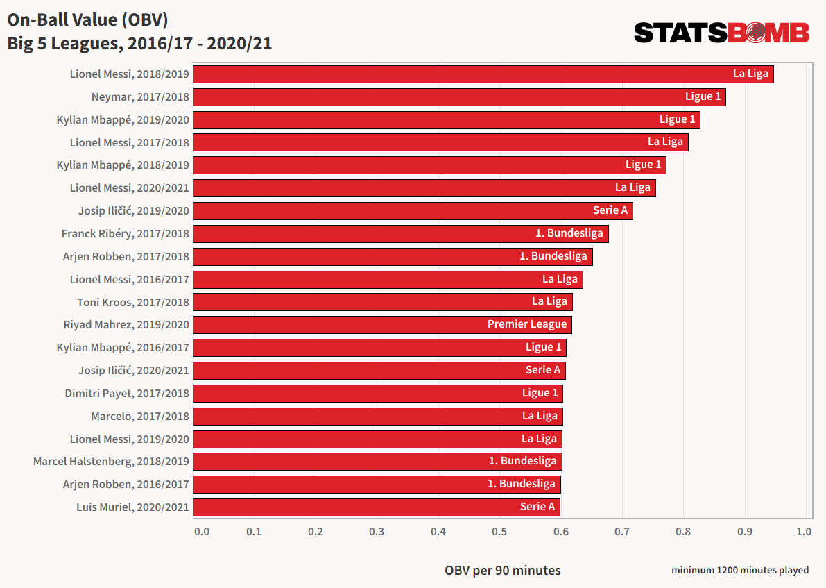
On-Ball Value (OBV) is a statistical model that objectively and quantitatively measures the value of each event in football. It calculates the change in the probability of a team scoring or conceding as a result of a specific event. OBV offers two key benefits:
Differentiation of Event Value: OBV accurately identifies actions within possession chains that contribute significantly to creating scoring opportunities, giving them greater credit. It can differentiate the value of different passes or actions within a possession chain leading to a goal.
Consideration of Opportunity Cost: OBV appropriately accounts for the opportunity cost of high-risk actions and turnovers. It recognizes and credits players who take calculated risks, as long as their actions contribute positively to the team overall.
Key features of OBV’s approach:
Training with xG: The model is trained using StatsBomb’s expected goals (xG) data, resulting in more accurate training by reducing variance and class imbalance.
Separate Models for Goals For and Goals Against: OBV utilizes separate models for offensive and defensive components, allowing a detailed assessment of both attacking and defensive contributions.
No Credit to Pass Recipients: OBV does not directly credit pass recipients, focusing instead on the intrinsic value of events themselves, considering the movement of players off the ball.
Inclusion of Possession State Features: OBV incorporates pitch location, action context, opposition pressure, and body part used as features to determine event value.
OBV enhances performance and recruitment analysis by providing a comprehensive understanding of the value of on-ball events in football. It offers improved event differentiation and considers the opportunity cost of actions. By leveraging xG data and possession state features, OBV advances the analysis of team performance and player contributions in the football domain.
We can create a similar concept to On-Ball Value (OBV) by aggregating expected possession metrics (xEpected Possession) from StatsBomb. Calculate the change in probability of scoring or conceding for each event and consider opportunity cost. Use xG, xA, xGBuildup, and other possession metrics. Enhance performance analysis and player evaluation in football.
OBV Chart Build.
Step 1 - Data Preparation
Filter the ‘match_events’ DataFrame to include only specific actions (passes, carries, dribbles). Group the filtered data by player and team, and calculate the total count of actions (‘total_obv’) for each player.
Step 2 - DataFrame Manipulation
Calculate the ‘obv_p90’ metric by dividing ‘total_obv’ by 90 (representing actions per 90 minutes). Sort the DataFrame by ‘obv_p90’ in descending order. Filter the DataFrame to include only players from the desired team.
Step 3 - Data Visualization
Define fonts, colors, and plot configurations. Assign player names to the ‘player’ variable and ‘obv_p90’ values to the ‘value’ variable. Create horizontal bar plots for each player, using the ‘player’ and ‘value’ variables. Customize the color of specific bars (e.g., the 9th and 10th bars). Invert the y-axis to show the top values at the top of the plot.
The code generates a horizontal bar chart showing the top players based on their on-ball value contribution. The chart provides insights into the number of passes, carries, and dribbles each player performs per 90 minutes. The bars are color-coded, and annotations display the exact values. The plot includes visual elements such as logos and captions for additional context.
Here is the code in question:
lst_actions=['Pass','Carry','Dribble']
df = match_events[match_events['type'].isin(lst_actions)]
df_grouped_obv = (df.groupby(['player', 'team']).agg({'type':'count'}).reset_index()                    )
df_grouped_obv.columns = ['player_name', 'country', 'total_obv']
df_grouped_obv['obv_p90'] = df_grouped_obv['total_obv'] / 90
### Sort by 'total_obv' decending
df_grouped_obv = df_grouped_obv.sort_values(['obv_p90'], ascending=[False])

df_grouped_obv = df_grouped_obv[df_grouped_obv['country'] == teams[0]]

### Reset index
df_grouped_obv = df_grouped_obv.reset_index(drop=True)


## Data Visualisation

## Define fonts and colours
title_font = 'DejaVu Sans'
main_font = 'Open Sans'
background='#f7f7f7'
title_colour='black'
text_colour='black'
mpl.rcParams.update(mpl.rcParamsDefault)
mpl.rcParams['xtick.color'] = text_colour
mpl.rcParams['ytick.color'] = text_colour
mpl.rcParams.update({'font.size': 18})

### Define labels and metrics
player = df_grouped_obv['player_name']
value = df_grouped_obv['obv_p90']

### Create figure
fig, ax = plt.subplots(figsize =(16, 16))
fig.set_facecolor(background)
ax.patch.set_facecolor(background)

### Create Horizontal Bar Plot
bars = ax.barh(player,
                value,
                color='#0184a3',
                alpha=0.75
                )

bars[8].set_color('#0c05fa')

### Select team of interest
bars[9].set_color('#c01430')

### Add a grid and set gridlines
ax.grid(linestyle='dotted',
        linewidth=0.25,
        color='#3B3B3B',
        axis='y',
        zorder=1
        )

### Remove top and right spines, colour bttom and left
spines = ['top', 'right', 'bottom', 'left']
for s in spines:
    if s in ['top', 'right', 'bottom', 'left']:
        ax.spines[s].set_visible(False)
    else:
        ax.spines[s].set_color(text_colour)

### Remove x, y Ticks
ax.xaxis.set_ticks_position('none')
ax.yaxis.set_ticks_position('none')

### Add padding between axes and labels
#ax.xaxis.set_tick_params(pad=2)
#ax.yaxis.set_tick_params(pad=20)

### Add X, Y gridlines
ax.grid(
        color='grey',
        linestyle='-.',
        linewidth=0.5,
        alpha=0.2
        )

### Show top values
ax.invert_yaxis()

### Add annotation to bars
for i in ax.patches:
    plt.text(i.get_width()+0.015, i.get_y()+0.4,
                str(round((i.get_width()), 3)),
                fontsize=18,
                fontweight='regular',
                color ='black'
            )

### Add Plot Title
plt.figtext(0.045,
            0.99,
            f'Top Player\'s for On-Ball Value Contribution',
            fontsize=30,
            fontweight='bold',
            color=text_colour
            )

### Add Plot Subtitle
fig.text(0.045, 0.96, f'FIFA World Cup 2022', fontweight='regular', fontsize=20, fontfamily=title_font, color=text_colour)

### Add Fifa WC logo
ax2 = fig.add_axes([0.9, 0.055, 0.08, 1.88])
ax2.axis('off')
img = image.imread('/Users/stephenahiabah/code/statsbomb_project/FWC_Logo.png')
ax2.imshow(img)


### Add Stats by Steve logo
ax3 = fig.add_axes([0.05, -0.1, 0.1, 0.13])
ax3.axis('off')
img = image.imread('/Users/stephenahiabah/code/statsbomb_project/logo_transparent_background.png')
ax3.imshow(img)

plt.figtext(0.52,
            -0.06,
            f'Viz by - @stephenaq7 inspired by @eddwebster. Data provided by StatsBomb.\n',
            fontstyle='italic',
            fontsize=12,
            )
## Show plt
plt.tight_layout()
plt.show()
And this is the resulting chart:

Conclusion
In conclusion, the provided code demonstrates the process of aggregating and manipulating data from the StatsBomb Python API, specifically player data.
With respect to our intial objectives, we have reahced these milestones:
Develop efficient functions to aggregate data from StatsBomb python API.
Perform data manipulation tasks to transform raw data into clean, structured datasets suitable for analysis.
Create data visualizations using the obtained datasets.
Evaluate significant metrics that aid in making assertions on players & team performance.
I hope you found this series useful, and please let me know if you have any further questions.
Thanks for reading
Steve

Comments