28 min to read
StatsBomb Data Exploration pt2
Advanced techniques for analyzing football data from StatsBomb
Exploring StatsBomb Python API and Datasets for Football Analysis and Visuals (part-2)
Code and notebook for this post can be found here.
Following on from part 1, we completed the following objectives: have:
Develop efficient functions to aggregate data from StatsBomb python API.
Perform data manipulation tasks to transform raw data into clean, structured datasets suitable for analysis.
Create data visualizations using the obtained datasets.
Evaluate significant metrics that aid in making assertions on players & team performance.
Now we’re going to delve into more player-based visualizations, examining individual player performance and exploring metrics that provide insights into player suitability for specific positions.
By focusing on player analysis, we aim to gain a deeper understanding of player contributions and their impact on team performance.
Creating Player Specific Visuals
Player Touches
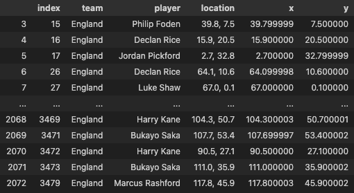
The code first copies the match_events dataframe to a new dataframe called touches_raw. Then, it selects the columns team, player, and location from the touches_raw dataframe and saves it to a new dataframe called touches.
Next, the code filters the touches dataframe to only include rows where the team column is equal to “England”. The filtered dataframe is then reset the index.
The code then drops any rows in the touches_team dataframe where the location column is equal to “a”.
Next, the code converts the location column in the touches_team dataframe to a string. Then, it splits the string on the comma delimiter and saves the two resulting columns as x and y.
Finally, the code drops any rows in the touches_team dataframe where the location column is equal to “a” to help us process the data effectively as it is string format in int column.
The code then prints the touches_team dataframe.
touches_raw = match_events.copy()
touches = touches_raw[['team','player','location']]
touches_team = touches[touches['team']=="England"].reset_index()

touches_team.drop(touches_team[touches_team['location'] == "a"].index, inplace = True)
touches_team["location"] = touches_team["location"].astype(str)
touches_team["location"] = touches_team["location"].str[1:]
touches_team["location"] = touches_team["location"].str[:-1]
touches_team.drop(touches_team[touches_team['location'] == "a"].index, inplace = True)
touches_team[["x", "y"]] = touches_team["location"].str.split(",", expand=True).astype(np.float32)
touches_team
This is what the resulting dataframe should look like:
This code generates a hexbin touch map for Bukayo Saka using data from the touches_team dataframe
The hexbin touch map is a visualization that shows the location and frequency of a player’s touches on the football pitch.
The code uses the VerticalPitch() module from the mplsoccer library to create the football pitch background, and hexbin() method to generate the hexbins for the player’s touches.
The code also adds two logos to the visual - the FIFA World Cup logo and a logo for “Stats by Steve”, and includes some text annotations to provide more information about the match and the player’s touches.
Finally, the code saves the visualization as a PNG file in a specified folder using the savefig() method.
style.use('fivethirtyeight')


player_name = 'Bukayo Saka'
touches_player = touches_team.loc[lambda x: x['player'] == player_name]

pitch = VerticalPitch(line_color='#000009', line_zorder=2, )
fig, axs = pitch.grid(figheight=10, title_height=0.08, endnote_space=0,
                      title_space=0,
                      # Turn off the endnote/title axis. I usually do this after
                      # I am happy with the chart layout and text placement
                      axis=False,)
hexmap = pitch.hexbin(touches_player.x, touches_player.y, ax=axs['pitch'],
                      gridsize=(16, 16), cmap="Blues")
### Add Fifa WC logo
ax2 = fig.add_axes([0.8, 0.035, 0.14, 1.7])
ax2.axis('off')
img = image.imread('/Users/stephenahiabah/code/statsbomb_project/FWC_Logo.png')
ax2.imshow(img)


### Add Stats by Steve logo
ax3 = fig.add_axes([0, 0.06, 0.16, 0.1])
ax3.axis('off')
img = image.imread('/Users/stephenahiabah/code/statsbomb_project/logo_transparent_background.png')
ax3.imshow(img)

axs['title'].text(0.4, 0.7, f'{player_name} - Hexbin Touch Map ', weight = 'bold', alpha = .75,
                 ha='center', fontsize=16)

axs['title'].text(0.185, 0.4, f' Match: {team_list[0]} vs {team_list[1]}  ', alpha = .75,
                  va='center', ha='center', fontsize=12)

axs['title'].text(0.107, 0.05, f' Total Touches: {len(touches_player)}  ', alpha = .75,
                  va='center', ha='center', fontsize=12)

axs['endnote'].text(1, 0.7, 'Viz by - @stephenaq7', va='center', ha='right', fontsize=10)
axs['endnote'].text(1, 0.4, 'Data via StatsBomb', va='center', ha='right', fontsize=10)
plt.savefig(f'Output Visuals/{player_name} - Hexbin Touch Map.png', dpi=300, bbox_inches='tight')
This is what the resulting visual should look like:

Player Passes
Now, lets get the induvidual pass diagrams.
The code below first copies the match_events dataframe to a new dataframe called player_passes_raw. Then, it selects the columns team, player, location, pass_end_location, and pass_outcome from the player_passes_raw dataframe and saves it to a new dataframe called player_passes_raw.
Next, we filter the player_passes_raw dataframe to only include rows where the team column is equal to “England”.
The code then drops any rows in the player_passes_raw dataframe where the location column or pass_end_location column is equal to “a”. This is done because the location column and pass_end_location column contain some invalid values, such as “a”.
Next, the code converts the location column and pass_end_location column in the player_passes_raw dataframe to strings. Then, it splits the strings on the comma delimiter and saves the two resulting columns as x and y for the location column and end_x and end_y for the pass_end_location column.
Finally, the code prints the player_passes_raw dataframe
player_passes_raw = match_events.copy()
player_passes_raw = player_passes_raw[['team','player','location','pass_end_location',"pass_outcome"]]
player_passes_raw = player_passes_raw[player_passes_raw['team']=="England"].reset_index()

player_passes_raw.drop(player_passes_raw[player_passes_raw['location'] == "a"].index, inplace = True)
player_passes_raw.drop(player_passes_raw[player_passes_raw['pass_end_location'] == "a"].index, inplace = True)
# touches_team = touches_team.loc[lambda x: x['location'] != 'a']

player_passes_raw["location"] = player_passes_raw["location"].astype(str)
player_passes_raw["location"] = player_passes_raw["location"].str[1:]
player_passes_raw["location"] = player_passes_raw["location"].str[:-1]
player_passes_raw.drop(player_passes_raw[player_passes_raw['location'] == "a"].index, inplace = True)
player_passes_raw[["x", "y"]] = player_passes_raw["location"].str.split(",", expand=True).astype(np.float32)


player_passes_raw["pass_end_location"] = player_passes_raw["pass_end_location"].astype(str)
player_passes_raw["pass_end_location"] = player_passes_raw["pass_end_location"].str[1:]
player_passes_raw["pass_end_location"] = player_passes_raw["pass_end_location"].str[:-1]
player_passes_raw.drop(player_passes_raw[player_passes_raw['pass_end_location'] == "a"].index, inplace = True)
player_passes_raw[["end_x", "end_y"]] = player_passes_raw["pass_end_location"].str.split(",", expand=True).astype(np.float32)
We now need to create the df called mask_complete that indicates whether or not a pass was completed. The mask is created by using the pass_outcome column in the player_passes_raw dataframe. If the pass_outcome column is null, then the pass was completed. Otherwise, the pass was not completed.
mask_complete = player_passes_raw.pass_outcome.isnull()
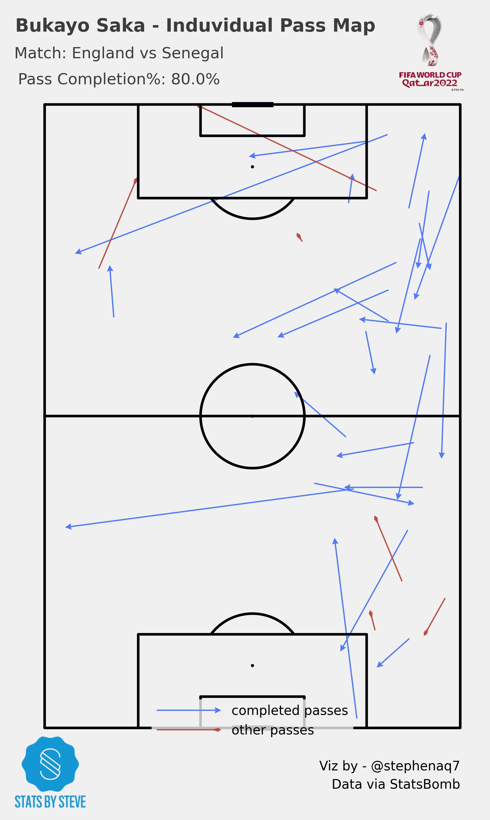
Next we need to plot the completed passes and the other passes on the pitch. This is done by using the pitch.arrows() method. The pitch.arrows() method takes a number of arguments, including the x-coordinates of the passes, the y-coordinates of the passes, the end x-coordinates of the passes, the end y-coordinates of the passes, the width of the arrows, the headwidth of the arrows, the headlength of the arrows, and the color of the arrows.
Finally, the code saves the plot as a PNG file. This is done by using the plt.savefig() method. The plt.savefig() method takes a number of arguments, including the filename of the plot, the dpi of the plot, and the bbox_inches argument, which specifies how much of the plot should be included in the saved file.
style.use('fivethirtyeight')


player_name = 'Bukayo Saka'

passes_player = player_passes_raw.loc[lambda x: x['player'] == player_name]

pitch = VerticalPitch(line_color='#000009', line_zorder=2, )
fig, axs = pitch.grid(figheight=10, title_height=0.08, endnote_space=0,
                      title_space=0,
                      # Turn off the endnote/title axis. I usually do this after
                      # I am happy with the chart layout and text placement
                      axis=False,)
# Plot the completed passes
pitch.arrows(passes_player[mask_complete].x, passes_player[mask_complete].y,
             passes_player[mask_complete].end_x, passes_player[mask_complete].end_y, width=1,
             headwidth=5, headlength=5, color='#507af8', ax=axs['pitch'], label='completed passes')

# Plot the other passes
pitch.arrows(passes_player[~mask_complete].x, passes_player[~mask_complete].y,
             passes_player[~mask_complete].end_x, passes_player[~mask_complete].end_y, width=1,
             headwidth=3, headlength=2.5, headaxislength=6,
             color='#ba4f45', ax=axs['pitch'], label='other passes')

# Set up the legend
legend = axs['pitch'].legend(handlelength=5, edgecolor='None', fontsize=10, loc='lower center')

### Add Fifa WC logo
ax2 = fig.add_axes([0.8, 0.035, 0.14, 1.7])
ax2.axis('off')
img = image.imread('/Users/stephenahiabah/code/statsbomb_project/FWC_Logo.png')
ax2.imshow(img)


### Add Stats by Steve logo
ax3 = fig.add_axes([0, 0.06, 0.16, 0.1])
ax3.axis('off')
img = image.imread('/Users/stephenahiabah/code/statsbomb_project/logo_transparent_background.png')
ax3.imshow(img)

axs['title'].text(0.37, 0.7, f'{player_name} - Induvidual Pass Map ', weight = 'bold', alpha = .75,
                 ha='center', fontsize=14)

axs['title'].text(0.185, 0.4, f' Match: {team_list[0]} vs {team_list[1]}  ', alpha = .75,
                  va='center', ha='center', fontsize=12)

axs['title'].text(0.185, 0.05, f' Pass Completion%: {(len(passes_player[mask_complete])/len(passes_player))*100}%  ', alpha = .75,
                  va='center', ha='center', fontsize=12)

axs['endnote'].text(1, 0.7, 'Viz by - @stephenaq7', va='center', ha='right', fontsize=10)
axs['endnote'].text(1, 0.4, 'Data via StatsBomb', va='center', ha='right', fontsize=10)
plt.savefig(f'Output Visuals/{player_name} - Hexbin Touch Map.png', dpi=300, bbox_inches='tight')
the resulting visual should look like this:

Combined Team Pass Map
Sure, here is the explanation of the code:
The code first imports the Sbopen library, which is used to access data from the StatsBomb Open API. The match ID is then set to 3869118, which is the ID of the England vs Sengal match we used in part 1.
match = 3869118

parser = Sbopen()
events, related, freeze, tactics = parser.event(match)
lineup = parser.lineup(match)
The next few lines of code create two dataframes: events and lineup. The events dataframe contains information about all of the events that happened in the match, such as goals, shots, and substitutions. The lineup dataframe contains information about the starting lineups for both teams.
We now merge the events and lineup dataframes to create a new dataframe that contains information about all of the players who played in the match, including when they were subbed on or off.
We now get the first position for each player and add this to the lineup dataframe.
# dataframe with player_id and when they were subbed off
time_off = events.loc[(events.type_name == 'Substitution'),
                      ['player_id', 'minute']]
time_off.rename({'minute': 'off'}, axis='columns', inplace=True)
# dataframe with player_id and when they were subbed on
time_on = events.loc[(events.type_name == 'Substitution'),
                     ['substitution_replacement_id', 'minute']]
time_on.rename({'substitution_replacement_id': 'player_id',
                'minute': 'on'}, axis='columns', inplace=True)
players_on = time_on.player_id
# merge on times subbed on/off
lineup = lineup.merge(time_on, on='player_id', how='left')
lineup = lineup.merge(time_off, on='player_id', how='left')
We also add a column to the lineup dataframe that contains the position abbreviation. This is done by creating a dictionary that maps the position ID to the corresponding position abbreviation.
The dataframe is then sorted the by the team name, whether or not the player started, the minute at which the player was subbed on, and the position ID.
The code then prints the lineup dataframe.
# filter the tactics lineup for the starting xi
starting_ids = events[events.type_name == 'Starting XI'].id
starting_xi = tactics[tactics.id.isin(starting_ids)]
starting_players = starting_xi.player_id

# filter the lineup for players that actually played
mask_played = ((lineup.on.notnull()) | (lineup.off.notnull()) |
               (lineup.player_id.isin(starting_players)))
lineup = lineup[mask_played].copy()

# get the first position for each player and add this to the lineup dataframe
player_positions = (events[['player_id', 'position_id']]
                    .dropna(how='any', axis='rows')
                    .drop_duplicates('player_id', keep='first'))
lineup = lineup.merge(player_positions, how='left', on='player_id')

# add on the position abbreviation
formation_dict = {1: 'GK', 2: 'RB', 3: 'RCB', 4: 'CB', 5: 'LCB', 6: 'LB', 7: 'RWB',
                  8: 'LWB', 9: 'RDM', 10: 'CDM', 11: 'LDM', 12: 'RM', 13: 'RCM',
                  14: 'CM', 15: 'LCM', 16: 'LM', 17: 'RW', 18: 'RAM', 19: 'CAM',
                  20: 'LAM', 21: 'LW', 22: 'RCF', 23: 'ST', 24: 'LCF', 25: 'SS'}
lineup['position_abbreviation'] = lineup.position_id.map(formation_dict)

# sort the dataframe so the players are
# in the order of their position (if started), otherwise in the order they came on
lineup['start'] = lineup.player_id.isin(starting_players)
lineup.sort_values(['team_name', 'start', 'on', 'position_id'],
                   ascending=[True, False, True, True], inplace=True)
We now filter the lineup data to only include players from the team that we are interested in.
Then, it filters the events data to exclude some set pieces. Next, it creates two new dataframes: one for the team pass map and one for the player pass maps.
The team pass map includes all of the ball receipts for the team, while the player pass maps only include the passes that were made by each individual player.
# filter the lineup for England players
# if you want the other team set team = team2
team1, team2 = lineup.team_name.unique()  # England (team1), Sengeal (team2)
team = team1
lineup_team = lineup[lineup.team_name == team].copy()

# filter the events to exclude some set pieces
set_pieces = ['Throw-in', 'Free Kick', 'Corner', 'Kick Off', 'Goal Kick']
# for the team pass map
pass_receipts = events[(events.team_name == team) & (events.type_name == 'Ball Receipt')].copy()
# for the player pass maps
passes_excl_throw = events[(events.team_name == team) & (events.type_name == 'Pass') &
                           (events.sub_type_name != 'Throw-in')].copy()

# identify how many players played and how many subs were used
# we will use this in the loop for only plotting pass maps for as
# many players who played
num_players = len(lineup_team)
num_sub = num_players - 11
In addition, we need to add some styling to the pitch and make completed passes in green and in-complete in red.
# add padding to the top so we can plot the titles, and raise the pitch lines
pitch = Pitch(pad_top=10, line_zorder=2)

# arrow properties for the sub on/off
green_arrow = dict(arrowstyle='simple, head_width=0.7',
                   connectionstyle="arc3,rad=-0.8", fc="green", ec="green")
red_arrow = dict(arrowstyle='simple, head_width=0.7',
                 connectionstyle="arc3,rad=-0.8", fc="red", ec="red")

# a fontmanager object for using a google font
# fm_scada = FontManager('https://raw.githubusercontent.com/googlefonts/scada/main/fonts/ttf/'
#                        'Scada-Regular.ttf')
The code then plots the 5 * 3 grid of player pass maps. For each player, the code plots the arrows that show the direction of the passes that the player made. The code also plots the text annotations that show the player’s name, position, and the number of passes that they made.
import warnings

import cmasher as cmr

from highlight_text import ax_text

# filtering out some highlight_text warnings - the warnings aren't correct as the
# text fits inside the axes.
warnings.simplefilter("ignore", UserWarning)

# plot the 5 * 3 grid
fig, axs = pitch.grid(nrows=5, ncols=3, figheight=30,
                      endnote_height=0.03, endnote_space=0,
                      # Turn off the endnote/title axis. I usually do this after
                      # I am happy with the chart layout and text placement
                      axis=False,
                      title_height=0.08, grid_height=0.84)
# cycle through the grid axes and plot the player pass maps
for idx, ax in enumerate(axs['pitch'].flat):
    # only plot the pass maps up to the total number of players
    if idx < num_players:
        # filter the complete/incomplete passes for each player (excudes throw-ins)
        lineup_player = lineup_team.iloc[idx]
        player_id = lineup_player.player_id
        player_pass = passes_excl_throw[passes_excl_throw.player_id == player_id]
        complete_pass = player_pass[player_pass.outcome_name.isnull()]
        incomplete_pass = player_pass[player_pass.outcome_name.notnull()]

        # plot the arrows
        pitch.arrows(complete_pass.x, complete_pass.y,
                     complete_pass.end_x, complete_pass.end_y,
                     color='#56ae6c', width=2, headwidth=4, headlength=6, ax=ax)
        pitch.arrows(incomplete_pass.x, incomplete_pass.y,
                     incomplete_pass.end_x, incomplete_pass.end_y,
                     color='#7065bb', width=2, headwidth=4, headlength=6, ax=ax)


        total_pass = len(complete_pass) + len(incomplete_pass)
        annotation_string = (f'{lineup_player.position_abbreviation} | '
                             f'{lineup_player.player_name} | '
                             f'<{len(complete_pass)}>/{total_pass} | '
                             f'{round(100 * len(complete_pass)/total_pass, 1)}%')
        ax_text(0, -5, annotation_string, ha='left', va='center', fontsize=13,
                highlight_textprops=[{"color": '#56ae6c'}], ax=ax)

        # add information for subsitutions on/off and arrows
        if not np.isnan(lineup_team.iloc[idx].off):
            ax.text(116, -10, str(lineup_team.iloc[idx].off.astype(int)), fontsize=20,
                    ha='center', va='center')
            ax.annotate('', (120, -2), (112, -2), arrowprops=red_arrow)
        if not np.isnan(lineup_team.iloc[idx].on):
            ax.text(104, -10, str(lineup_team.iloc[idx].on.astype(int)), fontsize=20,
                    ha='center', va='center')
            ax.annotate('', (108, -2), (100, -2), arrowprops=green_arrow)


# remove unused axes (if any)
for ax in axs['pitch'].flat[11 + num_sub:-1]:
    ax.remove()


# title text
axs['title'].text(0.5, 0.65, f'{team1} Pass Maps vs {team2}', fontsize=40,
                  va='center', ha='center')
SUB_TEXT = ('Player Pass Maps: exclude throw-ins only\n'
            'Team heatmap: includes all attempted pass receipts')
axs['title'].text(0.5, 0.35, SUB_TEXT, fontsize=20,
                  va='center', ha='center')
# plot logos (same height as the title_ax)

### Add Fifa WC logo
ax2 = fig.add_axes([0.85, 0.025, 0.08, 1.85])
ax2.axis('off')
img = image.imread('/Users/stephenahiabah/code/statsbomb_project/FWC_Logo.png')
ax2.imshow(img)


### Add Stats by Steve logo
ax3 = fig.add_axes([0.03, 0.9, 0.1, 0.1])
ax3.axis('off')
img = image.imread('/Users/stephenahiabah/code/statsbomb_project/logo_transparent_background.png')
ax3.imshow(img)


# endnote text
axs['endnote'].text(1, 0.7, 'Viz by - @stephenaq7 inspired by @DymondFormation', va='center', ha='right', fontsize=15)
axs['endnote'].text(1, 0.4, 'Data via StatsBomb', va='center', ha='right', fontsize=15)


plt.show()  # If you are using a Jupyter notebook you do not need this line
The resulting chart should look like this:

Conclusion
In conclusion, the provided code demonstrates the process of aggregating and manipulating data from the StatsBomb Python API, specifically player data.
With respect to our intial objectives, we still retain these milestones:
Develop efficient functions to aggregate data from StatsBomb python API.
Perform data manipulation tasks to transform raw data into clean, structured datasets suitable for analysis.
Create data visualizations using the obtained datasets.
Evaluate significant metrics that aid in making assertions on players & team performance.
Moving forward, in Part 3 of our analysis, we will delve into more more complex visualisations and analysis that will allow us to make assertions on players & team performance with regards to any given match from the API.
Thanks for reading
Steve

Comments