36 min to read
Figuring Out xG pt3
Advanced applications of expected goals (xG) in football analysis
In Part 2 of my series of posts on Figuring Out xG, we successfully achieved the following items;
-
Develop efficient functions to aggregate data from FBRef & FotMob.
-
Perform data manipulation tasks to transform raw data into clean, structured datasets suitable for analysis
-
Create data visualizations using the obtained datasets.
-
Evaluate significant metrics that aid in making assertions on team performance.
In Part 3 of our analysis, we will dexamining xG performance over multiple seasons and into player specific xG Data.
xG Rolling Charts
xG rolling charts offer a comprehensive view of a team’s performance dynamics, supporting strategic decision-making, player development, and the understanding of long-term trends for sustained success.
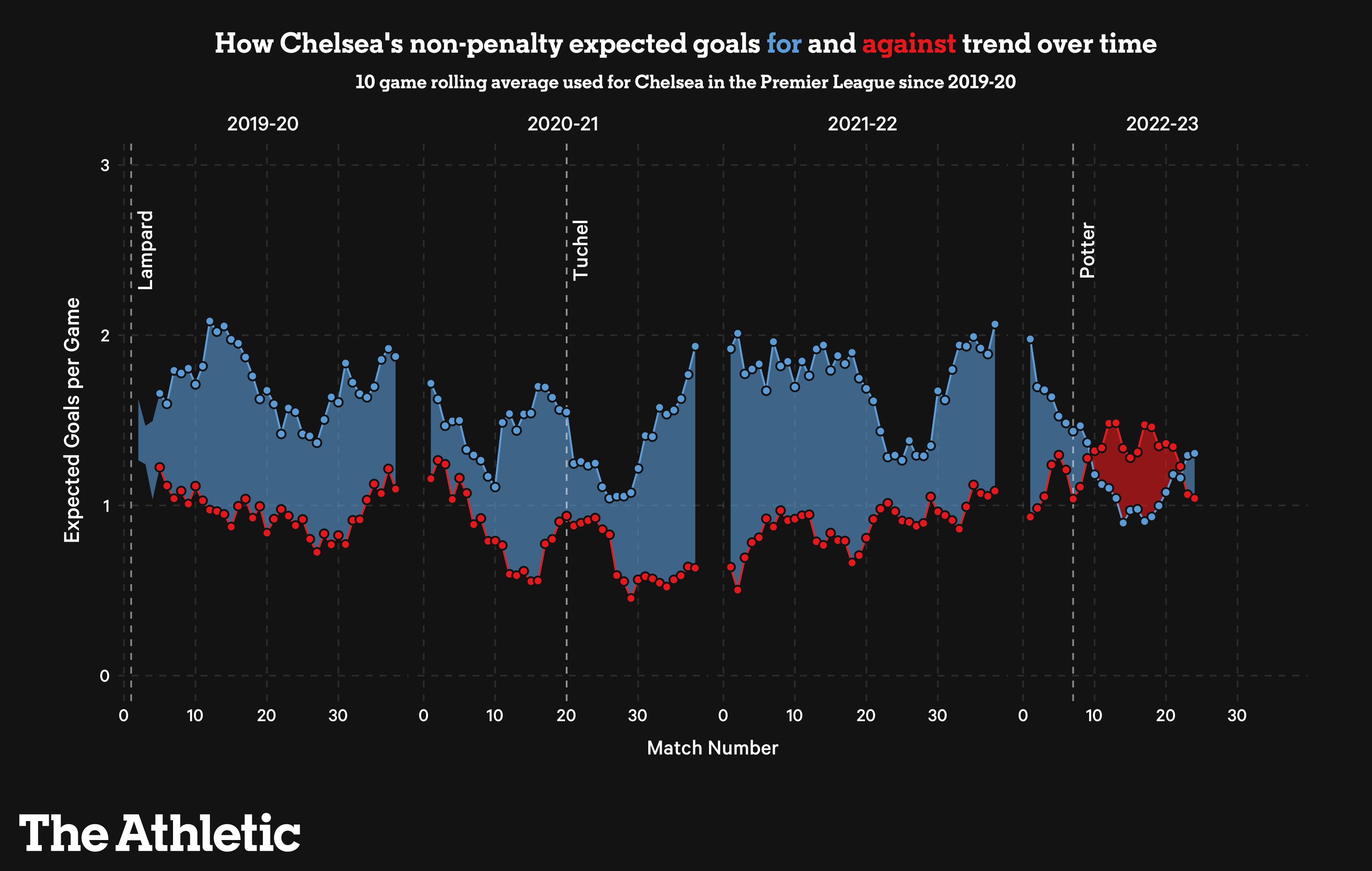
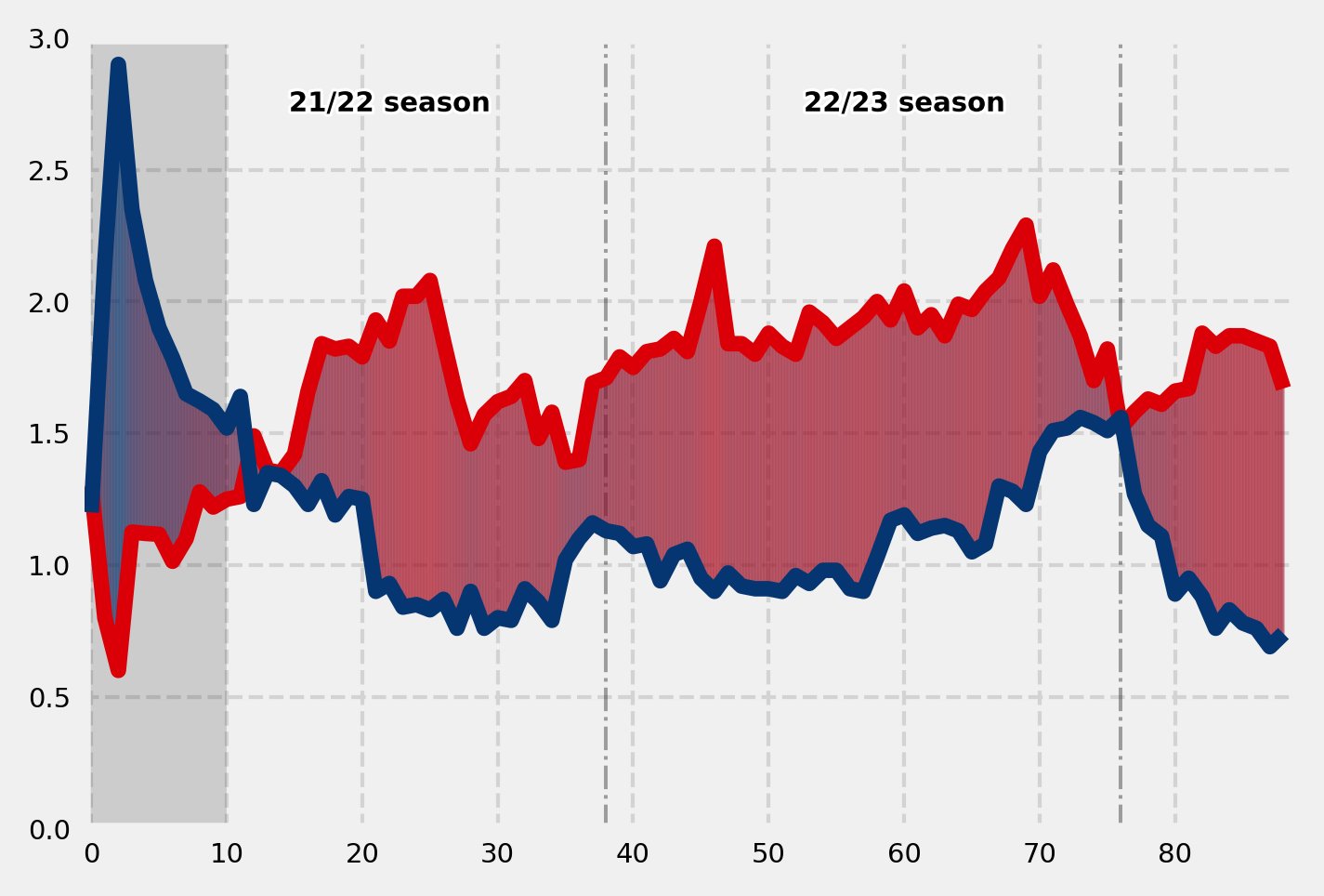
Below you will find an example of an xG Rolling charts from The Athletic which we will be recreating in this post.
Some of the key uses and benefits of using xG (expected goals) rolling charts over multiple seasons for team performance:
Long-Term Performance Trends: XG rolling charts provide a visual representation of a team’s expected goal performance over several seasons, offering insights into long-term trends and patterns.
Identifying Consistency: By examining xG trends over multiple seasons, one can identify how consistently a team performs in terms of creating and conceding expected goals, helping assess overall team reliability.
Performance Regression Analysis: The charts assist in regression analysis, enabling the identification of periods of overperformance or underperformance, which can be crucial for understanding the sustainability of a team’s success or areas for improvement.
Strategic Decision-Making: Teams and coaches can make informed strategic decisions based on the insights gained from xG rolling charts, adjusting tactics, formations, or player strategies to enhance performance over the long term.
Player Development and Recruitment: XG charts aid in assessing the impact of individual players on a team’s expected goals, facilitating player development decisions and guiding recruitment strategies for bringing in players who align with the team’s playing style.
Injury and Squad Depth Analysis: Analysis of xG trends over multiple seasons helps evaluate the impact of injuries or changes in squad depth on team performance, allowing for proactive measures to mitigate challenges and maintain competitiveness.
Setup
The set up remains the same as in Part 1 & Part 2, but as a refresher, please find the key imports and modules below.
import os
import requests
import pandas as pd
from bs4 import BeautifulSoup
import seaborn as sb
import matplotlib.pyplot as plt
import matplotlib as mpl
import warnings
import numpy as np
from math import pi
from urllib.request import urlopen
import matplotlib.patheffects as pe
from highlight_text import fig_text
from adjustText import adjust_text
from tabulate import tabulate
import matplotlib.style as style
import unicodedata
from fuzzywuzzy import fuzz
from fuzzywuzzy import process
import matplotlib.pyplot as plt
import matplotlib.ticker as ticker
import matplotlib.patheffects as path_effects
import matplotlib.font_manager as fm
import matplotlib.colors as mcolors
from matplotlib import cm
from highlight_text import fig_text

from PIL import Image
import urllib
import os
import math
Data Scraping and Preparation
The following code block is designed to scrape football fixtures data for the Premier League from three different seasons (2023/2024, 2022/2023, and 2021/2022) from the website ‘fbref.com.’ It uses the requests library to fetch the HTML content from the specified URLs, and BeautifulSoup to parse the HTML content. The scraped data is then read into a pandas DataFrame using pd.read_html. Finally, the fixtures data for each season is concatenated into a single DataFrame named multi_season using pd.concat. This aggregated DataFrame is expected to contain comprehensive information about football fixtures across multiple seasons required for our visual.
url = 'https://fbref.com/en/comps/9/schedule/Premier-League-Scores-and-Fixtures'
page =requests.get(url)
soup = BeautifulSoup(page.content, 'html.parser')
html_content = requests.get(url).text.replace('<!--', '').replace('-->', '')
df = pd.read_html(html_content)
# df[-1].columns = df[-1].columns.droplevel(0) # drop top header row
fixtures_23_24 = df[0]

url = 'https://fbref.com/en/comps/9/2022-2023/schedule/2022-2023-Premier-League-Scores-and-Fixtures'
page =requests.get(url)
soup = BeautifulSoup(page.content, 'html.parser')
html_content = requests.get(url).text.replace('<!--', '').replace('-->', '')
df = pd.read_html(html_content)
# df[-1].columns = df[-1].columns.droplevel(0) # drop top header row
fixtures_22_23 = df[0]

url = 'https://fbref.com/en/comps/9/2021-2022/schedule/2021-2022-Premier-League-Scores-and-Fixtures'
page =requests.get(url)
soup = BeautifulSoup(page.content, 'html.parser')
html_content = requests.get(url).text.replace('<!--', '').replace('-->', '')
df = pd.read_html(html_content)
# df[-1].columns = df[-1].columns.droplevel(0) # drop top header row
fixtures_21_22 = df[0]

multi_season = pd.concat([fixtures_23_24, fixtures_22_23, fixtures_21_22 ])
Th next code block preprocesses the multi_season DataFrame, which contains football match data across multiple seasons. It starts by dropping rows with missing values in the ‘Referee’ column. It then assigns unique match IDs to each row. Two separate DataFrames, multi_season_away and multi_season_home, are created to represent matches played away and at home, respectively. The column names are modified for consistency, and new columns ‘venue,’ ‘score_ag,’ and ‘score_for’ are added. Finally, the ‘multi_season_home’ DataFrame is aligned with the columns of ‘multi_season_away’.
multi_season.dropna(subset=['Referee'], inplace=True)
multi_season['match_id'] = range(1, len(multi_season) + 1)
multi_season_away = multi_season[['Away','xG', 'Score', 'xG.1','match_id', 'Date']]
multi_season_away.rename(columns={'Away': 'team'}, inplace=True)
multi_season_away.rename(columns={'xG.1': 'xG_for'}, inplace=True)
multi_season_away.rename(columns={'xG': 'xG_ag'}, inplace=True)
multi_season_away['venue'] = 'A'
multi_season_away[['score_ag','score_for']] = multi_season['Score'].str.split('–', expand=True)
multi_season_home = multi_season[['Home','xG', 'Score', 'xG.1','match_id', 'Date']]
multi_season_home.rename(columns={'Home': 'team'}, inplace=True)
multi_season_home.rename(columns={'xG.1': 'xG_ag'}, inplace=True)
multi_season_home.rename(columns={'xG': 'xG_for'}, inplace=True)
multi_season_home['venue'] = 'H'
multi_season_home[['score_for','score_ag']] = multi_season['Score'].str.split('–', expand=True)

columns = multi_season_away.columns

multi_season_home = multi_season_home[columns]
This next code block performs additional transformations on the preprocessed match data. It concatenates the ‘multi_season_away’ and ‘multi_season_home’ DataFrames into ‘multi_season_expanded.’ The resulting DataFrame is then melted to gather ‘score_for,’ ‘score_ag,’ ‘xG_for,’ and ‘xG_ag’ into a single column ‘value’ with a corresponding ‘variable’ column indicating the metric. The DataFrame is merged with ‘fm_ids’ on the ‘team’ column, adding football club information. Column names are adjusted, renaming ‘team’ to ‘team_name’ and ‘Date’ to ‘date.’.
multi_season_expanded = pd.concat([multi_season_away, multi_season_home])

multi_melted_df = multi_season_expanded.melt(id_vars=['match_id','Date', 'venue', 'team'], value_vars=['score_for', 'score_ag', 'xG_for', 'xG_ag',],
                    var_name='variable', value_name='value')

Final_df = multi_melted_df.merge(fm_ids, on='team', how='left')

Final_df.rename(columns={'team': 'team_name'}, inplace=True)

Final_df.rename(columns={'Date': 'date'}, inplace=True)


df = Final_df
Building Timeseries Functions
This next function, 'get_xG_rolling_data,' calculates the rolling average of expected goals (xG) for and against a specific football team. It takes a team ID, a rolling window size (default is 10), and the match data DataFrame (‘df’) as input. The function first filters the DataFrame to retrieve xG data for the given team. It then pivots the table to organize xG values by date, match ID, team ID, and team name. Rolling averages for both ‘xG_for’ and ‘xG_ag’ are computed using the specified window size, and the difference between these rolling averages is added as ‘rolling_diff.’ The resulting DataFrame is returned.
def get_xG_rolling_data(team_id, window=10, data=df):
    '''
    This function returns xG rolling average figures for a specific team.
    '''
    df = data.copy()
    df_xg = df[(df['team_id'] == team_id) & (df['variable'].isin(['xG_for', 'xG_ag']))]
    df_xg = pd.pivot_table(df_xg,
            index=['date', 'match_id', 'team_id', 'team_name'],columns='variable', values='value', aggfunc= 'first'
        ).reset_index().rename_axis(None, 1)

    df_xg.columns = ['date', 'match_id', 'team_id', 'team_name', 'xG_ag', 'xG_for']
    df_xg['rolling_xG_for'] = df_xg['xG_for'].rolling(window=window, min_periods=0).mean()
    df_xg['rolling_xG_ag'] = df_xg['xG_ag'].rolling(window=window, min_periods=0).mean()
    df_xg['rolling_diff'] = df_xg['rolling_xG_for'] - df_xg['rolling_xG_ag']
    return df_xg
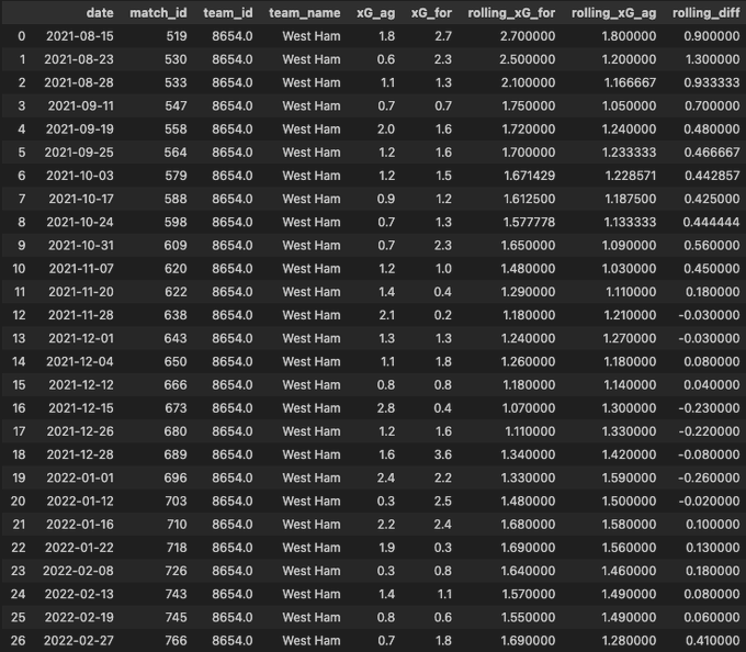
We’ll now test see if this works using West Ham United fm_id
get_xG_rolling_data(8654)
This is now our resulting table:
The next function we need to created , ‘get_xG_interpolated_df,’ takes a football team’s ID, a rolling window size (default is 10), and the match data DataFrame (‘df’) as input. It first calls the ‘get_xG_rolling_data’ function to obtain the rolling xG DataFrame for the specified team. Here is breakdown of the steps required to build this function:
Get the xG Rolling DataFrame:
- Calls the ‘get_xG_rolling_data’ function to retrieve the rolling xG DataFrame for the specified team.
Create Interpolated Series:
- Adds a new column, ‘match_number,’ to the xG DataFrame to store the match indices.
- Creates an auxiliary series, ‘X_aux,’ representing match indices with 10 times more points for smoother interpolation.
- Reindexes ‘X_aux’ to fill in missing indices and uses linear interpolation to generate values for intermediate points.
Create Auxiliary Series for xG (Y_for):
- Copies the rolling xG for values from the original xG DataFrame.
- Adjusts the index by multiplying it by 10 for consistency with interpolated indices.
- Reindexes and interpolates to create values for intermediate points.
Create Auxiliary Series for xG Conceded (Y_ag):
- Similar process as ‘Y_for,’ but applied to rolling xG against.
Create Auxiliary Series for Rolling Difference in xG (Z_diff):
- Similar process as ‘Y_for,’ but applied to the rolling difference in xG.
Create Auxiliary DataFrame (df_aux):
- Constructs a new DataFrame (‘df_aux’) using the interpolated ‘X’ series and auxiliary series (‘Y_for,’ ‘Y_ag,’ ‘Z_diff’).
- The columns represent the interpolated match indices (‘X’), interpolated rolling xG for (‘Y_for’), xG conceded (‘Y_ag’), and rolling xG difference (‘Z_diff’).
Return the Auxiliary DataFrame:
- The resulting DataFrame, ‘df_aux,’ is returned, containing the interpolated xG data for plotting.
The full code of the ‘get_xG_interpolated_df, should look as follows:
def get_xG_interpolated_df(team_id, window=10, data=df):
    # --- Get the xG rolling df
    df_xG = get_xG_rolling_data(team_id, window, data)
    # -- Create interpolated series
    df_xG['match_number'] = df_xG.index
    X_aux = df_xG.match_number.copy()
    X_aux.index = X_aux * 10 # 9 aux points in between each match
    last_idx = X_aux.index[-1] + 1
    X_aux = X_aux.reindex(range(last_idx))
    X_aux = X_aux.interpolate()
    # --- Aux series for the xG created (Y_for)
    Y_for_aux = df_xG.rolling_xG_for.copy()
    Y_for_aux.index = Y_for_aux.index * 10
    last_idx = Y_for_aux.index[-1] + 1
    Y_for_aux = Y_for_aux.reindex(range(last_idx))
    Y_for_aux = Y_for_aux.interpolate()
    # --- Aux series for the xG conceded (Y_ag)
    Y_ag_aux = df_xG.rolling_xG_ag.copy()
    Y_ag_aux.index = Y_ag_aux.index * 10
    last_idx = Y_ag_aux.index[-1] + 1
    Y_ag_aux = Y_ag_aux.reindex(range(last_idx))
    Y_ag_aux = Y_ag_aux.interpolate()
    # --- Aux series for the rolling difference in xG
    Z_diff_aux = df_xG.rolling_diff.copy()
    Z_diff_aux.index = Z_diff_aux.index * 10
    last_idx = Z_diff_aux.index[-1] + 1
    Z_diff_aux = Z_diff_aux.reindex(range(last_idx))
    Z_diff_aux = Z_diff_aux.interpolate()
    # -- Create the aux dataframe
    df_aux = pd.DataFrame({
        'X': X_aux,
        'Y_for': Y_for_aux,
        'Y_ag': Y_ag_aux,
        'Z': Z_diff_aux
    })
    return df_aux
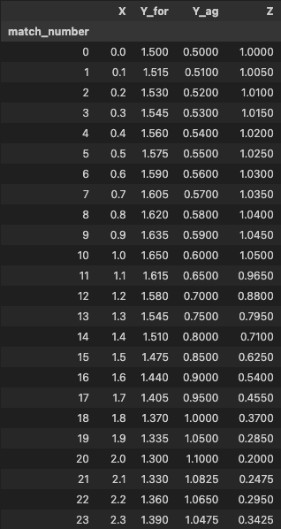
We’ll now test see if this works using Manchester United’s fm_id
get_xG_interpolated_df(10260)
This is now our resulting table:
Building Matplotlib Visuals
This next block of code defines a dictionary named big_six_cm, where keys represent football team IDs, and each corresponding value is another dictionary. This nested dictionary contains color codes for a low and high range of colors associated with a particular team. The purpose of these color codes is typically to use them in visualizations or plots related to football data, providing a consistent color scheme for each team.
Here’s a breakdown of a few entries:
- ‘8456’ (Manchester United):
- ‘low’: ‘#00285e’
- ‘high’: ‘#97c1e7’
- ‘8650’ (Chelsea):
- ‘low’: ‘#00B2A9’
- ‘high’: ‘#C8102E’
- ‘10260’ (Arsenal):
- ‘low’: ‘#DBA111’
- ‘high’: ‘#da020e’
Each team has specified low and high colors, allowing for a gradient or color scale representation in visualizations. These color schemes are often used for better visual distinction and aesthetics when representing different teams in charts or graphs.
big_six_cm = {
    '8456': {
        'low': '#00285e',
        'high': '#97c1e7'
    },

    '9825': {
        'low':'#063672',
        'high':'#db0007'
    },
    '8650': {
        'low': '#00B2A9',
        'high': '#C8102E'
    },
    '8455': {
        'low': '#d1d3d4',
        'high': '#034694'
    },
    '8586': {
        'low': '#0e9ca5',
        'high': '#132257'
    },

    '10260':{
        'low':'#DBA111',
        'high':'#da020e'
    },
    '10261':{
        'low':'#2dafe5',
        'high':'#7c2c3b'
    },
    '10252':{
        'low':'#fdbe11',
        'high':'#0053a0'
    },
    '10204':{
        'low':'#d1d3d4',
        'high':'#005daa'
    },
}
This code defines a function called colorFader that takes two color codes (c1 and c2) and a mixing parameter (mix). The function linearly interpolates between these two colors based on the mixing parameter, creating a color gradient. The result is then converted to a hexadecimal color code.
Following the function definition, there’s an example using Liverpool’s team colors from the big_six_cm dictionary. It creates a plot with vertical lines, each colored with a gradient of Liverpool’s low and high colors. The number of lines (n) determines the granularity of the gradient. The axvline function in the loop generates the vertical lines, and the color for each line is determined by the colorFader function with varying mixing parameters. The result is a visual representation of a color gradient for Liverpool’s team colors.
def colorFader(c1,c2,mix=0): #fade (linear interpolate) from color c1 (at mix=0) to c2 (mix=1)
    c1=np.array(mcolors.to_rgb(c1))
    c2=np.array(mcolors.to_rgb(c2))
    return mcolors.to_hex((1-mix)*c1 + mix*c2)

# Example with Liverpool
c1=big_six_cm['8456']['low']
c2=big_six_cm['8456']['high']
n=83

fig, ax = plt.subplots(figsize=(2, 2))
for x in range(n+1):
    ax.axvline(x, color=colorFader(c1,c2,x/n), linewidth=10)
The next function we need, plot_xG_gradient, generates a line plot to visualize the rolling xG (expected goals) figures for a specific team over time. The function takes several parameters, including the team ID, rolling window size, and the data frame (df) containing the necessary information.
Get Data
This block retrieves the rolling xG data (df_xg) and interpolated xG data (df_aux_xg) for a specific team using functions get_xG_rolling_data and get_xG_interpolated_df.
df_xg = get_xG_rolling_data(team_id, window, data)
df_aux_xg = get_xG_interpolated_df(team_id, window, data)
Setup Plot This section initializes the plot by setting the y-axis and x-axis limits, creating a grid, and selecting colors for subsequent visualizations.
ax.set_ylim(0, 3)
ax.set_xlim(-0.5, df_xg.shape[0])
ax.grid(ls='--', color='lightgrey')
color_1 = big_six_cm[str(team_id)]['low']
color_2 = big_six_cm[str(team_id)]['high']
Plot Rolling xG Data This part plots the rolling xG data for and against, creating a visual representation of the team’s performance over time.
ax.plot(df_xg.index, df_xg['rolling_xG_for'], color=color_2, zorder=4)
ax.plot(df_xg.index, df_xg['rolling_xG_ag'], color=color_1, zorder=4)
ax.fill_between(x=[-0.5, window], y1=ax.get_ylim()[0], y2=ax.get_ylim()[1], alpha=0.15, color='black', ec='None', zorder=2)
Plot Interpolated xG Data This block generates interpolated xG data and uses a color gradient to visualize the rolling xG difference, enhancing the representation.
for i in range(0, len(df_aux_xg['X']) - 1):
    ax.fill_between(
        [df_aux_xg['X'].iloc[i], df_aux_xg['X'].iloc[i+1]],
        [df_aux_xg['Y_for'].iloc[i], df_aux_xg['Y_for'].iloc[i + 1]],
        [df_aux_xg['Y_ag'].iloc[i], df_aux_xg['Y_ag'].iloc[i + 1]],
        color=colorFader(color_1, color_2, mix=((df_aux_xg['Z'].iloc[i] - vmin)/(vmax - vmin))),
        zorder=3, alpha=0.3
    )
Additional Annotations and Styling This part adds vertical lines for specific matchdays and annotations for season labels, enhancing the readability and providing additional context.
for x in [38, 38*2]:
    ax.plot([x, x], [ax.get_ylim()[0], ax.get_ylim()[1]], color='black', alpha=0.35, zorder=2, ls='dashdot', lw=0.95)

for x in [22, 60]:
    if x == 22:
        text = '21/22 season'
    else:
        text = '22/23 season'
    text_ = ax.annotate(
        xy=(x, 2.75),
        text=text,
        color='black',
        size=7,
        va='center',
        ha='center',
        weight='bold',
        zorder=4
    )
    text_.set_path_effects(
        [path_effects.Stroke(linewidth=1.5, foreground='white'), path_effects.Normal()]
    )
ax.tick_params(axis='both', which='major', labelsize=7)
The full function should look as follows:
def plot_xG_gradient(ax, team_id, window=10, data=df):
    # -- Get the data
    df_xg = get_xG_rolling_data(team_id, window, data)
    df_aux_xg = get_xG_interpolated_df(team_id, window, data)
    # Specify the axes limits
    ax.set_ylim(0,3)
    ax.set_xlim(-0.5,df_xg.shape[0])
    ax.grid(ls='--', color='lightgrey')
    # -- Select the colors
    color_1 = big_six_cm[str(team_id)]['low']
    color_2 = big_six_cm[str(team_id)]['high']

    ax.plot(df_xg.index, df_xg['rolling_xG_for'], color=color_2,zorder=4)
    ax.plot(df_xg.index, df_xg['rolling_xG_ag'], color=color_1,zorder=4)
    ax.fill_between(x=[-0.5,window], y1=ax.get_ylim()[0], y2=ax.get_ylim()[1], alpha=0.15, color='black', ec='None',zorder=2)
    vmin = df_xg['rolling_diff'].min()
    vmax = df_xg['rolling_diff'].max()
    vmax = max(abs(vmin), abs(vmax))
    vmin = -1*vmax
    for i in range(0, len(df_aux_xg['X']) - 1):
        ax.fill_between(
            [df_aux_xg['X'].iloc[i], df_aux_xg['X'].iloc[i+1]],
            [df_aux_xg['Y_for'].iloc[i], df_aux_xg['Y_for'].iloc[i + 1]],
            [df_aux_xg['Y_ag'].iloc[i], df_aux_xg['Y_ag'].iloc[i + 1]],
            color=colorFader(color_1, color_2, mix=((df_aux_xg['Z'].iloc[i] - vmin)/(vmax - vmin))),
            zorder=3, alpha=0.3
        )
    for x in [38, 38*2]:
        ax.plot([x,x],[ax.get_ylim()[0], ax.get_ylim()[1]], color='black', alpha=0.35, zorder=2, ls='dashdot', lw=0.95)

    for x in [22, 60]:
        if x == 22:
            text = '21/22 season'
        else:
            text = '22/23 season'
        text_ = ax.annotate(
            xy=(x,2.75),
            text=text,
            color='black',
            size=7,
            va='center',
            ha='center',
            weight='bold',
            zorder=4
        )
        text_.set_path_effects(
            [path_effects.Stroke(linewidth=1.5, foreground='white'), path_effects.Normal()]
        )
    ax.tick_params(axis='both', which='major', labelsize=7)
    return ax
We’ll now test see if this works using Arsenal’s fm_id
fig = plt.figure(figsize=(5,3.5), dpi=300)
ax = plt.subplot(111)

plot_xG_gradient(ax, 9825, 10)
This is now our resulting mpl plot:
Now we have all the functions we need to plot multiple teams, lets put this all together to get our final plot.
Certainly! Here’s an explanation of the code:
Path Effect for Text Stroke
This block defines a function path_effect_stroke that creates a stroke effect for text using the path_effects module. It is then used to generate a path effect (pe) with a specified linewidth and foreground color.
def path_effect_stroke(**kwargs):
    return [path_effects.Stroke(**kwargs), path_effects.Normal()]

pe = path_effect_stroke(linewidth=1.5, foreground="black")
Figure Setup
This section initializes a Matplotlib figure with specified dimensions and layout parameters using gridspec.
fig = plt.figure(figsize=(13, 10), dpi=200)
nrows = 6
ncols = 3
gspec = gridspec.GridSpec(
    ncols=ncols, nrows=nrows, figure=fig,
    height_ratios=[(1/nrows)*2.35 if x % 2 != 0 else (1/nrows)/2.35 for x in range(nrows)], hspace=0.3
)
Plotting xG Gradients and Logos
This part iterates over rows and columns, creating subplots for both xG gradients and club logos. It calls plot_xG_gradient for odd rows and adds logos and team info for even rows.
plot_counter = 0
logo_counter = 0

for row in range(nrows):
    for col in range(ncols):
        if row % 2 != 0:
            # Plot xG gradient for odd rows
            ax = plt.subplot(gspec[row, col])
            teamId = list(big_six_cm.keys())[plot_counter]
            teamId = int(teamId)
            plot_xG_gradient(ax, teamId, 10)
            plot_counter += 1
        else:
            # Add logos and team info for even rows
            teamId = list(big_six_cm.keys())[logo_counter]
            # ... (omitted for brevity)
            logo_counter += 1
Figure Text and Annotations This section adds figure titles, subtitles, and logos for the Premier League and Stats by Steve. It also includes attribution and source information.
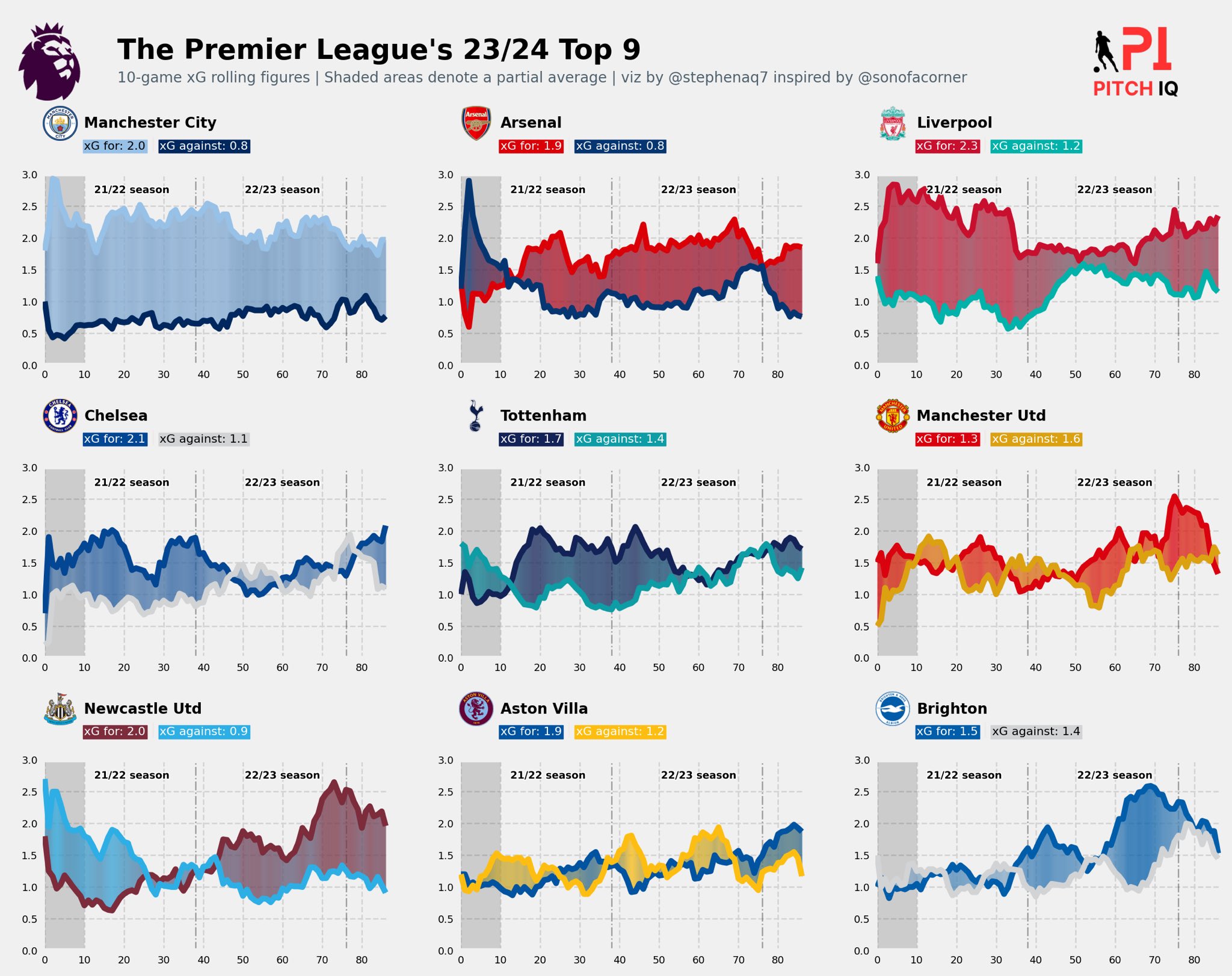
fig_text(x=0.135, y=.92, s='The Premier League\'s 23/24 Top 9', va='bottom', ha='left', fontsize=19, color='black', font='DM Sans', weight='bold')
fig_text(x=0.135, y=.9, s='10-game xG rolling figures | Shaded areas denote a partial average | viz by @stephenaq7 inspired by @sonofacorner', va='bottom', ha='left', fontsize=10, color='#4E616C', font='Karla')
fotmob_url = 'https://images.fotmob.com/image_resources/logo/leaguelogo/'
# ... (omitted for brevity)
img = Image.open(urllib.request.urlopen(f'{fotmob_url}{47:.0f}.png'))
logo_ax.imshow(img)
logo_ax.axis('off')

# Add Stats by Steve logo
ax3 = fig.add_axes([0.85, 0.075, 0.07, 1.7])
ax3.axis('off')
img = image.imread('/Users/stephenahiabah/Desktop/GitHub/Webs-scarping-for-Fooball-Data-/outputs/piqmain.png')
ax3.imshow(img)
This code creates a detailed visualization of xG gradients for selected football teams in the Premier League’s 2023-2024 season, combining graphical elements, logos, and text annotations.
The code in full should look as follows:
# ---- for path effects
def path_effect_stroke(**kwargs):
    return [path_effects.Stroke(**kwargs), path_effects.Normal()]
pe = path_effect_stroke(linewidth=1.5, foreground="black")
# ----
fig = plt.figure(figsize=(13, 10), dpi = 200)
nrows = 6
ncols = 3
gspec = gridspec.GridSpec(
    ncols=ncols, nrows=nrows, figure=fig,
    height_ratios=[(1/nrows)*2.35 if x % 2 != 0 else (1/nrows)/2.35 for x in range(nrows)], hspace=0.3
)

plot_counter = 0
logo_counter = 0

for row in range(nrows):
    for col in range(ncols):
        if row % 2 != 0:
            ax = plt.subplot(
                gspec[row, col],

            )
            teamId = list(big_six_cm.keys())[plot_counter]
            teamId = int(teamId)
            plot_xG_gradient(ax, teamId, 10)
            plot_counter += 1
        else:
            teamId = list(big_six_cm.keys())[logo_counter]
            color_1 = big_six_cm[str(teamId)]['low']
            color_2 = big_six_cm[str(teamId)]['high']
            # -- This was done manually cuz I'm lazy...
            if color_1 == '#d1d3d4':
                color_1_t = 'black'
            else:
                color_1_t = 'white'
            if color_2 == '#97c1e7':
                color_2_t = 'black'
            else:
                color_2_t = 'white'
            teamId = int(teamId)
            df_for_text = get_xG_rolling_data(teamId, 10)
            teamName = df_for_text['team_name'].iloc[0]
            xG_for = df_for_text['rolling_xG_for'].iloc[-1]
            xG_ag = df_for_text['rolling_xG_ag'].iloc[-1]
            fotmob_url = 'https://images.fotmob.com/image_resources/logo/teamlogo/'
            logo_ax = plt.subplot(
                gspec[row,col],
                anchor = 'NW', facecolor = '#EFE9E6'
            )
            club_icon = Image.open(urllib.request.urlopen(f'{fotmob_url}{teamId:.0f}.png'))
            logo_ax.imshow(club_icon)
            logo_ax.axis('off')
            # -- Add the team name
            ax_text(
                x = 1.2,
                y = 0.7,
                s = f'<{teamName}>\n<xG for: {xG_for:.1f}> <|> <xG against: {xG_ag:.1f}>',
                ax = logo_ax,
                highlight_textprops=[
                    {'weight':'bold', 'font':'DM Sans'},
                    {'size':'8', 'bbox': {'edgecolor': color_2, 'facecolor': color_2, 'pad': 1}, 'color': color_2_t},
                    {'color':'#EFE9E6'},
                    {'size':'8', 'bbox': {'edgecolor': color_1, 'facecolor': color_1, 'pad': 1}, 'color': color_1_t}
                ],
                font = 'Karla',
                ha = 'left',
                size = 10,
                annotationbbox_kw = {'xycoords':'axes fraction'}
            )
            logo_counter += 1

fig_text(
    x=0.135, y=.92,
    s='The Premier League\'s 23/24 Top 9',
    va='bottom', ha='left',
    fontsize=19, color='black', font='DM Sans', weight='bold'
)
fig_text(
	x=0.135, y=.9,
    s='10-game xG rolling figures | Shaded areas denote a partial average | viz by @stephenaq7 inspired by @sonofacorner',
	va='bottom', ha='left',
	fontsize=10, color='#4E616C', font='Karla'
)
fotmob_url = 'https://images.fotmob.com/image_resources/logo/leaguelogo/'
logo_ax = fig.add_axes(
    [.05, .885, .07, .075]
)
club_icon = Image.open(urllib.request.urlopen(f'{fotmob_url}{47:.0f}.png'))
logo_ax.imshow(club_icon)
logo_ax.axis('off')

### Add Stats by Steve logo
ax3 = fig.add_axes([0.85, 0.075, 0.07, 1.7])
ax3.axis('off')
img = image.imread('/Users/stephenahiabah/Desktop/GitHub/Webs-scarping-for-Fooball-Data-/outputs/piqmain.png')
ax3.imshow(img)
Conclusion
In conclusion, the provided code demonstrates the process of aggregating and manipulating data from the FBREF to obtain clean and structured datasets for analysis. We have successfully achieved the objectives of developing efficient functions for data aggregation and performing data manipulation tasks. Additionally, we have explored team-based xG visualizations, laying the groundwork for further visualisations using newer data in different gameweeks and also for different leagues.
With respect to our intial objectives, we have:
Develop efficient functions to aggregate data from FBRef & FotMob.
Perform data manipulation tasks to transform raw data into clean, structured datasets suitable for analysis.
Create data visualizations using the obtained datasets.
Evaluate significant metrics that aid in making assertions on team performance.
Thanks for reading
Steve

Comments