42 min to read
Figuring Out xG pt1
Introduction to expected goals (xG) in football
Understanding xG for Football Analysis and Visuals
Code and notebook for this post can be found here.
This post is part of a series focusing drilling down on “Expected Goals” (xG) and crafting compelling data visuals with data sourced from the internet, employing Python’s BeautifulSoup & Matplotlib as the key tools.
The key aims of this project are to:
- Develop efficient functions to aggregate data from FBRef & FotMob.
- Perform data manipulation tasks to transform raw data into clean, structured datasets suitable for analysis.
- Create visually appealing data visualizations using the obtained datasets.
- Evaluate significant metrics that aid in making assertions on team performance.
By accomplishing these objectives, we will gain valuable insights into football analysis and visualization techniques. This project serves as a foundation for further exploration of FBRefs & FotMob’s datasets, offering opportunities to expand the scope of analysis and delve deeper into football analytics.
What is xG?
"Expected Goals" (xG) is a statistical concept widely used in football (soccer) to assess the quality of goal-scoring opportunities in a match. It provides a quantitative measure of the likelihood that a given goal-scoring chance will result in a goal. xG is typically represented as a value between 0 and 1.
Here’s how it works:
Shot Location: xG takes into account the location of the shot on the pitch. The closer a shot is to the goal, the higher its xG value will be.
Shot Angle: The angle from which a shot is taken also affects the
xG value. Shots from more favorable angles have higher xG values.
Type of Shot: The type of shot, such as a header, volley, or a shot from open play, can influence the
xG value. Some types of shots are more likely to result in goals than others.
Build-up Play: The events leading up to the shot, such as the quality of the pass, whether the shot was taken under pressure, and the involvement of playmakers, are also factored into
xG.
Defensive Pressure: The level of defensive pressure on the shooter can impact the
xG value. Shots taken under less defensive pressure have higher xG values.
In essence, xG provides a more detailed and data-driven assessment of goal-scoring opportunities than just counting goals. It allows teams, coaches, and analysts to evaluate the quality of a team’s attacking and defensive performances. It’s also used in player analysis to assess an individual’s ability to create and convert goal-scoring chances.
Conversely we can derive other such metric such as "Expected Goals Conceded" (xGA) is a statistical concept used in football (soccer) to assess a team’s or a goalkeeper’s defensive performance. xGA quantifies the quality of scoring opportunities that a team or goalkeeper has faced. Similar to Expected Goals (xG) for attackers, xGA provides a numerical measure representing the likelihood of conceding a goal based on the quality and location of shots faced.
Analysts and websites like Understat, Wyscout, StatsBomb and others calculate and provide xG data for matches, enabling fans and professionals to gain deeper insights into the game.
Setup
We will need to import several Python libraries that will be key in our tasks.
Some of the key imports include:
- The BeautifulSoup library used for web scraping and parsing
HTMLorXMLdocuments. - Matplotlib is a widely used library for creating 2D plots and visualizations. pyplot is a submodule of matplotlib that provides a simple and consistent interface for creating plots.
- The requests library, used for making
HTTP requeststo web servers. It’s commonly used for web scraping and interacting with web APIs.
import os
import requests
import pandas as pd
from bs4 import BeautifulSoup
import seaborn as sb
import matplotlib.pyplot as plt
import matplotlib as mpl
import warnings
import numpy as np
from math import pi
from urllib.request import urlopen
import matplotlib.patheffects as pe
from highlight_text import fig_text
from adjustText import adjust_text
from tabulate import tabulate
import matplotlib.style as style
import unicodedata
from fuzzywuzzy import fuzz
from fuzzywuzzy import process
import matplotlib.pyplot as plt
import matplotlib.ticker as ticker
import matplotlib.patheffects as path_effects
import matplotlib.font_manager as fm
import matplotlib.colors as mcolors
from matplotlib import cm
from highlight_text import fig_text

from PIL import Image
import urllib
import os
import math
To create visualizations, we utilize the matplotlib library, which provides a flexible and powerful framework for generating various types of plots and charts. We also import matplotlib.ticker to customize the tick placement on our plots and matplotlib.patheffects to add special effects to our plot elements.
Data Aggregation and Preparation
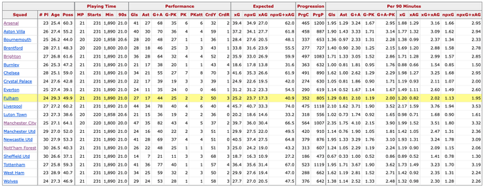
Now that all our packages are installed, we can start looking at the data. The code provided below demonstrates the use of the beautiful soup library to retrieve and save league data from 2023/24 EPL Season from FBREF. For these series of posts we will be using data from FBREF Premierlegue Stats pages as of Gameweek 14.
We will begin by building a method to pull all the basic data from this page.
def generate_league_data(x):
    url = x
    page = urlopen(url).read()
    soup = BeautifulSoup(page)
    count = 0
    table = soup.find("tbody")

    pre_df = dict()
    features_wanted =  {"team" , "games","wins","draws","losses", "goals_for","goals_against", "points", "xg_for","xg_against","xg_diff","attendance","xg_diff_per90", "last_5"} #add more features here!!
    rows = table.find_all('tr')
    for row in rows:
        for f in features_wanted:
            if (row.find('th', {"scope":"row"}) != None) & (row.find("td",{"data-stat": f}) != None):
                cell = row.find("td",{"data-stat": f})
                a = cell.text.strip().encode()
                text=a.decode("utf-8")
                if f in pre_df:
                    pre_df[f].append(text)
                else:
                    pre_df[f]=[text]

    df = pd.DataFrame.from_dict(pre_df)
    df["games"] = pd.to_numeric(df["games"])
    df["xg_diff_per90"] = pd.to_numeric(df["xg_diff_per90"])
    df["minutes_played"] = df["games"] *90
    return(df)
The Python function generate_league_data(x) facilitates the extraction and organization of football league data from a provided URL into a structured Pandas DataFrame. This function begins by assigning the input URL to the variable url. Subsequently, it reads the HTML content from the specified URL using the urlopen() function and parses it using BeautifulSoup, storing the result in soup. It initializes variables such as count and an empty dictionary named pre_df to track and store the extracted data.
Dataframe Manipulation
A set called features_wanted defines specific attributes sought from the HTML table, including team names, game statistics (wins, draws, losses), goal-related metrics, points, attendance, and more. The code navigates through the HTML structure by finding the table body (<tbody>) and then iterates through each row (<tr>) and desired feature to extract the relevant information.
It further transforms certain columns to numeric data types (pd.to_numeric) and creates a new column called "minutes_played" based on the number of games played.
Ultimately, the function returns the formatted DataFrame (df), ready for further analysis and manipulation. This code effectively automates the extraction of pertinent football league data from HTML tables, enabling easy conversion and utilization for statistical and analytical purposes.
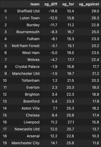
After some more maniupations as shown below:
df = generate_league_data("https://fbref.com/en/comps/9/Premier-League-Stats")

df['xg_diff'] = pd. to_numeric(df['xg_diff'])
data = df[["team","xg_diff","xg_for","xg_against"]]
data = data.sort_values(by="xg_diff").reset_index(drop=True)
data
The code converts the 'xg_diff' column in DataFrame df to numeric values and creates a new DataFrame data containing selected columns, sorted based on the 'xg_diff' column in ascending order with its index reset.
We will have a resulting table that looks like this:
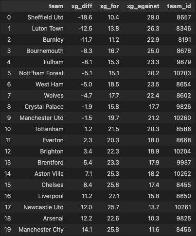
In order to get the club logos, I created a CSV file with each of the PL teams FotMob id, this way we can access the FotMoB image library and request the correct team logo in the correct size without any weird inconsistencies with sizing or pixelation. This CSV was made manually, I will probabaly need to work out a way to do this more effieciently, but for now, this method will suffice.
fm_ids = pd.read_csv("CSVs/fotmob_epl_team_ids.csv")
fm_ids = fm_ids[["team", "team_id"]]

data = data.merge(fm_ids, on='team', how='left')
data
There are further changes that are required, as we are working with a 23/24 season and the list I had initally created is out of data, we need to add the newly promoted teams for consistency. So the following code block below shows you how you can easily add new teams. Again, these FotMob team IDs we retrieved manually.
teams_to_replace = {'Sheffield Utd': 8657, 'Burnley': 8191, 'Luton Town': 8346}
for team, team_id in teams_to_replace.items():
    data.loc[data['team'] == team, 'team_id'] = team_id

data['team_id'] = data['team_id'].astype(int)

data.to_csv("CSVs/fotmob_epl_team_ids.csv")
We will have a resulting table that looks like this:
Building Visualisations
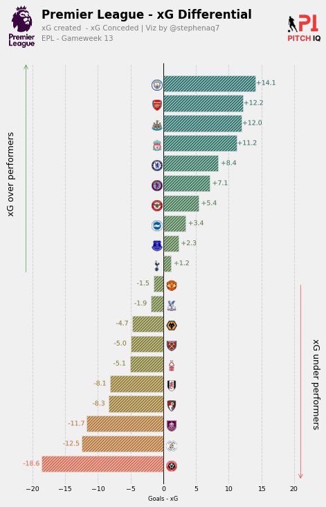
xG Difference Tree
As we now have our cleaned up dataset. We can start work on the third objective of this post which is to: Create visually appealing data visualizations using the obtained datasets. @Sonofcorner, who has been a big inspiration for not only the creation of this blog but also a helpful basis upon which I have redesigned alot my data visuals has great tutorial on how to create stunnign visuals using relatively simple to understand matplotlib techniques. You can find his blog here
From the title image of this post, we will be creating an xG Difference tree. An example version created by StatBomb can be seen below.

These visuals are a really useful way of ascertaining both a teams, offensive and defensive performance simulataenously. The formaula for xG Difference = xG - xGA.
Simply, the higher and more positive the xG Difference the better the teams overall performance from a statitical point of view, and vice versa.
Functions
Firstly, we need to apply some colours to our visual, to represent the shades of green as higher positive xG Diffrence and the shade of reds for the opposite.
gradient = [
    '#de6f57',
    '#d5724d',
    '#cb7644',
    '#c0783e',
    '#b57b38',
    '#a97d35',
    '#9e7f34',
    '#928134',
    '#878137',
    '#7c823a',
    '#71823f',
    '#668244',
    '#5c814a',
    '#528050',
    '#497f56',
    '#407d5b',
    '#387b61',
    '#317966',
    '#2c776a',
    '#29756e',
    '#287271',
]
soc_cm = mcolors.LinearSegmentedColormap.from_list('SOC', gradient, N=50)
cm.register_cmap(name='SOC', cmap=soc_cm))
From earlier in this post, I meantioned about getting the team IDs from FotMob to retrieve the correct team logos, the function below does exactly that. In summary, this function takes an axes object, a Fotmob team ID, and an optional parameter to specify whether to display the logo in black and white. It then fetches the team’s logo from Fotmob, makes any necessary conversions, displays the logo on the axes, and returns the modified axes object.
def add_logo_on_ax(ax, team_id, bw = False):
    '''
    This function adds the logo of a football team on a specific
    axes based on the Fotmob team ID.
    Args:
        - ax (object): the matplotlib axes object.
        - team_id (int): the Fotmob team ID.
        - bw (bool): whether to add the logo as black & white or with color.
    '''
    fotmob_url = 'https://images.fotmob.com/image_resources/logo/teamlogo/'
    club_icon = Image.open(urllib.request.urlopen(f"{fotmob_url}{team_id}.png"))
    if bw:
        club_icon = club_icon.convert('LA')
    ax.imshow(club_icon)
    ax.axis("off")
    return ax
Matplotlib
The following code generates a visual representation of the expected goals (xG) differential for football teams in the Premier League using our xG Diff table. It uses Matplotlib for plotting and relies on the PIL (Python Imaging Library) module for image processing. Let’s break down the code into its main components:
1: Matplotlib Setup:
The code begins by importing necessary modules, including PIL for image processing and Matplotlib for plotting. It sets up a Matplotlib figure with a specified size and resolution, creating an axes (ax) for later plotting.
from PIL import Image
import matplotlib.image as image
import matplotlib.pyplot as plt
import matplotlib.ticker as ticker
import matplotlib.colors as mcolors
from matplotlib.patheffects import withStroke
from matplotlib.offsetbox import OffsetImage, AnnotationBbox

fig = plt.figure(figsize=(7, 10), dpi=75)
ax = plt.subplot()
# -- Axes settings and styling --
# ... (setting spines, grid, ticks, etc.)
2: Data Preparation:
This section of the code prepares the axes by setting limits, ticks, and labels. It calculates the symmetrical limits on the x-axis based on the minimum and maximum values of the 'xg_diff' column in the data. A 10% margin is added, and tick parameters are adjusted for the x-axis.
# -- Axes limits and tick positions --
# Ensure symmetrical limits on the x-axis
max_ = max(abs(data['xg_diff'].min()), data['xg_diff'].max())
# Add 10% margin of the limit to the x-axis
max_ = max_ * (1.3)
ax.tick_params(axis='x', labelsize=9)
ax.set_xlim(-max_, max_)
ax.set_ylim(-1, data.shape[0])
# ... (setting x-axis ticks, labels, etc.)
3: Bar Chart:
The code generates a horizontal bar chart using ax.barh to visualize the xG differentials for each team. The chart is customized with hatching, edge color, and a black line indicating the zero xG differential. There’s also additional customization for bar colors based on the xG differential.
# -- Bar Chart --
ax.barh(data.index, data['xg_diff'], hatch='//////', ec='#efe9e6', zorder=3)
ax.plot([0, 0], [ax.get_ylim()[0], ax.get_ylim()[1]], color='black', lw=0.75, zorder=3)
# ... (additional bar customization, such as color based on xG differential)
4: Annotations and Logos:
This part of the code handles annotations for each team’s xG differential and includes team logos. It iterates through the data, creating annotations with path effects and determining the position and offset for each team’s logo. The add_logo_on_ax function is used to add team logos to the plot.
# -- Annotations and Logos --
for index, x in enumerate(data['xg_diff']):
    # ... (creating annotations based on xG differential)
    team_id = data['team_id'].iloc[index]
    ax_coords = DC_to_NFC([sign_offset*(-1)*offset_logo, index - 0.5])
    logo_ax = fig.add_axes([ax_coords[0], ax_coords[1], 0.03, 0.03], anchor="C")
    add_logo_on_ax(logo_ax, team_id, False)
5: Figure Title and Arrows:
Annotations and arrows are added to the plot to highlight overperforming and underperforming teams. Arrows are drawn and text annotations indicating xG overperformers and underperformers are placed at specific positions on the plot.
position_negative = data[data['xg_diff'] < 0].index.max()
position_x_negative = math.floor(-max_*(.85))
position_x_positive = math.ceil(max_*(.85))
ax.annotate(
    xy=(position_x_negative,position_negative + .5),
    xytext=(position_x_negative,ax.get_ylim()[1]),
    text='',
    arrowprops=dict(arrowstyle='<-',color='green')
)
ax.annotate(
    xy=(position_x_positive,position_negative),
    xytext=(position_x_positive,ax.get_ylim()[0] + .2),
    text='',
    arrowprops=dict(arrowstyle='<-',color='red')
)
mid_point_positive = (position_negative + ax.get_ylim()[1])/2
mid_point_negative = (position_negative + ax.get_ylim()[0])/2
6: Additional Figures:
Two additional figures (logos) are added to the main plot. The Premier League 2 logo is positioned on the left side of the plot, and the “PitchIQ” logo is positioned on the right side.
# -- Additional Figures (logos) --
ax2 = fig.add_axes([0.09, 0.075, 0.07, 1.75])
ax2.axis('off')
img = image.imread('/path/to/premier-league-2-logo.png')
ax2.imshow(img)

ax3 = fig.add_axes([0.85, 0.075, 0.1, 1.75])
ax3.axis('off')
img = image.imread('/path/to/piqmain.png')
ax3.imshow(img)
When we put it all together, the full code should look like the following.
from PIL import Image
import matplotlib.image as image

# style.use('fivethirtyeight')
fig = plt.figure(figsize=(7,10), dpi=75)
ax = plt.subplot()
# -- Axes settings --------------------------------
ax.spines['left'].set_visible(False)
ax.grid(ls='--', lw=1, color='lightgrey', axis='x')
ax.yaxis.set_ticks([])
# -- Hatches --------------------------------------
plt.rcParams['hatch.linewidth'] = 0.75
# -- Axes limits and tick positions ---------------
# Ensure symmetrical limits on the x-axis
max_ = max(abs(data['xg_diff'].min()), data['xg_diff'].max())
# Add 10% margin of the limit to the x-axis
max_ = max_*(1.3)

ax.tick_params(axis='x', labelsize=9)
ax.set_xlim(-max_, max_)
ax.set_ylim(-1, data.shape[0])
ax.xaxis.set_major_locator(ticker.MultipleLocator(5))
ax.set_xlabel('Goals - xG', size=8)
# -- Bar Chart -------------------------------------
ax.barh(
    data.index, data['xg_diff'],
    hatch='//////', ec='#efe9e6',
    zorder=3
)
ax.plot(
    [0,0],
    [ax.get_ylim()[0], ax.get_ylim()[1]],
    color='black',
    lw=.75,
    zorder=3
)
norm = mcolors.Normalize(vmin=data['xg_diff'].min(),vmax=data['xg_diff'].max())
cmap = plt.get_cmap('SOC')
ax.barh(
    data.index, data['xg_diff'],
    hatch='//////', ec='#efe9e6',
    color = cmap(norm(data['xg_diff'])),
    zorder=3
)
ax.plot(
    [0,0],
    [ax.get_ylim()[0], ax.get_ylim()[1]],
    color='black',
    lw=.75,
    zorder=3
)
# -- Annotations -----------------------------------
DC_to_FC = ax.transData.transform
FC_to_NFC = fig.transFigure.inverted().transform
DC_to_NFC = lambda x: FC_to_NFC(DC_to_FC(x))

for index, x in enumerate(data['xg_diff']):
    if x < 0:
        sign_offset = -1.8
        offset_logo = 0.25
        sign_text = ''
    else:
        sign_offset = 1.8
        offset_logo = 1
        sign_text = '+'
    text_ = ax.annotate(
        xy=(x, index),
        xytext=(sign_offset*8,0),
        text=f'{sign_text}{x:.1f}',
        weight='normal',
        ha='center',
        va='center',
        color= cmap(norm(x)),
        size=9,
        textcoords='offset points'
    )
    text_.set_path_effects([
        path_effects.Stroke(
            linewidth=1,
            foreground='#efe9e6'
        ),
        path_effects.Normal()
    ])
    team_id = data['team_id'].iloc[index]
    ax_coords = DC_to_NFC([sign_offset*(-1)*offset_logo, index - 0.5])
    logo_ax = fig.add_axes([ax_coords[0], ax_coords[1], 0.03, 0.03], anchor = "C")
    add_logo_on_ax(logo_ax, team_id, False)
    # print(x)

# -- Figure title and arrows --------------------------------
position_negative = data[data['xg_diff'] < 0].index.max()
position_x_negative = math.floor(-max_*(.85))
position_x_positive = math.ceil(max_*(.85))
ax.annotate(
    xy=(position_x_negative,position_negative + .5),
    xytext=(position_x_negative,ax.get_ylim()[1]),
    text='',
    arrowprops=dict(arrowstyle='<-',color='green')
)
ax.annotate(
    xy=(position_x_positive,position_negative),
    xytext=(position_x_positive,ax.get_ylim()[0] + .2),
    text='',
    arrowprops=dict(arrowstyle='<-',color='red')
)
mid_point_positive = (position_negative + ax.get_ylim()[1])/2
mid_point_negative = (position_negative + ax.get_ylim()[0])/2
ax.annotate(
    xy=(position_x_negative,mid_point_positive),
    text='xG over performers',
    rotation=90,
    xytext=(-20,0),
    textcoords='offset points',
    ha='center',
    va='center',
    size=12
)
ax.annotate(
    xy=(position_x_positive,mid_point_negative),
    text='xG under performers',
    rotation=-90,
    xytext=(20,0),
    textcoords='offset points',
    ha='center',
    va='center',
    size=12
)

fig_text(
    x = 0.18, y = .96,
    s = 'Premier League - xG Differential',
    va = 'bottom', ha = 'left',
    fontsize = 16, color = 'black', font='Karla', weight = 'bold'
)

fig_text(
    x = 0.18, y = 0.94,
    s = 'xG created  - xG Conceded | Viz by @stephenaq7',
    va = 'bottom', ha = 'left',
    fontsize = 10, font='Karla', color = 'gray'
)

fig_text(
    x = 0.18, y = 0.92,
    s = 'EPL - Gameweek 13',
    va = 'bottom', ha = 'left',
    fontsize = 10, font='Karla', color = 'gray'
)


ax2 = fig.add_axes([0.09, 0.075, 0.07, 1.75])
ax2.axis('off')
img = image.imread('/Users/stephenahiabah/Desktop/GitHub/Webs-scarping-for-Fooball-Data-/Images/premier-league-2-logo.png')
ax2.imshow(img)


### Add Stats by Steve logo
ax3 = fig.add_axes([0.85, 0.075, 0.1, 1.75])
ax3.axis('off')
img = image.imread('/Users/stephenahiabah/Desktop/GitHub/Webs-scarping-for-Fooball-Data-/outputs/piqmain.png')
ax3.imshow(img)
Our final visual should look as follows:
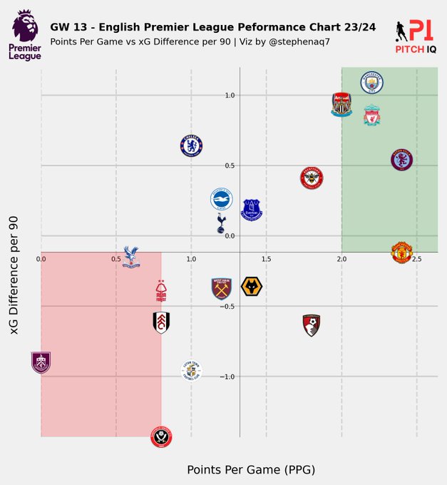
xG Difference vs Points per Game
Now, we’re going to go slightly further and create a new type of visual. xG difference is great way of assessing a teams statistical performance, however the fans of PL will know, the league is unforgiving and despite some teams putting up great statitcal numbers, they simply can’t put the ball in the back of the net and win the points that are all so important in the league.
Here is an example of this underperfromance from one of my favourite twitter accounts, The xG Philosophy that illustrates this:
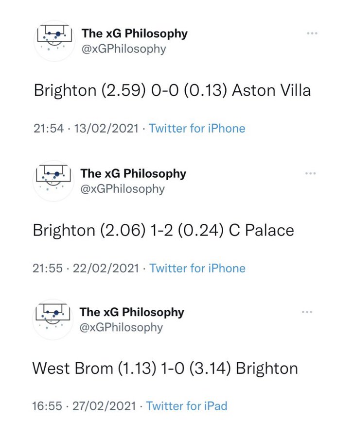
So how can we capture a teams ‘points on the board’ performance along side their statistical performance? One way I thought of was to plot a teams xG Difference per 90 vs their Points per game.
Functions
Earlier in this post, I outlined a way of pulling a generic dataframe from a webpage in FBREF (shown below), using the function generate_league_data.
So will we re-suse this fucntion and assign it to the variable df.
df = generate_league_data("https://fbref.com/en/comps/9/Premier-League-Stats")
Firstly we need to bring all the data we need from this table under a per-90 basis. The following functions will achieve this.
def p90_Calculator(variable_value, minutes_played):

    variable_value = pd.to_numeric(variable_value)

    ninety_minute_periods = minutes_played/90

    p90_value = variable_value/ninety_minute_periods

    return p90_value

def form_ppg_calc(variable_value):
    wins = variable_value.count("W")
    draws = variable_value.count("D")
    losses = variable_value.count("L")
    points = (wins*3) + (draws)
    # ppg = points/3
    ppg = points/5
    return ppg
1:
p90_CalculatorFunction: This function calculates a per-90-minutes value for a given variable. The function takes two parameters:
variable_value: The actual value of the variable (e.g., goals, assists, etc.). minutes_played: The total minutes played by a player. The function starts by converting the variable_value to a numeric type using pd.to_numeric to ensure that the calculations are performed on numerical values.
Next, it calculates the number of 90-minute periods (ninety_minute_periods) based on the total minutes played. It divides the minutes_played by 90.
Finally, the function computes the per-90 value (p90_value) by dividing the variable_value by the number of 90-minute periods. The result is then returned.
In summary, p90_Calculator is a utility function to standardize a given variable’s value to a per-90-minutes basis, which is commonly used in soccer statistics.
2:
form_ppg_calcFunction: This function calculates thePoints Per Game (PPG)for a given variable that represents a team’s recent form. The function takes a single parameter:
variable_value: A string representing a team’s recent results (e.g., “WDLW”). The function calculates the number of wins, draws, and losses by counting the occurrences of “W,” “D,” and “L” in the variable_value string. It then computes the total points based on the standard point system in soccer, where wins earn 3 points, draws earn 1 point, and losses earn 0 points.
The calculated PPG is determined by dividing the total points by 5 (as opposed to the standard 3). This modification is specific to the context of the application as we have 5 values in the variable column from FBREF.
The function returns the calculated PPG value.
In summary, form_ppg_calc is a function designed to calculate the Points Per Game based on a string representation of a team’s recent results, providing a measure of its recent performance.
The following lines of code enhance the DataFrame by adding three new columns: 'xG_p90', 'xGA_p90', and 'ppg_form'. These columns provide additional insights into the expected goals per 90 minutes, expected goals against per 90 minutes, and recent form in terms of Points Per Game for each row in the DataFrame.
df['xG_p90'] = df.apply(lambda x: p90_Calculator(x['xg_for'], x['minutes_played']), axis=1)
df['xGA_p90'] = df.apply(lambda x: p90_Calculator(x['xg_against'], x['minutes_played']), axis=1)
df['ppg_form'] = df.apply(lambda x: form_ppg_calc(x['last_5']), axis=1)
Similarly to the logo_ax function used in the xG Tree visual, we will use this function to plot the team logos on the scatter plot.
def ax_logo(team_id, ax):
    '''
    Plots the logo of the team at a specific axes.
    Args:
        team_id (int): the id of the team according to Fotmob. You can find it in the url of the team page.
        ax (object): the matplotlib axes where we'll draw the image.
    '''
    fotmob_url = 'https://images.fotmob.com/image_resources/logo/teamlogo/'
    club_icon = Image.open(urllib.request.urlopen(f'{fotmob_url}{team_id:.0f}.png'))
    ax.imshow(club_icon)
    ax.axis('off')
    return ax
Matplotlib
The following code generates a customized scatter plot with logos, annotations, and stylized elements to visualize the relationship between PPG and xG Difference per 90. The plot is saved as an image file for further use or sharing. Let’s break down the code into its main components:
1: Setting Plot Style and Data:
style.use('fivethirtyeight')
x_loc = df["ppg_form"]
y_loc = df['xg_diff_per90']
bgcol = '#fafafa'
fig = plt.figure(figsize=(5, 5), dpi=300)
ax = plt.subplot()
The plot is styled using the ‘fivethirtyeight’ style.
Data for x-axis (ppg_form) and y-axis (xg_diff_per90) is extracted from the DataFrame.
Figure and axes objects are created for plotting.
2: Axes Transformation:
DC_to_FC = ax.transData.transform
FC_to_NFC = fig.transFigure.inverted().transform
DC_to_NFC = lambda x: FC_to_NFC(DC_to_FC(x))
Transformation functions are defined to convert data coordinates to normalized figure coordinates.
3: Plotting Scatter Points with Logos:
ax_size = 0.05
counter = 0
for x, y in zip(x_loc, y_loc):
    ax_coords = DC_to_NFC((x, y))
    image_ax = fig.add_axes(
        [ax_coords[0] - ax_size/2, ax_coords[1] - ax_size/2, ax_size, ax_size],
        fc='None'
    )
    ax_logo(clubs[counter], image_ax)
    counter += 1
Scatter points are plotted on the axes using the transformed coordinates.
Logos (retrieved by the ax_logo function) are added to each point
4: Axes Styling:
# Change ticks
ax.tick_params(axis='both', which='major', labelsize=5)


plt.grid(False)
ax.grid(ls='--', lw=1, color='lightgrey', axis='x')

ax.spines['left'].set_position('center')
ax.spines['left'].set_color('black')
ax.spines['bottom'].set_position('center')
ax.spines['bottom'].set_color('black')
# Eliminate upper and right axes
ax.spines['right'].set_color('none')
ax.spines['top'].set_color('none')

for axis in ['top','bottom','left','right']:
    ax.spines[axis].set_linewidth(0.2)

# Show ticks in the left and lower axes only
ax.xaxis.set_ticks_position('bottom')
ax.yaxis.set_ticks_position('left')
Axes limits are set based on the data. Grid lines and spine positions are adjusted to create a cleaner appearance.
5: Adding Average Lines and Shaded Regions:
plt.hlines(df['xg_diff_per90'].mean(), 0, 3, color='#c2c1c0')
plt.vlines(df['ppg_form'].mean(), df['xg_diff_per90'].min(), df['xg_diff_per90'].max(), color='#c2c1c0')
ax.axvspan(2.0, 3.3, ymin=0.5, ymax=1.5, alpha=0.2, color='green', label="Title's on")
ax.axvspan(0.0, 0.8, alpha=0.2, ymin=0.5, ymax=-0.5, color='red', label="Oh Dear")
Horizontal and vertical average lines are added to the plot. Shaded regions are created to highlight specific areas.
6: Adding Text Annotations:
# ... (figure and axis text annotations)
Text annotations are added to the figure, providing a title, description, and axis labels.
7: Adding Logos:
ax2 = fig.add_axes([0.01, 0.075, 0.07, 1.75])
ax2.axis('off')
img = image.imread('/path/to/premier-league-2-logo.png')
ax2.imshow(img)

ax3 = fig.add_axes([0.85, 0.075, 0.1, 1.75])
ax3.axis('off')
img = image.imread('/path/to/piqmain.png')
ax3.imshow(img)
Two additional axes are added to the figure to display logos. The axes are turned off to hide their spines and ticks.
When we put it all together, the full code should look like the following:
style.use('fivethirtyeight')
x_loc = df["ppg_form"]
y_loc = df['xg_diff_per90']

bgcol = '#fafafa'

fig = plt.figure(figsize=(5,5), dpi=300)
ax = plt.subplot()


ax.set_xlim(x_loc.min()*-1.1,x_loc.max()*1.1)
ax.set_ylim(y_loc.min(),y_loc.max()*1.1)

# -- Transformation functions
DC_to_FC = ax.transData.transform
FC_to_NFC = fig.transFigure.inverted().transform
# -- Take data coordinates and transform them to normalized figure coordinates
DC_to_NFC = lambda x: FC_to_NFC(DC_to_FC(x))

ax_size = 0.05

counter = 0
for x,y in zip(x_loc, y_loc):
    ax_coords = DC_to_NFC((x,y))
    image_ax = fig.add_axes(
        [ax_coords[0] - ax_size/2, ax_coords[1] - ax_size/2, ax_size, ax_size],
         fc='None'
    )
    ax_logo(clubs[counter], image_ax)

    counter += 1

# Change ticks
ax.tick_params(axis='both', which='major', labelsize=5)


plt.grid(False)
ax.grid(ls='--', lw=1, color='lightgrey', axis='x')

ax.spines['left'].set_position('center')
ax.spines['left'].set_color('black')
ax.spines['bottom'].set_position('center')
ax.spines['bottom'].set_color('black')
# Eliminate upper and right axes
ax.spines['right'].set_color('none')
ax.spines['top'].set_color('none')

for axis in ['top','bottom','left','right']:
    ax.spines[axis].set_linewidth(0.2)

# Show ticks in the left and lower axes only
ax.xaxis.set_ticks_position('bottom')
ax.yaxis.set_ticks_position('left')


# Add average lines
plt.hlines(df['xg_diff_per90'].mean(), 0, 3, color='#c2c1c0')
plt.vlines(df['ppg_form'].mean(), df['xg_diff_per90'].min(), df['xg_diff_per90'].max(), color='#c2c1c0')
ax.axvspan(2.0, 3.3, ymin=0.5, ymax=1.5, alpha=0.2, color='green',label= "Title's on")

ax.axvspan(0.0, 0.8, alpha=0.2, ymin=0.5, ymax=-0.5,color='red',label= "Oh Dear")


## Title & comment
fig.text(.1,.93,'Points Per Game vs xG Difference per 90 | Viz by @stephenaq7',size=7, font='Karla')
fig.text(.1,.96,'GW 13 - English Premier League Peformance Chart 23/24',size=8, font='Karla', weight = 'bold')

## Avg line explanation
fig.text(0.01,0.3,'xG Difference per 90', size=9, color='k',rotation=90)
fig.text(.4,-0.01,'Points Per Game (PPG)', size=9, color='k')


ax2 = fig.add_axes([0.01, 0.075, 0.07, 1.75])
ax2.axis('off')
img = image.imread('/Users/stephenahiabah/Desktop/GitHub/Webs-scarping-for-Fooball-Data-/Images/premier-league-2-logo.png')
ax2.imshow(img)


### Add Stats by Steve logo
ax3 = fig.add_axes([0.85, 0.075, 0.1, 1.75])
ax3.axis('off')
img = image.imread('/Users/stephenahiabah/Desktop/GitHub/Webs-scarping-for-Fooball-Data-/outputs/piqmain.png')
ax3.imshow(img)


## Save plot
plt.savefig('xGChart.png', dpi=1200)
Our final visual should look as follows:
Conclusion
In conclusion, the provided code demonstrates the process of aggregating and manipulating data from the FBREF to obtain clean and structured datasets for analysis. We have successfully achieved the objectives of developing efficient functions for data aggregation and performing data manipulation tasks. Additionally, we have explored team-based xG visualizations, laying the groundwork for further visualisations using newer data in different gameweeks and also for different leagues.
With respect to our intial objectives, we have:
Develop efficient functions to aggregate data from FBRef & FotMob.
Perform data manipulation tasks to transform raw data into clean, structured datasets suitable for analysis.
Create data visualizations using the obtained datasets.
Evaluate significant metrics that aid in making assertions on team performance.
Moving forward, in Part 2 of our analysis, we will delve into more advanced visualizations, examining xG performance when compared to actual goals scored and conceded.
Thanks for reading
Steve

Comments