31 min to read
FBREF Data Scraping Walk Through pt1
Step-by-step guide to scraping football data from FBREF
Code and notebook for this post can be found here.
In my previous post, which you can find here, I outlined the current data landscape in the football analytics world including my picks for the best free resources out there.
This post is a part of series of posts, where we will explore how to use web-scraping packages available in python to get football data as efficiently as possible.
This project is written in Python and my webscraper of choice is BeautifulSoup. I’ve had a little bit of exposure to this already and seems to be the most popular ‘web-scraper’, so naturally it’s a safe bet for now.
For the data source, I’ve gone with FBREF, very popular with the football hipsters and kids on football twitter that comment ‘ykb’ under posts they agree with. The underlying data for FBREF is provided by StatsBomb, so A* for reliability and accuracy. There is vast amount of this data available at league, team, player and match level, complete with detailed metrics such as pass types and even body parts used for passes. The issue is being able to programtically sift through the webpages to get there.
The end goal of this is to:
-
Create a set of working functions to aggregate data from FBREF.
-
Perform a series of data munging tasks to get easy to to use datasets ready for analysis.
-
Create a series of Data Visualisations from these cleaned datasets.
-
Assess the meaningful metrics we need to start making some predictions on player suitability to positions.
Setup
First we have to install Beautiful Soup. The beautiful soup package will find the tables we need in the source code of the html. The following article goes in to great depths as to how the package works and how you can find the tables you need.
pip install beautifulsoup4

Collecting beautifulsoup4
  Downloading beautifulsoup4-4.10.0-py3-none-any.whl (97 kB)
     |████████████████████████████████| 97 kB 13.1 MB/s
Collecting soupsieve>1.2
  Downloading soupsieve-2.3.1-py3-none-any.whl (37 kB)
Installing collected packages: soupsieve, beautifulsoup4
Successfully installed beautifulsoup4-4.10.0 soupsieve-2.3.1
WARNING: You are using pip version 21.3.1; however, version 22.0.4 is available.
You should consider upgrading via the '/usr/local/bin/python3 -m pip install --upgrade pip' command.
Note: you may need to restart the kernel to use updated packages.
Next up, we import all our necessary packages for web-scraping, data cleaning and analysis.
import os
import requests
import pandas as pd
from bs4 import BeautifulSoup
import seaborn as sb
import matplotlib.pyplot as plt
import matplotlib as mpl
import warnings
import numpy as np
from math import pi
from urllib.request import urlopen
import matplotlib.patheffects as pe
from highlight_text import fig_text
from adjustText import adjust_text
Data
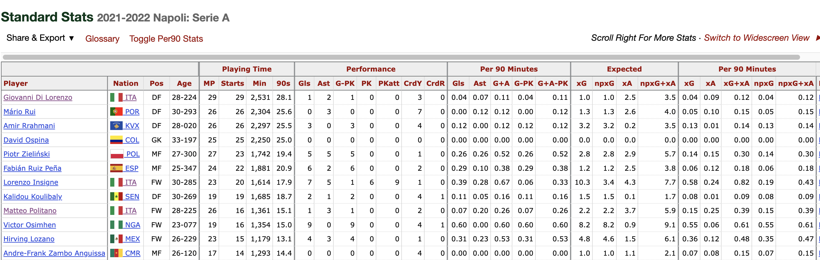
Let’s load the data. For the sake of ease lets start with a squad page. I’ve gone with this as this page seems to have the most data in a table that is easy for the scrapper to access and retrieve the information from. I’m watching far more Serie A these days so the team I’ve gone with is Napoli. The fbref page used can be found here.
Napoli Team Analysis
Scraping Functions
The first function requires the URL of squad to be passed, in order to return a pandas dataframe with the high level per/90 team stats available on this page.
def generate_squadlist(url):
    html = requests.get(url).text
    data = BeautifulSoup(html, 'html5')
    table = data.find('table')
    cols = []

    for header in table.find_all('th'):
        cols.append(header.string)

    columns = cols[8:37] #gets necessary column headers
    players = cols[37:-2]


    rows = [] #initliaze list to store all rows of data
    for rownum, row in enumerate(table.find_all('tr')): #find all rows in table
        if len(row.find_all('td')) > 0:
            rowdata = [] #initiliaze list of row data
            for i in range(0,len(row.find_all('td'))): #get all column values for row
                rowdata.append(row.find_all('td')[i].text)
            rows.append(rowdata)
    df = pd.DataFrame(rows, columns=columns)

    df.drop(df.tail(2).index,inplace=True)
    df["Player"] = players
    df.drop('Matches', axis=1, inplace=True)
    df['Nation'] = df['Nation'].str[3:]
    # df["team"] = name
    df.set_index("Player")
    return df
Get list of players in squad
The above functions works on any page with this template so effectively any teams stats page will work with this function.
I want to be able to get the team name and store it for later. As it happens the URLs for FBREF follow a similar pattern so we can slice the list to get the name and save it in the team name variable.
team = "https://fbref.com/en/squads/d48ad4ff/Napoli-Stats"
team_name = team[37:-6]
squad_stats_per_team = generate_squadlist(team)
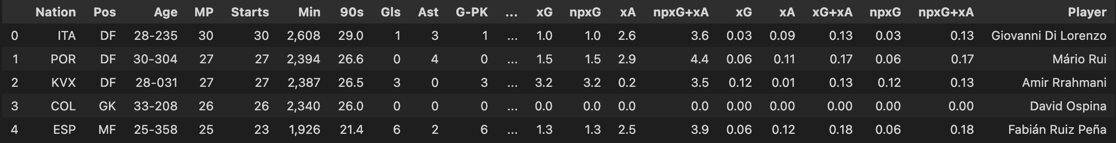
squad_stats_per_team.head()
Now lets have a look a the output
Creating visualisations from based on web-scraped dataset
Okay so we’ve got a table with some good data. There 29 features available including all of the match related stats in per 90 format. We even have ages and squad time. Abhishek Sharma provided some inspiration with his notebook, where he creates a beautiful age-squad profile map.
This particular visualisation really helps illustrate the age distributions of a squad. Charts such as these could be used to supplement analysis regarding; player performance, squad importance and possibly even transfer planning.
Lets do something similar but use the dataset we have loaded in and put it in to a function to have a look at Napoli’s squad age vs share of minutes played profile.
def squad_age_profile_chart(df, team_name):
        df[["90s"]] = df[["90s"]].apply(pd.to_numeric)
        df["Min_pct"] = 100*df["90s"]/len(df) ##number of matches played so far this season
        df = df.dropna(subset=["Age", "Min_pct"])
        df = df.loc[:len(df)-1, :]
        df[["Player", "Pos", "age_new", "Min_pct"]].head()

        line_color = "silver"
        marker_color = "dodgerblue"
        fig, ax = plt.subplots(figsize=(12, 8))

        ax.scatter(df["age_new"], df["Min_pct"],alpha=0.8) ##scatter points
        ax.fill([24, 29, 29, 24], [-6, -6, 106, 106], color='limegreen',
                alpha=0.3, zorder=2) ##the peak age shaded region
        ax.text(26.5, 55, "PEAK", color=line_color, zorder=3,
                alpha=2, fontsize=26, rotation=90, ha='center',
                va='center', fontweight='bold') ## `PEAK` age text
        texts = [] ##plot player names
        for row in df.itertuples():
                texts.append(ax.text(row.age_new, row.Min_pct, row.Player, fontsize=8, ha='center', va='center', zorder=10))
                adjust_text(texts) ## to remove overlaps between labels

        ## update plot
                ax.set(xlabel="Age", ylabel="Share of Minutes Played %", ylim=(-5, 105), xlim=(16, 40)) ## set labels and limits

        ##grids and spines
        ax.grid(color=line_color, linestyle='--', linewidth=0.8, alpha=0.5)
        for spine in ["top", "right"]:
                ax.spines[spine].set_visible(False)
                ax.spines[spine].set_color(line_color)

        ax.xaxis.set_ticks(range(16, 44, 4)) ##fix the tick frequency
        ax.xaxis.label.set(fontsize=12, fontweight='bold')
        ax.yaxis.label.set(fontsize=12, fontweight='bold') ## increase the weight of the axis labels

        ax.set_position([0.08, 0.08, 0.82, 0.78]) ## make space for the title on top of the axes

        ## title and subtitle
        fig.text(x=0.08, y=0.92, s=f"{team_name} | Squad Age Profile",
                ha='left', fontsize=20, fontweight='book',
                path_effects=[pe.Stroke(linewidth=3, foreground='0.15'),
                        pe.Normal()])
        fig.text(x=0.08, y=0.88, s=f"Serie A | 2020-21", ha='left',
                fontsize=20, fontweight='book',
                path_effects=[pe.Stroke(linewidth=3, foreground='0.15'),
                        pe.Normal()])
I’ve gone with the peak Age range of 25 to 27 as this is argued by Seife Dendir in his article in the Journal of Sports Analytics 2 (2016) 89–105.
The range was determined using WhoScored.com performance ratings of players in the four major top flight leagues of Europe from 2010/11 to 2014/15.
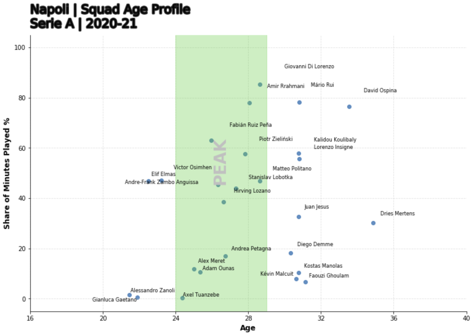
As we can see, there’s a troubling distribution here. Napoli have a high proportion of players just about to exit their peak or past their peak with a significant share of league minutes. From just an eye ball I can see regular starters like Koulibaly, Di Lorenzo are very much on the ‘wrong side of 30’. However we cant just take this data in isolation as there are obvious limitations a few are:
- We need to get the age profile of the league for a true comparison
- We are not including longevity as a variable. Wherein some players simply just last longer at the elite level than others
- Not all peaks are equal, goalkeepers & defenders have much later peaks than forward players
- This doesn’t account for injury records to clearly explain the factors effecting share of minutes.
So all in all, a good start. We have managed to scrape data from FBREF, cleaned up the data we have gathered and then done some interesting data visualisations on top of this. As mentioned previously, this data source has extensive minisites and other sub-pages so lets take a look at scraping another on of those areas.
–page-break–
Scraping fixture data
Naturally when assessing a team we need performance data and the best place can look is the in FBRefs team specific fixture page Lets see if we can take some fixture data from another table in the website.
We’re going to write a similar function to what was used for the squad data scrape however we need to contruct a table with a new shape and new features match whats on the webpage:
{"date","time","comp","Round","dayofweek", "venue","result","goals_for","goals_against","opponent","xg_for","xg_against","possession","attendance","captain", "formation","referee"}
def team_fixture_data(x):
    url = x
    page = urlopen(url).read()
    soup = BeautifulSoup(page)
    count = 0
    table = soup.find("tbody")

    pre_df = dict()
    features_wanted =  {"date" , "time","comp","Round","dayofweek", "venue","result","goals_for","goals_against","opponent","xg_for","xg_against","possession","attendance","captain", "formation","referee"} #add more features here!!
    rows = table.find_all('tr')
    for row in rows:
        for f in features_wanted:
            if (row.find('th', {"scope":"row"}) != None) & (row.find("td",{"data-stat": f}) != None):
                cell = row.find("td",{"data-stat": f})
                a = cell.text.strip().encode()
                text=a.decode("utf-8")
                if f in pre_df:
                    pre_df[f].append(text)
                else:
                    pre_df[f]=[text]

    df = pd.DataFrame.from_dict(pre_df)
    return df
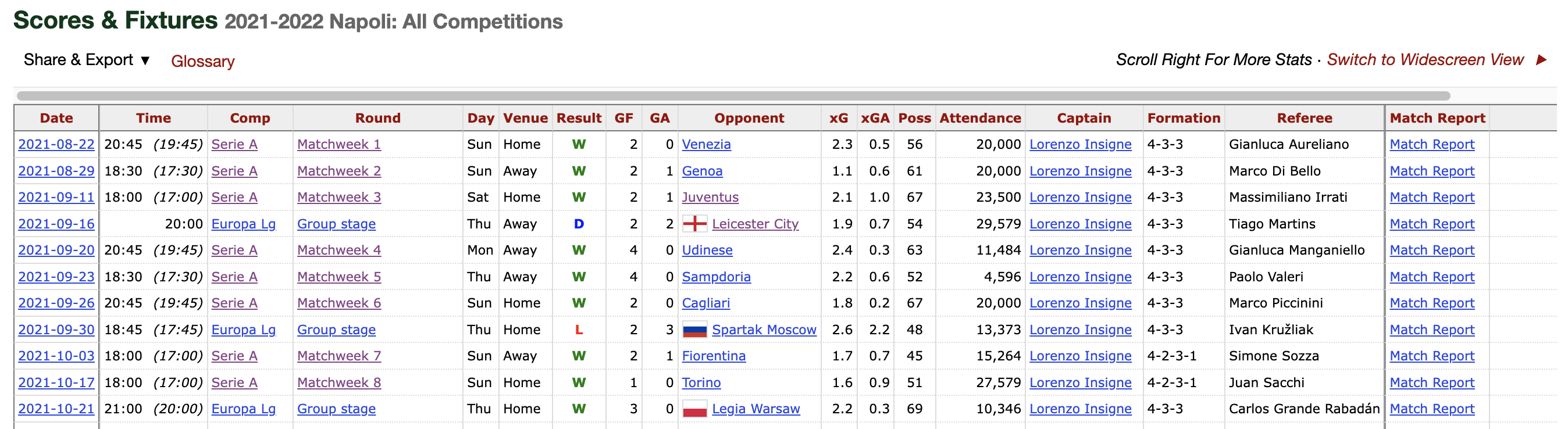
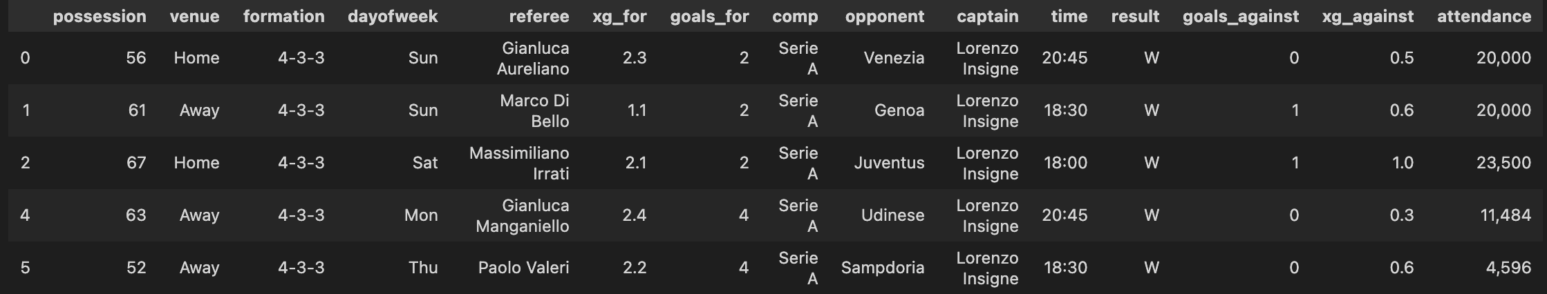
To clean up the table slightly, we’re going to select only the domestic league fixtures and fixtures that have already been played.
league_results = team_fixture_data("https://fbref.com/en/squads/d48ad4ff/2021-2022/matchlogs/all_comps/schedule/Napoli-Scores-and-Fixtures-All-Competitions")
league_results = league_results.loc[(league_results['captain'] != '') & (league_results['comp'] == 'Serie A')]
league_results
The resulting table will now look like this:
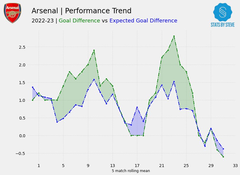
xExpected Goal Difference vs Goal Difference
Now lets dive deeper and investigate Napoli’s league performance data. Naturally, you might start with looking at league standings, however we want to acertain how Napoli have performed over the course of the Season so far.
Goal Difference vs Expected Goal difference, in my opinion is really good way to visualise how well a team is performing, as it can indicate not only how effectively a team is scoring and keeping shots out on a rolling basis, the xExpected metrics can allow us to identify periods of under/overperformance. Going further, we could overlay this chart with key event data such change of manager, formation and even injuries to key players to allow for more comprehensive analysis.
def generate_xg_analysis_chart(df,team_name):
        window = 5
        gd_color = "green"
        xgd_color = "blue"

        df[["goals_for","xg_for","xg_against","goals_against"]] = df[["goals_for","xg_for","xg_against","goals_against"]].apply(pd.to_numeric)

        df["GD"] = df["goals_for"] - df["goals_against"]
        df["xGD"] = df["xg_for"] - df["xg_against"]

        gd_rolling = df["GD"].rolling(window).mean().values[window:]
        xgd_rolling = df["xGD"].rolling(window).mean().values[window:]

        plt.rcParams['font.family'] = 'Palatino Linotype' ##set global font
        fig, ax = plt.subplots(figsize=(12, 8))

        ax.plot(gd_rolling, color=gd_color,  linestyle="-.", marker="o",  mfc=gd_color, mec="white", markersize=8, mew=0.4, zorder=10)  ##goal-difference
        ax.plot(xgd_rolling, color=xgd_color,  linestyle="-.", marker = "o", mfc=xgd_color, mec="white", markersize=8, mew=0.4, zorder=10) ##expected goals difference

        ax.fill_between(x=range(len(gd_rolling)), y1=gd_rolling, y2=xgd_rolling, where = gd_rolling>xgd_rolling,
                        alpha=0.2, color=gd_color, interpolate=True, zorder=5) ##shade the areas in between
        ax.fill_between(x=range(len(gd_rolling)), y1=gd_rolling, y2=xgd_rolling, where = gd_rolling<=xgd_rolling,
                        alpha=0.2, color=xgd_color, interpolate=True, zorder=5)

        ax.grid(linestyle="dashed", lw=0.7, alpha=0.1, zorder=1) ## a faint grid
        for spine in ["top", "right"]:
                ax.spines[spine].set_visible(False)
        ax.set_position([0.08, 0.08, 0.82, 0.78]) ## make space for the title on top of the axes

        ## labels, titles and subtitles
        ax.set(xlabel=f"{window} match rolling mean", xlim=(-1, len(df)-window))
        ax.xaxis.label.set(fontsize=12, fontweight='bold')

        fig.text(x=0.08, y=0.92, s=f"{team_name} | Performance Trend",
                ha='left', fontsize=24, fontweight='book',
                path_effects=[pe.Stroke(linewidth=3, foreground='0.15'),
                        pe.Normal()])

        fig_text(x=0.08, y=0.90, ha='left',
                fontsize=18, fontweight='book',
                s='2020-21 | <Goal Difference> vs <Expected Goal Difference>',
                path_effects=[pe.Stroke(linewidth=3, foreground='0.15'),
                        pe.Normal()],
                highlight_textprops=[{"color": gd_color},
                                        {"color": xgd_color}])
From this function, we are able to produce our xGD vs GD Performance chart. In this example the xGD per90 is calulated on a 5 game rolling average basis to correct for any swings in form that will detract from the insight we’re trying to gain from this chart.
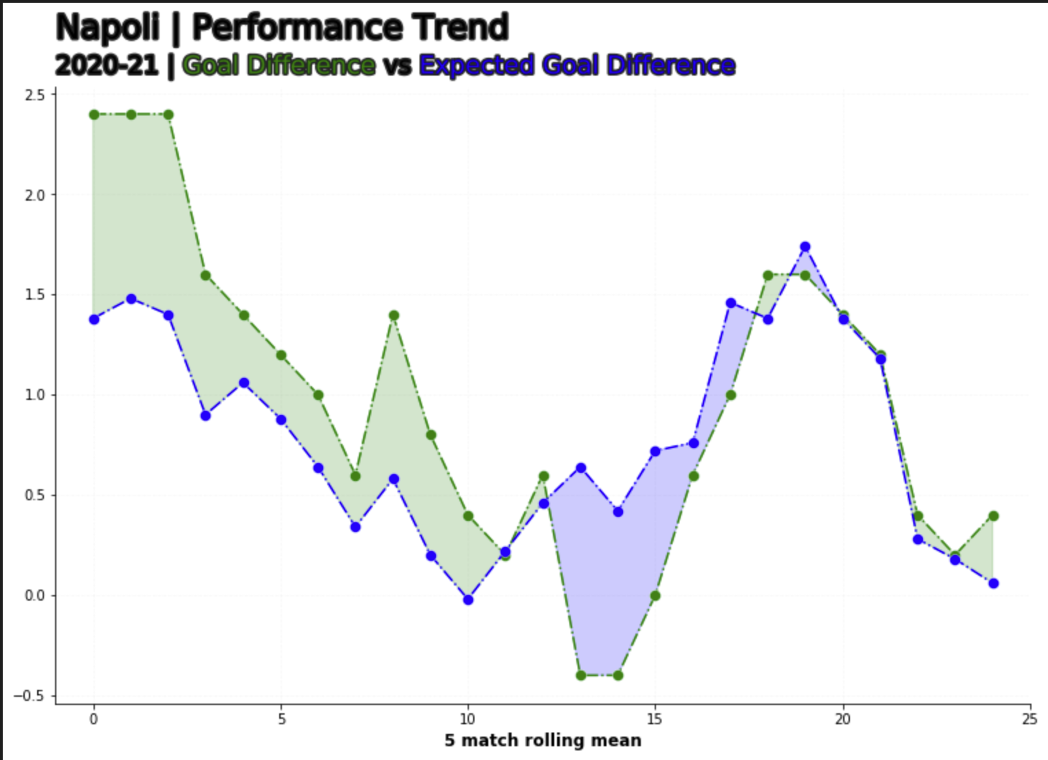
From the chart we can see that Napoli started the league absolutely on fire, overperforming on their xGD by over a goal, the subsequent weeks up until MW 13 where can see a reversal of the good early season form, wherein now they are underperfroming on the thier xGD by a goal.
If we cross reference this against their league results, in this period, Napoli went 1 win in 5, losing to Inter, Atalanta and Empoli at home and drawing with Sassuolo. To go even further, the absense of Napoli’s Talismanic forward Victor Osimhen also correlates to their weeks of underperformance in relation to xGD. Osimhen was out from the 21st of November till the 14th of January, so MW13 to MW22.
Taking a second look at the chart, after MW22 is when we start to see Napoli start peforming above their xGD again. for refrence you can find Victor Osimhens injury record here and I’ve added Napoli’s league results here.
Great. Pretty simple work to get the get the data and we’ve done some analysis that checks out with the real world events.
xExpected Goal Difference vs Points Per Game
Finally we’re going to have a look at the performance of the rest of the teams in the league. I wrote another function to pull out the league data from this page. Again we need to make sure we’re only pulling the features we need and in this case we need and convert the columns we’re going to use for calculation into numeric data-types.
def generate_league_data(x):
    url = x
    page = urlopen(url).read()
    soup = BeautifulSoup(page)
    count = 0
    table = soup.find("tbody")

    pre_df = dict()
    features_wanted =  {"squad" , "games","wins","draws","losses", "goals_for","goals_against", "points", "xg_for","xg_against","xg_diff","attendance","xg_diff_per90", "last_5"}
    rows = table.find_all('tr')
    for row in rows:
        for f in features_wanted:
            if (row.find('th', {"scope":"row"}) != None) & (row.find("td",{"data-stat": f}) != None):
                cell = row.find("td",{"data-stat": f})
                a = cell.text.strip().encode()
                text=a.decode("utf-8")
                if f in pre_df:
                    pre_df[f].append(text)
                else:
                    pre_df[f]=[text]

    df = pd.DataFrame.from_dict(pre_df)
    df["games"] = pd.to_numeric(df["games"])
    df["xg_diff_per90"] = pd.to_numeric(df["xg_diff_per90"])
    df["minutes_played"] = df["games"] *90
    return(df)
Resulting Table should look like this:
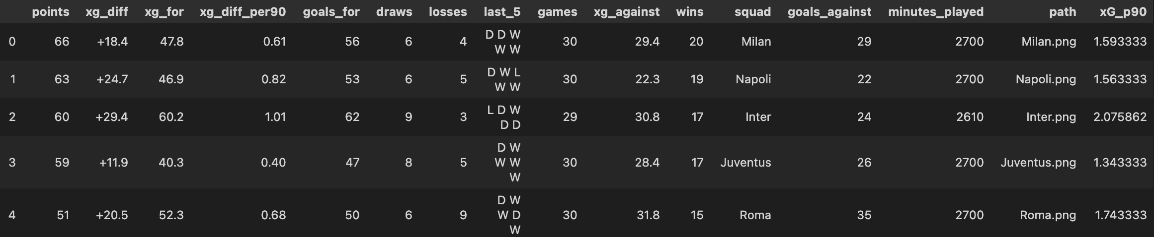
The league table data is slightly different to that of the previous tables we scraped, wherein the metrics are no longer ‘per-90-fied’, so we need to do that. In addition as we have the feature ‘Last 5’ this table. The actual feature on its own is pretty useless in isolation, but we can do some string manipulation and turn this in another feature, lets call it ppg_form.
def p90_Calculator(variable_value, minutes_played):

    variable_value = pd.to_numeric(variable_value)

    ninety_minute_periods = minutes_played/90

    p90_value = variable_value/ninety_minute_periods

    return p90_value

def form_ppg_calc(variable_value):
    wins = variable_value.count("W")
    draws = variable_value.count("D")
    losses = variable_value.count("L")
    points = (wins*3) + (draws)
    ppg = points/5
    return ppg

df['xG_p90'] = df.apply(lambda x: p90_Calculator(x['xg_for'], x['minutes_played']), axis=1)
df['xGA_p90'] = df.apply(lambda x: p90_Calculator(x['xg_against'], x['minutes_played']), axis=1)
df['ppg_form'] = df.apply(lambda x: form_ppg_calc(x['last_5']), axis=1)
The final auxillary function we need to create a viz from our leage data is the actual images of the team badges. FC Python has a great tutorial of how to do this using EPL teams.
def getImage(path):
    return OffsetImage(plt.imread(path), zoom=.05, alpha = 1)
Plotting every teams relative GD vs xGD can be quite cumbersome and the resulting chart will look messy and hard to actually infer any information from. Instead, we’re going to use our new ‘per-90-fied’ stats to get the xGD and plot that against league form. This chart should tell us which are teams getting results and how sustainable their form is. For example a team with a postive and high xGD accumlating several points, indicates not only good form but sustainable form and vice versa.
import matplotlib.pyplot as plt
from matplotlib.offsetbox import OffsetImage, AnnotationBbox
fig, ax = plt.subplots(figsize=(6, 4), dpi=120)
ax.scatter(df["ppg_form"], df["xg_diff_per90"])

for index, row in df.iterrows():
    ab = AnnotationBbox(getImage(os.path.join("team_logos/"+row["path"])), (row["ppg_form"], row["xg_diff_per90"]), frameon=False)
    ax.add_artist(ab)

# Set font and background colour
bgcol = '#fafafa'

# Create initial plot
fig, ax = plt.subplots(figsize=(6, 4), dpi=120)
fig.set_facecolor(bgcol)
ax.set_facecolor(bgcol)
ax.scatter(df['ppg_form'], df['xg_diff_per90'], c=bgcol)

# Change plot spines
ax.spines['right'].set_visible(False)
ax.spines['top'].set_visible(False)
ax.spines['left'].set_color('#ccc8c8')
ax.spines['bottom'].set_color('#ccc8c8')

# Change ticks
plt.tick_params(axis='x', labelsize=6, color='#ccc8c8')
plt.tick_params(axis='y', labelsize=6, color='#ccc8c8')

# Plot badges
def getImage(path):
    return OffsetImage(plt.imread(path), zoom=.05, alpha = 1)

for index, row in df.iterrows():
    ab = AnnotationBbox(getImage(os.path.join("team_logos/"+row["path"])), (row['ppg_form'], row['xg_diff_per90']), frameon=False)
    ax.add_artist(ab)

# Add average lines
plt.hlines(df['xg_diff_per90'].mean(), df['ppg_form'].min(), df['ppg_form'].max(), color='#c2c1c0')
plt.vlines(df['ppg_form'].mean(), df['xg_diff_per90'].min(), df['xg_diff_per90'].max(), color='#c2c1c0')
ax.axvspan(2.0, 3,0, alpha=0.1, color='green',label= "In Form")
ax.axvspan(0.9, 1,2, alpha=0.1, color='yellow',label= "Mediorcre")
ax.axvspan(0.0, 0.5, alpha=0.1, color='red',label= "relegation on speed dail")

# Text

## Title & comment
fig.text(.15,.98,'Last 5 ppg vs xG Difference per 90',size=18)

## Avg line explanation
fig.text(.06,.14,'xG Difference per 90', size=9, color='#575654',rotation=90)
fig.text(.12,0.05,'Last 5 ppg', size=9, color='#575654')

## Axes titles
fig.text(.76,.535,'Avg. xG Difference per 90', size=6, color='#c2c1c0')
fig.text(.325,.17,'Avg. Last 5 ppg', size=6, color='#c2c1c0',rotation=90)

## Save plot
plt.savefig('xGChart.png', dpi=1200, bbox_inches = "tight")
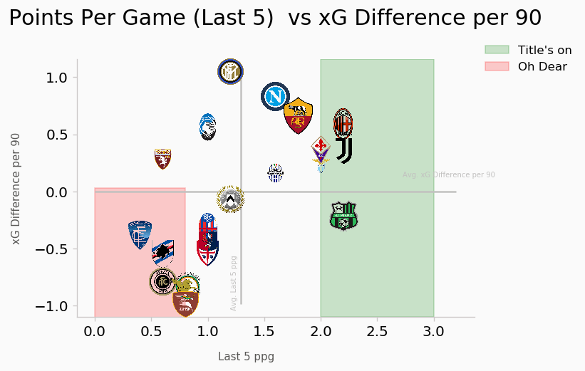
From this viz, we cans see that Napoli, although not accumulating that many points per game in the last 5 are still accruing a league leading xGD. Compared to a team like Sassuolo, we can see they are accumulating more points at similar pace to the league leaders AC Milan but at a negative xGD, possibly indicating a massive overperformance. Inter Milan & Atalanta are two examples of team that are not picking up as many points as the league average in the last 5 games but they are maintainting better xGDs than teams that are in form indicating a significant underperformance at present. Looking at the other end of the chart, we can see several mid-table teams particularly Bologna & Empoli who are (12th and 13th at the time of writing) are performing at relegation level form. Both teams are 11 points from the drop and with other teams in around them not performing either they may just be safe from the drop this year.
Conclusion
As mentioned in the intro to this post I was looking to achieve the follwing key items:
- Create a set of working functions to aggregate data from FBREF.
-
We have done so, taking 3 seprate data-tables from FBREF minisites and converting them into pandas data frames
- Perform a series of data munging tasks to get easy to to use datasets ready for analysis.
-
We have created our features & variables utilising dataset manipulation technique availbe just using pandas
- Create a series of Data Visualisations from these cleaned datasets.
-
We have managed to create 3 visuals from our scraped data sets and gotten simple yet meaniful insights from them
- Assess the meaningful metrics we need to start making some predictions on player suitability to positions.
- We did not manage to hit this item yet as we’ve only looked at league and team data
Next week we’re going to dive straight into getting some player data in part 2.
Thanks for reading!
Steve

Comments