88 min to read
EPL Wages Analysis
Analyzing player wages in the English Premier League
This post is a comprehensive tutorial on scraping and analyzing Premier League wage data from FBREF, from this tutorial I hope you are able to walk away with the following key objectives and outcomes:
-
Establish a set of effective functions for extracting wage data from FBREF, ensuring robust data aggregation.
-
Conduct essential data cleaning and transformation tasks to prepare well-structured datasets for in-depth financial analysis.
-
Generate informative data visualizations, shedding light on the intricate financial landscape within the English Premier League.
-
Identify and evaluate crucial metrics, laying the foundation for predictive modeling related to player compensation and its correlation with performance.
-
Better understand the relationship between financial and on pitch performance of players and teams, providing valuable insights into the economic dynamics of one of the world’s most prominent football leagues.
This tutorial serves as a pragmatic guide for Python enthusiasts seeking to delve into the financial intricacies of the Premier League, facilitating an exploration of wage data and its implications on player suitability and team strategies.
Understanding Wage Information
Analyzing wage data in football is crucial for gaining insights into the financial dynamics of the sport, understanding team investment strategies, and evaluating player market values. It allows clubs, analysts, and enthusiasts to assess the economic aspects influencing player performance, team competitiveness, and overall league dynamics.
However, it’s important to note that the scraped data may not be 100% accurate, considering potential discrepancies, confidentiality issues, or variations in reporting standards. Therefore, this dataset should be approached as a foundational basis for further exploration and refinement, acknowledging the inherent limitations in data accuracy and completeness.
Setup
This project is extremely data intensive and requires the installation of many python packages to both analyse and visualise the data we’re going to extract. Here is a full breakdown of some of the modules we will be using in this tutorial.
In this tutorial script, we incorporate several key Python modules to delve into football-related data analysis and visualization. The MobFot library an open source module accessing FotMob’s API is employed for accessing performance related information, while the MPLSoccer module facilitates the creation of insightful football pitch visualizations. Utilizing Matplotlib, we enhance our general plotting capabilities. The inclusion of FuzzyWuzzy suggests a focus on string matching, likely aiding in the recognition of team names or other textual entities. For efficient data manipulation and analysis, we leverage the powerful data processing capabilities of Pandas and employ BeautifulSoup for web scraping. The script also taps into Seaborn for statistical visualization, promising elegant and informative plots. The use of image-related libraries such as PIL and urllib hints at the integration of club logos or player images, adding a visually appealing dimension to the analytical outputs.
Here is a snippet of the full code block below.
import requests
import json
from mobfot import MobFot
from mplsoccer import Pitch


import matplotlib.patheffects as path_effects

from matplotlib.patches import Ellipse
import matplotlib.patches as mpatches
from matplotlib import cm
from highlight_text import fig_text, ax_text
from ast import literal_eval

from PIL import Image
import urllib
import os
from fuzzywuzzy import fuzz
from fuzzywuzzy import process

import pandas as pd
from bs4 import BeautifulSoup
# import klib as kb
import seaborn as sb
import matplotlib.pyplot as plt
import matplotlib.pyplot as plt
import matplotlib.ticker as ticker
import matplotlib.patheffects as path_effects
import matplotlib.font_manager as fm
# import wes
import matplotlib as mpl
import warnings
import numpy as np
from math import pi
from urllib.request import urlopen
from matplotlib.transforms import Affine2D
import mpl_toolkits.axisartist.floating_axes as floating_axes
from sklearn.preprocessing import StandardScaler
Data Aggregation and Preparation
Now that all our packages are installed, we can start looking at the data. The code provided below demonstrates the use of the beautiful soup library to retrieve and save league data from 2023/24 EPL Season from FBREF. For this posts we will be using wage data from FBREF via Capology for Premier League Stats pages.
FBREF has a structure of pages and sub-pages that we can access and store key information and save it for further analysis.
We will begin by building a method to pull all the basic data from the Premier League Stats pages and build out programmatically.
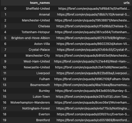
The following code defines a Python function named get_team_urls(x). This function takes a URL (x) as input and performs a series of web scraping operations to extract information about football teams, particularly their names and corresponding URLs. The code begins by sending a request to the provided URL, retrieving the HTML content, and parsing it using BeautifulSoup.
Subsequently, it identifies anchor tags within table headers, extracts their ‘href’ attributes, and removes any duplicate URLs. The script then constructs full URLs by appending the base address “https://fbref.com” to each extracted relative URL.
Next, it iterates through the URLs, extracting team names by slicing the URL strings. The team names and full URLs are then zipped into tuples, forming a list of pairs. Finally, this list is used to create a Pandas DataFrame named Team_url_database with columns ‘team_names’ and ‘urls’, and it is returned as the output of the function. This function essentially serves to gather a database of football team names and their respective URLs from the provided web page.
def get_team_urls(x):
    url = x
    data  = requests.get(url).text
    soup = BeautifulSoup(data)
    player_urls = []
    links = BeautifulSoup(data).select('th a')
    urls = [link['href'] for link in links]
    urls = list(set(urls))
    full_urls = []
    for y in urls:
        full_url = "https://fbref.com"+y
        full_urls.append(full_url)
    team_names = []
    for team in urls:
        team_name_slice = team[20:-6]
        team_names.append(team_name_slice)
    list_of_tuples = list(zip(team_names, full_urls))
    Team_url_database = pd.DataFrame(list_of_tuples, columns = ['team_names', 'urls'])
    return Team_url_database

team_table = get_team_urls("https://fbref.com/en/comps/9/Premier-League-Stats")
The function now returns this following output:
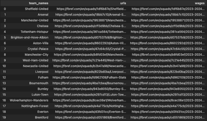
The next code snippet begins by selecting specific columns, namely “team_names” and “urls,” from the DataFrame named team_table. Subsequently, a new function get_wages(url) is defined, which takes a URL as input. Inside this function, a modified URL is generated by appending “2023-2024/wages/” to the initial part of the URL. A nested function remove_first_n_char is utilized to remove the first 37 characters from the URL, and the modified and original strings are concatenated to form the final URL for wage details.
The apply function is then employed on the DataFrame team_table to create a new column named ‘wages.’ This column is populated by applying the get_wages function to each row of the ‘urls’ column. The result is a DataFrame, now enriched with a ‘wages’ column containing the URLs for wage details corresponding to each football team. Essentially, this code is responsible for extracting and structuring URLs for wage details based on the original team URLs in the DataFrame.
team_table = team_table[["team_names","urls"]]

def get_wages(url):
    start = url[0:37]+ "2023-2024/wages/"
    def remove_first_n_char(org_str, n):
        mod_string = ""
        for i in range(n, len(org_str)):
            mod_string = mod_string + org_str[i]
        return mod_string
    mod_string = remove_first_n_char(url, 37)
    final_string = start+mod_string+"-Wage-Details"
    return final_string

team_table['wages'] = team_table.apply(lambda x: get_wages(x['urls']), axis=1)
The function now returns this following output complete with the URLs to the Wage information sub-pages for each team:
The following function, league_wages_df, is crafted to systematically extract and structure weekly wage data for football players from a provided list of match links. The function initiates by iterating through each link, conducting web scraping operations to retrieve relevant information. The player’s name is extracted and processed, removing the last 17 characters and handling HTML comments.
Subsequently, the code employs Pandas to read HTML tables and isolate the table containing wage statistics. Rows with NaN values in the “Weekly Wages” column are dropped for cleanliness. A dedicated function, extract_currency_values, is defined to split currency values and create separate columns for pounds, euros, and dollars. This function is applied to derive new columns for these currency values.
The pound values are further converted to integers, introducing a new column named ‘new_pound_value.’ The DataFrame is then refined to include only specific columns such as “Player,” “Nation,” “Pos,” “Age,” and “new_pound_value.” Processed wage statistics are appended to a list for each match link.
In terms of cleanup, temporary variables (df and soup) are deleted to manage memory usage. Additionally, a deliberate delay of 10 seconds is implemented between requests (time.sleep(10)) to prevent overwhelming the server. The final step involves concatenating all individual DataFrames in data_append into a comprehensive DataFrame named df_total.
This function serves as a valuable tool for systematically collecting and organizing football player wage data from various match links. The resulting DataFrame, df_total, encapsulates crucial financial information for further analysis.
import time
def league_wages_df(match_links):
    data_append = []
    for x in match_links:
        print(x)
        warnings.filterwarnings("ignore")
        url = x
        page =requests.get(url)
        soup = BeautifulSoup(page.content, 'html.parser')
        name = [element.text for element in soup.find_all("span")]
        name = name[7]
        # name = name[10:]

        # Remove last 17 characters
        name = name[:-17]
        html_content = requests.get(url).text.replace('<!--', '').replace('-->', '')
        df = pd.read_html(html_content)
        wage_stats = df[0]
        def remove_nan_rows(df, column_name):
            df.dropna(subset=[column_name], inplace=True)
            return df
        wage_stats = remove_nan_rows(wage_stats, "Weekly Wages")
        def extract_currency_values(column_value):
            parts = column_value.split(" ")
            pound_value = parts[0] + "  " + parts[1]
            euro_value = parts[3]
            dollar_value = parts[4]
            return pound_value, euro_value, dollar_value

        wage_stats[["Pound Value", "Euro Value", "Dollar Value"]] = wage_stats["Weekly Wages"].apply(extract_currency_values).apply(pd.Series)
        def convert_pound_values_to_int(df, column_name):
            df['new_pound_value'] = df[column_name].str.replace('£', '').str.replace(',', '').astype(int)
            return df
        wage_stats = convert_pound_values_to_int(wage_stats, "Pound Value")
        wage_stats = wage_stats[["Player", "Nation","Pos","Age","new_pound_value"]]
        # wage_stats['Player'] = name
        data_append.append(wage_stats)
        del df, soup
        time.sleep(10)
    df_total = pd.concat(data_append)

    return df_total
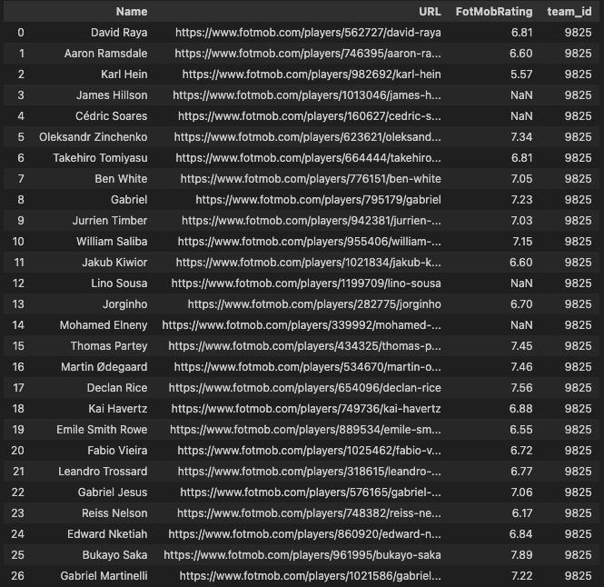
Within this next code block, football player ratings from FotMob for English Premier League (EPL) teams are extracted and organized. The process involves iterating through team IDs, making requests to the FotMob API via the MobFot client.
1: Data Initialization:
- A CSV file containing EPL team IDs is read into a DataFrame named
team_ids. - An instance of the
MobFotclient is created.
2: Ratings Extraction Loop:
- The code iterates through unique team IDs in
team_ids. - For each team, the
get_teammethod is used to obtain information about the team, and a functionextract_names_and_urlsis defined to retrieve player names and their corresponding URLs from the obtained data.
3: Rating Retrieval:
- For each player URL, the
get_playermethod is utilized to fetch player details. - A function
extract_ratingis defined to parse the player’s rating from the obtained data. - The extracted ratings are appended to a list
fm_ratings.
4: Data Organization:
- The player names, URLs, and FotMob ratings are organized into a DataFrame named
table. - The team ID is added to the DataFrame to identify the team associated with each player.
- The DataFrame for each team is appended to a list
dataframes.
5: Final Concatenation:
- After processing all teams, the individual DataFrames in
dataframesare concatenated into a final DataFrame namedfinal.
6: Result:
- The function returns the consolidated DataFrame,
final, containing player names, FotMob ratings, and corresponding team IDs. This structured data can be utilized for further analysis and insights into player performance in the English Premier League.
import re

match_links = list(team_table.wages.unique())
wages_df = league_wages_df(match_links)
wages_df.to_csv("CSVs/EPL_Player_Wages.csv")


team_ids = pd.read_csv("CSVs/fotmob_epl_team_ids.csv")
client = MobFot()

def get_epl_ratings(team_ids):
    dataframes = []
    for t_id in team_ids.team_id.unique():
        dict1 = client.get_team(t_id)

        def extract_names_and_urls(data):
            names = []
            urls = []
            for athlete in data['details']['sportsTeamJSONLD']['athlete']:
                names.append(athlete['name'])
                urls.append(athlete['url'])
            df = pd.DataFrame({'Name': names, 'URL': urls})
            return df

        player_rating = extract_names_and_urls(dict1)

        fm_ratings = []
        player_ids = (player_rating.URL.unique())
        def extract_rating(player_id):
            numbers = re.findall(r'\d+', player_id)
            player_id = ''.join(numbers)
            dict2 = client.get_player(player_id)
            try:
                rating_info = dict2['mainLeague']['stats']
                rating_value = next((stat['value'] for stat in rating_info if stat['title'] == 'Rating'), None)
                return rating_value
            except (KeyError, TypeError):
                return None
                fm_ratings.append(rating)  # Append None if rating is not found
        table = extract_names_and_urls(dict1)
        table['FotMobRating'] = table['URL'].apply(extract_rating)

        table['team_id'] = t_id
        dataframes.append(table)
    final = pd.concat(dataframes)

    return final
Building Initial Visuals
In the provided code below, the variable epl_player_ratings is assigned the result of calling the get_epl_ratings function on the team_ids DataFrame. This function extracts and organizes FotMob ratings for players in the English Premier League, creating a comprehensive DataFrame.
The subsequent line filters the epl_player_ratings DataFrame to include only rows corresponding to the EPL team with a team ID of 9825, which represents Arsenal.
Together, these two lines effectively generate a subset of the player ratings DataFrame specifically for Arsenal (COYG), providing a detailed dataset focused on players associated with the club.
epl_player_ratings = get_epl_ratings(team_ids)
epl_player_ratings[epl_player_ratings['team_id'] == 9825]
We are now able to return the following output complete with the URLs to each players FotMob information and rating.
In this next code block, a function named create_team_table is defined to generate a DataFrame tailored specifically for a particular English Premier League (EPL) team, identified by the team ID (t_id). The function takes two inputs: epl_player_ratings, which represents the comprehensive player ratings DataFrame, and t_id, which specifies the team ID.
1: Data Initialization:
- A DataFrame (
wages_df) is loaded from a CSV file containing EPL player wages. - The ‘Player’ column in
wages_dfis renamed to ‘Name’ for consistency.
2: Name Matching:
- A function (
get_approximate_match) is defined to find an approximate match for each player name in the wages DataFrame within the player ratings DataFrame. - A mapping (
name_mapping) is created, associating each player’s name in the wages DataFrame with its closest match in the player ratings DataFrame.
3: Data Merging:
- The player ratings DataFrame (
epl_player_ratings) and the wages DataFrame are merged on the ‘Name’ column using a left join. - Rows with NaN values in the ‘Nation’ column are dropped for cleanliness.
4: Team-Specific Filtering:
- The merged DataFrame is filtered to include only rows corresponding to the specified team ID (
t_id). - Player IDs are extracted from the ‘URL’ column.
- Rows with NaN values in the ‘FotMobRating’ column are dropped.
5: Wage Contribution Calculation:
- The total wages for the team are calculated by summing the ‘new_pound_value’ column.
- A new column, ‘wage_contribution,’ is created to represent the percentage contribution of each player’s wage to the team’s total wages.
6: Result:
- The function returns the filtered and enriched DataFrame (
filtered_df), providing a comprehensive overview of player ratings, wages, and their contributions for the specified EPL team (in this case, Arsenal with team ID 9825). The final DataFrame is ready for further analysis or visualization.
def create_team_table(epl_player_ratings,t_id ):
    wages_df = pd.read_csv("CSVs/EPL_Player_Wages.csv")
    wages_df.rename(columns={'Player': 'Name'}, inplace=True)
    def get_approximate_match(query, choices):
        return process.extractOne(query, choices)[0]
    name_mapping = {}
    for name in wages_df['Name']:
        match = get_approximate_match(name, epl_player_ratings['Name'])
        name_mapping[name] = match
    wages_df['Name'] = wages_df['Name'].map(name_mapping)
    merged_df = pd.merge(wages_df, epl_player_ratings, on='Name', how='left')
    merged_df.dropna(subset=['Nation'], inplace=True)
    filtered_df = merged_df[merged_df['team_id'] == t_id]
    filtered_df['player_id'] = filtered_df['URL'].str.extract(r'(\d+)')
    filtered_df = filtered_df[filtered_df['FotMobRating'].notna()]

    total_wages = filtered_df['new_pound_value'].sum()

    # Calculate wage contribution percentage
    filtered_df['wage_contribution'] = (filtered_df['new_pound_value'] / total_wages)

    return filtered_df

t_id = 9825
filtered_df = create_team_table(epl_player_ratings, t_id)
Functions needed for visual
In this next code block, a set of utility functions for handling player and club images within Matplotlib visualizations is defined. The functions facilitate the retrieval and rendering of player and club images from FotMob URLs.
1: BboxLocator Class:
- A custom class,
BboxLocator, is introduced to handle the positioning of images within the Matplotlib plot using bounding boxes (Bbox). - This class takes a bounding box and a transform as input during initialization and is designed to be callable, returning the transformed bounding box.
2: draw_player_image_at_ax Function:
- This function,
draw_player_image_at_ax, is created to draw a player image at a specified Matplotlib axis (ax). - It takes a player ID and the axis as input and fetches the player image from FotMob URLs using the provided ID.
- The image is optionally converted to grayscale, and it is then displayed on the specified axis. The axis is configured to have no visible ticks or labels.
3: draw_club_image_at_ax Function:
- Similar to the player image function,
draw_club_image_at_axis designed to draw a club logo at a specified Matplotlib axis (ax). - It takes a team ID as input, fetches the club logo image from FotMob URLs, and optionally converts it to grayscale.
- The club logo image is then displayed on the specified axis, and the axis is configured to have no visible ticks or labels.
These functions provide a convenient way to incorporate player and club images into Matplotlib visualizations, enhancing the aesthetic appeal of football-related plots or charts. The utilization of bounding boxes ensures precise positioning of these images within the plot.
# -- For Logos and images
from matplotlib.transforms import Bbox
class BboxLocator:
    def __init__(self, bbox, transform):
        self._bbox = bbox
        self._transform = transform
    def __call__(self, ax, renderer):
        _bbox = self._transform.transform_bbox(self._bbox)
        return ax.figure.transFigure.inverted().transform_bbox(_bbox)

def draw_player_image_at_ax(player_id, ax, grayscale=False):
    '''
    '''
    fotmob_url = 'https://images.fotmob.com/image_resources/playerimages/'
    club_icon = Image.open(urllib.request.urlopen(F'{fotmob_url}{player_id}.png'))
    if grayscale:
        club_icon = club_icon.convert('LA')
    ax.imshow(club_icon)
    ax.axis('off')
    return ax

def draw_club_image_at_ax(team_id, ax, grayscale=False):
    '''
    '''
    fotmob_url = 'https://images.fotmob.com/image_resources/logo/teamlogo/'
    club_icon = Image.open(urllib.request.urlopen(f'{fotmob_url}{team_id}.png'))
    if grayscale:
        club_icon = club_icon.convert('LA')
    ax.imshow(club_icon)
    ax.axis('off')
    return ax
Team Wage Summary
In this next code block, a Matplotlib plot is created to visualize team wage analysis for English Premier League (EPL) players. The code includes the generation of a detailed chart with player information, including images, positional data, weekly wages, FotMob ratings, and wage contribution percentages. Here are steps taken to create the plot:
1: Sorting DataFrame:
- The DataFrame (
filtered_df) is sorted by the ‘new_pound_value’ column in ascending order.
filtered_df = filtered_df.sort_values(by='new_pound_value', ascending=True)
2: Matplotlib Setup:
- A Matplotlib figure (
fig) with a specified size and resolution is initialized. - A subplot (
ax) is created within the figure.
   fig = plt.figure(figsize=(7, 10), dpi=300)
   ax = plt.subplot()
3: Axis Configuration:
- The number of rows and columns are determined based on the dimensions of the filtered DataFrame.
- Axis limits for both x and y axes are set.
- Pixel coordinates for the lower-left and upper-right corners of the axis are obtained.
   nrows = filtered_df.shape[0]
   ncols = filtered_df.shape[1] - 7  # Removing approximately 3 columns from the DataFrame
   ax.set_xlim(0, ncols + 1)
   ax.set_ylim(-.65, nrows + 1)
   x0, y0 = ax.transAxes.transform((0, 0))  # Lower left in pixels
   x1, y1 = ax.transAxes.transform((1, 1))  # Upper right in pixels
4: Image Dimensions:
- The maximum width and height for player images are calculated based on pixel coordinates.
   dx = x1 - x0
   dy = y1 - y0
   maxd = max(dx, dy)
   width = .35 * maxd / dx
   height = .81 * maxd / dy
5: Iteration over Rows:
- A loop iterates over each row in the DataFrame to create visual elements for each player.
for y in range(0, nrows):
6: Player Image and Background:
- Circular background (
circle) and player image are drawn on the axis.
   circle = Ellipse((0.5, y), width, height, ec='grey', fc=fig.get_facecolor(), transform=ax.transData, lw=.65)
   logo_ax = fig.add_axes([0, 0, 0, 0], axes_locator=BboxLocator(bbox, ax.transData))
   draw_player_image_at_ax(filtered_df['player_id'].iloc[y], logo_ax)
   ax.add_artist(circle)
7: Player Information Annotations:
- Player name, position, weekly wage, FotMob rating, and battery chart information are annotated using the
ax_textfunction.
   ax_text(x=1.3, y=y, s=filtered_df['Name'].iloc[y], weight='book', size=10, ha='left', va='center', ax=ax, family='Karla')
   ax_text(x=3.8, y=y, s=filtered_df['Pos'].iloc[y], weight='book', size=10, ha='center', va='center', ax=ax)
   ax_text(x=5.0, y=y, s=f"£{filtered_df['new_pound_value'].iloc[y]:,.0f}", size=9, ha='center', va='center', ax=ax)
   ax_text(x=6.2, y=y, s=f"{filtered_df['FotMobRating'].iloc[y]:,.1f}", size=9, ha='center', va='center', ax=ax)
8: Battery Chart:
- A battery chart is drawn to represent wage contribution percentages.
   bbox = Bbox.from_bounds(6.8, y - .295, 1.15, .65)
   battery_ax = fig.add_axes([0, 0, 0, 0], axes_locator=BboxLocator(bbox, ax.transData))
Battery chart bars are drawn, annotated, and stylized with path effects.
9: Drawing Border Lines and Fill:
- Border lines and fill are drawn on the axis.
   ax.plot([ax.get_xlim()[0], ax.get_xlim()[1]], [nrows - .5, nrows - .5], lw=1, color='black', zorder=3)
   ax.plot([ax.get_xlim()[0], ax.get_xlim()[1]], [-.5, -.5], lw=1, color='black', zorder=3)
Additionally, alternate rows are filled with a light color, creating a striped effect.
10: Column Titles: - Column titles are annotated on the axis.
```python
ax_text(x=1.65,
y=nrows + .05, s=’PLAYER’, size=9, ha=’center’, va=’center’, ax=ax, textalign=’center’, weight=’bold’) ```
Similar annotations are made for other column titles.
11: Text Annotations Outside the Axis:
- Text annotations outside the axis for the title and additional information are added using fig_text.
```python
fig_text(x=0.4, y=.92, s="Team Wage Analysis", va="bottom", ha="center", fontsize=14, color="black", font="DM Sans", weight="bold")
```

```python
fig_text(x=0.24, y=.88, s="EPL FotMob Ratings & Weekly Wage. Wage Data from Capology via FBREF.\nSeason 2023/2024 | viz by @steveaq | Data correct as of 28/01/24", va="bottom", ha="left", fontsize=7, color="#4E616C", font="DM Sans")
```
12: Logo and Images: - Team logo and external logos/images are added to the figure.
```python
logo_ax = fig.add_axes([0.065, .87, 0.21, 0.07], zorder=1)
```

Club icon is opened and displayed on `logo_ax`. A similar process is done for the Stats by Steve logo.
The code in full looks as follows:
import matplotlib.image as image

filtered_df = filtered_df.sort_values(by='new_pound_value', ascending=True)

fig = plt.figure(figsize=(7,10), dpi=300)
ax = plt.subplot()

nrows = filtered_df.shape[0]
ncols = filtered_df.shape[1] - 7 # because I want to remove aprox. 3 columns from my DF

ax.set_xlim(0, ncols + 1)
ax.set_ylim(-.65, nrows + 1)

x0, y0 = ax.transAxes.transform((0, 0)) # lower left in pixels
x1, y1 = ax.transAxes.transform((1, 1)) # upper right in pixes
dx = x1 - x0
dy = y1 - y0
maxd = max(dx, dy)
width = .35 * maxd / dx
height = .81 * maxd / dy

# Iterate
for y in range(0, nrows):

    # -- Player picture
    circle = Ellipse((0.5, y), width, height, ec='grey', fc=fig.get_facecolor(), transform=ax.transData, lw=.65)
    bbox = Bbox.from_bounds(0, y - .295, 1, .65)
    logo_ax = fig.add_axes([0, 0, 0, 0], axes_locator=BboxLocator(bbox, ax.transData))
    draw_player_image_at_ax(filtered_df['player_id'].iloc[y], logo_ax)
    ax.add_artist(circle)
    # -- Player name
    ax_text(
        x=1.3, y=y,
        s=filtered_df['Name'].iloc[y],
        weight='book', size=10,
        ha='left', va='center', ax=ax, family='Karla'
    )
    # -- Player position
    ax_text(
        x=3.8, y=y,
        s=filtered_df['Pos'].iloc[y],
        weight='book', size=10,
        ha='center', va='center', ax=ax
    )
    # -- Wage
    ax_text(
        x=5.0, y=y,
        s=f"£{filtered_df['new_pound_value'].iloc[y]:,.0f}",
        size=9,
        ha='center', va='center', ax=ax
    )
    # # -- Rating
    ax_text(
        x=6.2, y=y,
        s=f"{filtered_df['FotMobRating'].iloc[y]:,.1f}",
        size=9,
        ha='center', va='center', ax=ax
    )
    # # -- Battery Chart
    bbox = Bbox.from_bounds(6.8, y - .295, 1.15, .65)
    battery_ax = fig.add_axes([0, 0, 0, 0], axes_locator=BboxLocator(bbox, ax.transData))
    battery_ax.set_xlim(0,1)
    battery_ax.barh(y=.5, width=filtered_df['wage_contribution'].iloc[y], height=.3, alpha=.85)
    battery_ax.barh(y=.5, width=1, height=.5, alpha=.25, color='#287271', ec='black')
    text_ = battery_ax.annotate(
        xy=(filtered_df['wage_contribution'].iloc[y], .5),
        xytext=(5,0),
        textcoords='offset points',
        text=f"{filtered_df['wage_contribution'].iloc[y]:.1%}",
        ha='left', va='center',
        size=6, weight='bold'
    )
    text_.set_path_effects(
                [path_effects.Stroke(linewidth=.75, foreground="white"),
                path_effects.Normal()]
            )
    battery_ax.set_axis_off()


# -- Draw border lines
ax.plot([ax.get_xlim()[0], ax.get_xlim()[1]], [nrows - .5, nrows - .5], lw=1, color='black', zorder=3)
ax.plot([ax.get_xlim()[0], ax.get_xlim()[1]], [-.5, -.5], lw=1, color='black', zorder=3)
for x in range(nrows):
    if x % 2 == 0:
        ax.fill_between(x=[ax.get_xlim()[0], ax.get_xlim()[1]], y1=x-.5, y2=x+.5, color='#d7c8c1', zorder=-1)
    ax.plot([ax.get_xlim()[0], ax.get_xlim()[1]], [x - .5, x - .5], lw=1, color='grey', ls=':', zorder=3)

ax.set_axis_off()


# -- Column titles

ax_text(
    x=1.65, y=nrows + .05,
    s='PLAYER',
    size=9,
    ha='center', va='center', ax=ax,
    textalign='center', weight='bold'
)


ax_text(
    x=3.8, y=nrows + .05,
    s='POS',
    size=9,
    ha='center', va='center', ax=ax,
    textalign='center', weight='bold'
)


ax_text(
    x=5.0, y=nrows + .05,
    s='WEEKLY.\nWAGE',
    size=9,
    ha='center', va='center', ax=ax,
    textalign='center', weight='bold'
)
ax_text(
    x=6.2, y=nrows + .05,
    s='FotMob\nRating',
    size=9,
    ha='center', va='center', ax=ax,
    textalign='center', weight='bold'
)
ax_text(
    x=7.3, y=nrows + .05,
    s='(%)\nWAGES',
    size=9,
    ha='center', va='center', ax=ax,
    textalign='center', weight='bold'
)

# ax.plot([5, ax.get_xlim()[1]], [nrows + .85, nrows + .85], lw=1, color='black', zorder=3)

fig_text(
    x = 0.4, y = .92,
    s = "Team Wage Analysis",
    va = "bottom", ha = "center",
    fontsize = 14, color = "black", font = "DM Sans", weight = "bold"
)
fig_text(
	x = 0.24, y = .88,
    s = "EPL FotMob Ratings &  Weekly Wage. Wage Data from Capology via FBREF.\nSeason 2023/2024 | viz by @steveaq | Data correct as of 28/01/24",
	va = "bottom", ha = "left",
	fontsize = 7, color = "#4E616C", font = "DM Sans"
)

fotmob_url = "https://images.fotmob.com/image_resources/logo/teamlogo/"

logo_ax = fig.add_axes([0.065, .87, 0.21, 0.07], zorder=1)
club_icon = Image.open(urllib.request.urlopen(f"{fotmob_url}{t_id}.png"))

logo_ax.imshow(club_icon)
logo_ax.axis("off")

### Add Stats by Steve logo
ax3 = fig.add_axes([0.80, 0.11, 0.10, 1.6])
ax3.axis('off')
img = image.imread('/Users/stephenahiabah/Desktop/GitHub/Webs-scarping-for-Fooball-Data-/outputs/piqmain.png')
ax3.imshow(img)
From the code above this is the visual we’re now able to produce. A ranking of Arsenal’s sqaud with wage data, thier FotMob Rating and also a computation of how much each player contributes to the total wage bill.

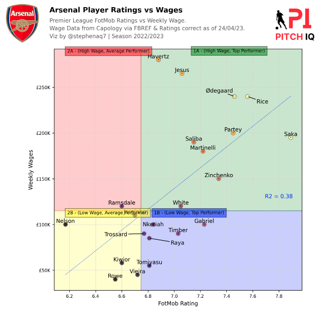
Wages vs Rating Chart
The second visual we’re going to make is to plot player ratings against their weekly wage to try and acertain which player are either over or underperforming. It must be noted that neither the wages or the FotMob data we’ve stored havent been calculated through an exact science, however I see this as a fun exercise to play around with the information we gather for free and see if there are any correlations we can extract insights from
The next steps involve transforming the data to represent weekly wages in thousands, calculating z-scores, identifying data points with higher z-scores, and creating a custom formatter for displaying values in pounds.
1: New Column Creation:
- In this step, a new column named
new_pound_value_2is created in the DataFrame. This column is derived by dividing the existing ‘new_pound_value’ column by 1000. It represents the weekly wages in thousands of pounds.
2: Z-Score Calculation:
- Z-scores are statistical measures that indicate how far a particular data point is from the mean of a group of data points. Here, z-scores are calculated for two columns: ‘new_pound_value_2’ (representing weekly wages) and ‘FotMobRating’ (representing player ratings). The z-scores are then combined with weights of 1 for each column, and the result is stored in a new column called ‘zscore’.
3: Annotated Column Creation:
- An ‘annotated’ column is created to identify rows where the z-score is greater than the 0th quantile of the ‘zscore’ column. This effectively marks data points that are relatively higher than others in terms of both weekly wages and FotMob ratings.
4: Pound Formatter Function:
- A custom formatting function named
pound_formatteris defined. This function takes a numerical value and a position and returns a formatted string representing the value in pounds. The format includes dividing the value by 1000 and appending ‘K’ to indicate thousands.
from adjustText import adjust_text
from matplotlib.colors import LinearSegmentedColormap, Normalize
from matplotlib import cm
import scipy.stats as stats

filtered_df['new_pound_value_2'] = filtered_df['new_pound_value']/1000

filtered_df['zscore'] = stats.zscore(filtered_df['new_pound_value_2'])*1 + stats.zscore(filtered_df['FotMobRating'])*1
filtered_df['annotated'] = [True if x > filtered_df['zscore'].quantile(0) else False for x in filtered_df['zscore']]


def pound_formatter(x, pos):
    return f'£{x/1000:.0f}K'
The Python script below utilizes Matplotlib to create a visually informative scatter plot comparing Arsenal players’ FotMob ratings and weekly wages. The data is segmented into quadrants based on median values, with annotated player names. Transparent colors fill each quadrant, and additional features like a regression line and R2 value enhance the plot’s analytical depth. The plot is adorned with annotations, a club logo, and external images.
Here is a summary of the steps taken to build this plot:
1: Import Necessary Libraries:
import matplotlib.pyplot as plt
import matplotlib.style as style
import matplotlib.image as image
from matplotlib.transforms import Affine2D
import mpl_toolkits.axisartist.floating_axes as floating_axes
import matplotlib.ticker as ticker
import matplotlib.patheffects as path_effects
from adjustText import adjust_text
import math
2: Pound Formatter Function:
max_ = max(abs(filtered_df['new_pound_value_2'].min()), filtered_df['new_pound_value_2'].max())
In this step, a custom formatter for the y-axis tick labels is set up, determining the maximum absolute value of the ‘new_pound_value_2’ column.
3: Create Matplotlib Figure and Subplot:
fig = plt.figure(figsize=(8, 8), dpi=300)
ax = plt.subplot()
ax.grid(visible=False, ls='--', color='lightgrey')
Matplotlib figure and subplot are created with a specific size and resolution, and the grid is set to be invisible with dashed lines.
4: Define Quadrants Based on Median Values:
median_ratings = ((filtered_df['FotMobRating'].median()) * 0.97)
median_wages = filtered_df['new_pound_value_2'].median()
Quadrants are defined based on the median values of ‘FotMobRating’ and ‘new_pound_value_2’ columns. The rating median is adjusted slightly.
5: Plot Scatter Points for Each Quadrant:
scatter = ax.scatter(
    filtered_df['FotMobRating'], filtered_df['new_pound_value_2'],
    c=filtered_df['zscore'], cmap='inferno',
    zorder=3, ec='grey', s=55, alpha=0.8)
A scatter plot is created with points colored based on the ‘zscore’ column.
6: Extract Last Names for Annotated Points:
texts = []
annotated_df = filtered_df[filtered_df['annotated']].reset_index(drop=True)
for index in range(annotated_df.shape[0]):
    last_name = annotated_df['Name'].iloc[index].split()[-1]
    texts += [
        ax.text(
            x=annotated_df['FotMobRating'].iloc[index], y=annotated_df['new_pound_value_2'].iloc[index],
            s=f"{last_name}",
            color='black', family='DM Sans', weight='light', fontsize=10
        )
    ]
For annotated points, last names are extracted from the ‘Name’ column and added to the plot.
7: Use adjust_text to Avoid Overlapping Texts:
adjust_text(texts, force_text=(2, 2),
            arrowprops=dict(arrowstyle='-', color='black'),
            autoalign='y',
            only_move={'points': 'y'})
The adjust_text function is used to automatically adjust the position of text labels to avoid overlap.
8: Add Dotted Lines to Separate Quadrants:
ax.axvline(median_ratings, linestyle='dotted', color='grey', lw=1, zorder=0)
ax.axhline(median_wages, linestyle='dotted', color='grey', lw=1, zorder=0)
Dotted lines are added to visually separate the quadrants.
9: Set Equal X and Y Limits:
ax.set_xlim([ax.get_xlim()[0], ax.get_xlim()[1]])
ax.set_ylim([ax.get_ylim()[0], ax.get_ylim()[1]])
X and Y axis limits are set to be equal for consistency.
10: Fill Quadrants with Transparent Colors:
ax.fill_between([ax.get_xlim()[0], median_ratings], ax.get_ylim()[0], median_wages, color='yellow', alpha=0.2)
ax.fill_between([median_ratings, ax.get_xlim()[1]], ax.get_ylim()[0], median_wages, color='blue', alpha=0.2)
ax.fill_between([ax.get_xlim()[0], median_ratings], median_wages, ax.get_ylim()[1], color='red', alpha=0.2)
ax.fill_between([median_ratings, ax.get_xlim()[1]], median_wages, ax.get_ylim()[1], color='green', alpha=0.2)
Transparent colors are used to fill the quadrants, creating a visual representation of different segments.
11: Adjust X-Axis and Y-Axis Ticks:
ax.xaxis.set_major_locator(ticker.MaxNLocator(integer=False, prune='both'))
ax.yaxis.set_major_formatter(ticker.FuncFormatter(lambda x, pos: f'£{x:.0f}K'))
ax.tick_params(axis='both', labelsize=8)
The tick locators and formatters are adjusted for better readability.
12: Set Y-Axis Label and X-Axis Label:
ax.set_ylabel('Weekly Wages', fontsize=10)
ax.set_xlabel('FotMob Rating', fontsize=10)
Axis labels are set for clarity.
13: Add Annotations for Each Quadrant:
ax.text(ax.get_xlim()[0] + 0.1, ax.get_ylim()[1] - 0.1, '2A - (High Wage, Average Performer)', bbox=dict(facecolor='red', alpha=0.5), horizontalalignment='left', verticalalignment='top', fontsize=8, color='black')
ax.text(ax.get_xlim()[0] + 0.1, median_wages + 0.1, '2B - (Low Wage, Average Performer)', bbox=dict(facecolor='yellow', alpha=0.5), horizontalalignment='left', verticalalignment='top', fontsize=8, color='black')
ax.text(median_ratings + 0.4, ax.get_ylim()[1] + 0.15, '1A - (High Wage, Top Performer)', bbox=dict(facecolor='green', alpha=0.5), horizontalalignment='left', verticalalignment='top', fontsize=8, color='black')
ax.text(median_ratings + 0.1, median_wages + 0.1, '1B - (Low Wage, Top Performer)', bbox=dict(facecolor='blue', alpha=0.5), horizontalalignment='left', verticalalignment='top', fontsize=8, color='black')
Annotations are added for each quadrant, describing the characteristics.
14: Calculate and Plot Regression Line:
coefficients = np.polyfit(filtered_df['FotMobRating'], filtered_df['new_pound_value_2'], 1)
p = np.poly1d(coefficients)
x_regression = np.linspace(np.min(filtered_df['FotMobRating']), np.max(filtered_df['FotMobRating']), 100)
y_regression = p(x_regression)
ax.plot(x_regression, y_regression, c='b', label='Regression Line', linewidth=1,

 linestyle=':', alpha=0.8)
A linear regression line is calculated and plotted on the scatter plot.
15: Add R2 Value as Text:
r2 = np.corrcoef(filtered_df['FotMobRating'], filtered_df['new_pound_value_2'])[0, 1] ** 2
ax.text(0.85, 0.4, f'R2 = {r2:.2f}', transform=ax.transAxes, ha='left', va='top', fontsize=10, color='blue')
The R2 value is calculated and displayed as text on the plot.
16: Add External Image to the Plot:
ax3 = fig.add_axes([0.78, 0.89, 0.19, 0.14])
ax3.axis('off')
img = image.imread('/Users/stephenahiabah/Desktop/GitHub/Webs-scarping-for-Fooball-Data-/outputs/piqmain.png')
ax3.imshow(img)
An external image is added to the plot in a separate axis.
17: Add Main Title and Subtitle to the Figure:
fig_text(x=0.11, y=.99, s="Arsenal Player Ratings vs Wages", va="bottom", ha="left", fontsize=13, color="black", font="DM Sans", weight="bold")
fig_text(x=0.11, y=0.91, s="Premier League FotMob Ratings vs Weekly Wage.\nWage Data from Capology via FBREF & Ratings correct as of 24/04/23.\nViz by @stephenaq7 | Season 2022/2023", va="bottom", ha="left", fontsize=10, color="#5A5A5A", font="Karla")
Titles and subtitles are added to provide context and information about the plot.
18: Add Club Logo Image:
fotmob_url = "https://images.fotmob.com/image_resources/logo/teamlogo/"
logo_ax = fig.add_axes([-0.08, .90, 0.21, 0.12], zorder=1)
club_icon = Image.open(urllib.request.urlopen(f"{fotmob_url}{t_id}.png"))
logo_ax.imshow(club_icon)
logo_ax.axis("off")
An image of a club logo is added to the plot using its URL.
19: Show the Final Plot:
plt.show()
The final plot is displayed.
The code in full looks as follows:
import matplotlib.pyplot as plt
import matplotlib.style as style
import matplotlib.image as image
from matplotlib.transforms import Affine2D
import mpl_toolkits.axisartist.floating_axes as floating_axes
import matplotlib.ticker as ticker
import matplotlib.patheffects as path_effects
from adjustText import adjust_text
import math

# Define a custom formatter for y-axis tick labels
max_ = max(abs(filtered_df['new_pound_value_2'].min()), filtered_df['new_pound_value_2'].max())

fig = plt.figure(figsize=(8, 8), dpi=300)
ax = plt.subplot()
ax.grid(visible=False, ls='--', color='lightgrey')

# Define quadrants based on median values of 'ratings' and 'new_pound_value_2'
median_ratings = ((filtered_df['FotMobRating'].median())*0.97)
median_wages = filtered_df['new_pound_value_2'].median()

# Plot scatter points for each quadrant
scatter = ax.scatter(
    filtered_df['FotMobRating'], filtered_df['new_pound_value_2'],
    c=filtered_df['zscore'], cmap='inferno',
    zorder=3, ec='grey', s=55, alpha=0.8)

texts = []
annotated_df = filtered_df[filtered_df['annotated']].reset_index(drop=True)
for index in range(annotated_df.shape[0]):
    # Extract last name from 'Name' column by splitting on space and taking the last element
    last_name = annotated_df['Name'].iloc[index].split()[-1]
    texts += [
        ax.text(
            x=annotated_df['FotMobRating'].iloc[index], y=annotated_df['new_pound_value_2'].iloc[index],
            s=f"{last_name}",
            color='black',
            family='DM Sans', weight='light', fontsize=10
        )
    ]

# Use adjust_text function to move overlapping texts
adjust_text(texts, force_text=(2, 2),
            arrowprops=dict(arrowstyle='-',color='black'),
            autoalign='y',
            only_move={'points':'y'})


# Add dotted line to separate quadrants
ax.axvline(median_ratings, linestyle='dotted', color='grey', lw=1, zorder=0)
ax.axhline(median_wages, linestyle='dotted', color='grey', lw=1, zorder=0)


# Set x-axis and y-axis limits to be equal
ax.set_xlim([ax.get_xlim()[0], ax.get_xlim()[1]])
ax.set_ylim([ax.get_ylim()[0], ax.get_ylim()[1]])

# Fill quadrants with transparent colors
ax.fill_between(
    [ax.get_xlim()[0], median_ratings],
    ax.get_ylim()[0], median_wages,
    color='yellow', alpha=0.2
)
ax.fill_between(
    [median_ratings, ax.get_xlim()[1]],
    ax.get_ylim()[0], median_wages,
    color='blue', alpha=0.2
)
ax.fill_between(
    [ax.get_xlim()[0], median_ratings],
    median_wages, ax.get_ylim()[1],
    color='red', alpha=0.2
)
ax.fill_between(
    [median_ratings, ax.get_xlim()[1]],
    median_wages, ax.get_ylim()[1],
    color='green', alpha=0.2
)

ax.xaxis.set_major_locator(ticker.MaxNLocator(integer=False, prune='both'))
ax.yaxis.set_major_formatter(ticker.FuncFormatter(lambda x, pos: f'£{x:.0f}K'))
ax.tick_params(axis='both', labelsize=8)  # Updated fontsize to 8

ax.set_ylabel('Weekly Wages', fontsize=10)  # Set y-axis label with font size
ax.set_xlabel('FotMob Rating', fontsize=10)

ax.text(ax.get_xlim()[0] + 0.1, ax.get_ylim()[1] - 0.1,
        '2A - (High Wage, Average Performer)',
        bbox=dict(facecolor='red', alpha=0.5),
        horizontalalignment='left', verticalalignment='top',
        fontsize=8, color='black')
ax.text(ax.get_xlim()[0] + 0.1, median_wages + 0.1,
        '2B - (Low Wage, Average Performer)',
        bbox=dict(facecolor='yellow', alpha=0.5),
        horizontalalignment='left', verticalalignment='top',
        fontsize=8, color='black')
ax.text(median_ratings + 0.4, ax.get_ylim()[1] + 0.15,
        '1A - (High Wage, Top Performer)',
        bbox=dict(facecolor='green', alpha=0.5),
        horizontalalignment='left', verticalalignment='top',
        fontsize=8, color='black')
ax.text(median_ratings + 0.1, median_wages + 0.1,
        '1B - (Low Wage, Top Performer)',
        bbox=dict(facecolor='blue', alpha=0.5),
        horizontalalignment='left', verticalalignment='top',
        fontsize=8, color='black')

coefficients = np.polyfit(filtered_df['FotMobRating'], filtered_df['new_pound_value_2'], 1)
p = np.poly1d(coefficients)
x_regression = np.linspace(np.min(filtered_df['FotMobRating']), np.max(filtered_df['FotMobRating']), 100)
y_regression = p(x_regression)

# Plot the regression line
ax.plot(x_regression, y_regression, c='b', label='Regression Line', linewidth=1, linestyle=':', alpha=0.8)

# Add R2 value as text
r2 = np.corrcoef(filtered_df['FotMobRating'], filtered_df['new_pound_value_2'])[0, 1] ** 2  # Calculate R2 value
ax.text(0.85, 0.4, f'R2 = {r2:.2f}', transform=ax.transAxes, ha='left', va='top',fontsize=10,color='blue')


ax3 = fig.add_axes([0.78, 0.89, 0.19, 0.14])
ax3.axis('off')
img = image.imread('/Users/stephenahiabah/Desktop/GitHub/Webs-scarping-for-Fooball-Data-/outputs/piqmain.png')
ax3.imshow(img)


fig_text(
    x=0.11, y=.99,
    s="Arsenal Player Ratings vs Wages",
    va="bottom", ha="left",
    fontsize= 13, color="black", font="DM Sans", weight="bold"
)
fig_text(
    x=0.11, y=0.91,
    s="Premier League FotMob Ratings vs Weekly Wage.\nWage Data from Capology via FBREF & Ratings correct as of 24/04/23.\nViz by @stephenaq7 | Season 2022/2023",
    va="bottom", ha="left",
    fontsize=10, color="#5A5A5A", font="Karla"
)
fotmob_url = "https://images.fotmob.com/image_resources/logo/teamlogo/"

logo_ax = fig.add_axes([-0.08, .90, 0.21, 0.12], zorder=1)
club_icon = Image.open(urllib.request.urlopen(f"{fotmob_url}{t_id}.png"))
logo_ax.imshow(club_icon)
logo_ax.axis("off")


plt.show()
From the code above this is the visual we’re now able to produce. A scatter plot of the Arsenal squad’s wage data vs thier FotMob Rating to see who is performing either at, below or above expactation relative to the team.
Premier League Wage Distrubtion
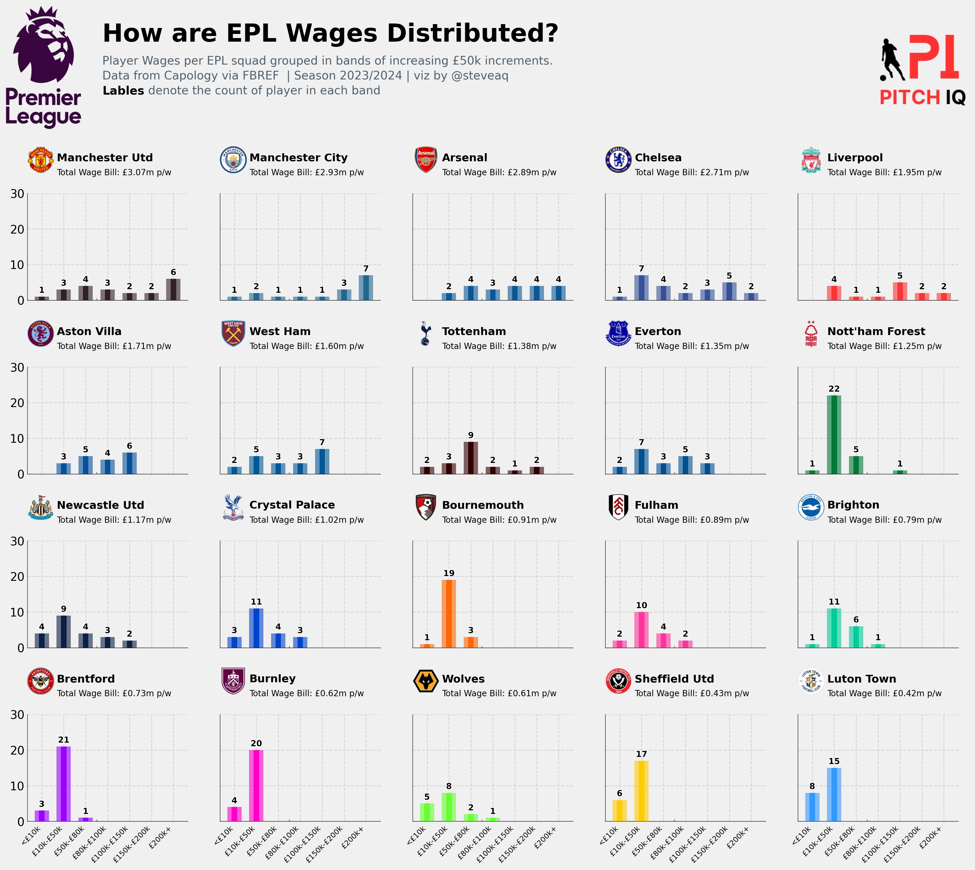
So far in this post we have focused on team specific wage information, now lets turn to look out the financial context of the entire league. In this next section, we will construct a multi-chart plot that will show the distribution of wages in specified buckets for every team in league and see how they compare.
In summary, this next code block is a series of data manipulation steps, including column renaming, merging, column selection, and duplicate removal, with the goal of creating a cleaned and consolidated DataFrame (wage_dist) containing relevant information about players, their teams, and associated attributes. As you may recall we have already created this dataframe in an early step
wages_df.rename(columns={'Player': 'Name'}, inplace=True)
merged_df = pd.merge(wages_df,epl_player_ratings,on='Name')

team_names = pd.read_csv("CSVs/fotmob_epl_team_ids.csv")
wage_dist = pd.merge(merged_df, team_names, on='team_id')
cols = ["Name", "Age", "new_pound_value", "team_id", "team"]
wage_dist = wage_dist[cols]

def remove_duplicates(df):
    df.drop_duplicates(subset=["Name"], keep="last", inplace=True)
    return df

wage_dist = remove_duplicates(wage_dist)
Here’s a breakdown of the code above:
1: Column Renaming:
- The first line of code renames a column in the
wages_dfDataFrame. The column originally named ‘Player’ is changed to ‘Name’ using therenamemethod. This is done in place, meaning the changes are applied directly to the original DataFrame.
2: Data Merging:
- The second line involves merging the
wages_dfDataFrame with another DataFrame calledepl_player_ratings. The merging is done based on the common column ‘Name’. This operation combines the information from both DataFrames where the ‘Name’ values match, creating a new DataFrame namedmerged_df.
3: Loading Team Names:
- The third line reads a CSV file named “fotmob_epl_team_ids.csv” into a new DataFrame called
team_names. This file likely contains information about team names and their corresponding IDs.
4: Additional Merging:
- The fourth line merges the
merged_dfDataFrame with theteam_namesDataFrame based on the ‘team_id’ column. This operation brings in additional information about the teams associated with the players, creating a new DataFrame namedwage_dist.
5: Column Selection:
- The fifth line selects specific columns from the
wage_distDataFrame. The columns include “Name”, “Age”, “new_pound_value”, “team_id”, and “team”. The resulting DataFrame is assigned back to the variablewage_dist.
6: Duplicate Removal:
- The code defines a function named
remove_duplicatesthat takes a DataFrame as input, drops duplicate rows based on the ‘Name’ column, and keeps only the last occurrence of each duplicate. The function is then applied to thewage_distDataFrame, effectively removing duplicate player entries.
This next code block defines a function called create_wage_bins that takes a DataFrame (df) as input. The function is designed to categorize the values in the ‘new_pound_value’ column of the DataFrame into different wage bins. The bin edges and labels are predefined for various wage ranges.
The function then adds a new column to the DataFrame named ‘Wage_Bin’, which contains labels corresponding to the wage bins assigned to each player based on their ‘new_pound_value’. Rows with missing values in the ‘Wage_Bin’ column are subsequently removed from the DataFrame.
After creating the wage bins, the function calculates the number of unique teams in each bin and stores the result in a variable named bin_counts. Finally, the function adds a new column named ‘Count’ to the DataFrame, which represents the number of unique teams associated with each wage bin.
The function modifies the input DataFrame in place and returns the updated DataFrame. The function is then applied to the wage_dist DataFrame, and the result is assigned to a new DataFrame called wages_viz.
def create_wage_bins(df):
    bin_labels = ["<£10k", "£10k-£50k", "£50k-£80k", "£80k-£100k", "£100k-£150k", "£150k-£200k", "£200k+"]
    bin_edges = [0, 10000, 50000, 80000, 100000, 150000, 200000, 500000]

    df["Wage_Bin"] = pd.cut(df["new_pound_value"], bins=bin_edges, labels=bin_labels, include_lowest=True)
    df.dropna(subset=["Wage_Bin"], inplace=True)
    bin_counts = df.groupby("Wage_Bin")["team"].nunique()
    df["Count"] = df["Wage_Bin"].map(bin_counts)
    return df

wages_viz = create_wage_bins(wage_dist)
Next we need to aggregate player wage information by team, create a summary of wage bins for each team, and organize the data into a final DataFrame (aggregated_df) for further analysis or visualization.
1: Calculate Total Wage Bill per Team:
- The first line groups the
wages_vizDataFrame by team and team_id and sums up the ‘new_pound_value’ (player wages) for each team. The result is stored in a new DataFrame calledwage_bill.
2: Reformat Wage Bill DataFrame:
- The second line converts the
wage_billDataFrame into a new DataFrame, resetting the index and keeping only the ‘team’ and ‘new_pound_value’ columns. The DataFrame is then sorted in descending order based on the ‘new_pound_value’.
3: Create Aggregated DataFrame for Wage Bins:
- The third line groups the
wages_vizDataFrame by team and ‘Wage_Bin’ (previously created in thecreate_wage_binsfunction) and counts the number of occurrences for each combination. The result is stored in a DataFrame calledaggregated_df.
4: Generate All Possible Wage Bins:
- The fourth line creates a list named
all_binscontaining all possible wage bins.
5: Create Dataframes for Each Team and Wage Bin Combination:
- The subsequent code iterates over unique teams and performs the following steps for each team:
- Subset the
aggregated_dfto include only rows corresponding to the current team. - Create a DataFrame (
team_combinations) with all possible wage bins. - Merge the team’s data with the all_bins DataFrame on the ‘Wage_Bin’ column, filling missing values with zeros.
- Add a ‘team’ column to identify the team for each row.
- Append the resulting DataFrame to a list (
result_dfs).
- Subset the
6: Concatenate Dataframes and Final Sorting:
- After iterating through all teams, the code concatenates all DataFrames in the
result_dfslist into a single DataFrame calledaggregated_df. It is then reorganized to include only the ‘team’, ‘Wage_Bin’, and ‘Count’ columns and is sorted by team.
wage_bill = wages_viz.groupby(['team','team_id' ])['new_pound_value'].sum()
wage_bill = pd.DataFrame(wage_bill).reset_index()
wage_bill = wage_bill[['team','new_pound_value']].sort_values(by='new_pound_value', ascending=False)
aggregated_df = wages_viz.groupby(['team', 'Wage_Bin']).size().reset_index(name='Count')
all_bins = ["<£10k", "£10k-£50k", "£50k-£80k", "£80k-£100k", "£100k-£150k", "£150k-£200k", "£200k+"]

# Get unique teams and team_ids
unique_teams = aggregated_df['team'].unique()

result_dfs = []
for team in unique_teams:

    team_data = aggregated_df[(aggregated_df['team'] == team)]
    team_combinations = pd.DataFrame({'Wage_Bin': all_bins})
    merged_data = team_combinations.merge(team_data, on='Wage_Bin', how='left').fillna(0)
    merged_data['team'] = team
    result_dfs.append(merged_data)

aggregated_df = pd.concat(result_dfs, ignore_index=True)
aggregated_df = aggregated_df[['team', 'Wage_Bin', 'Count']].sort_values(by=['team'])
Next, the DataFrame aggregated_df is enhanced by incorporating team-related information and organizing the data. Additionally, a separate DataFrame named wage_bill_rank is created to rank teams based on their total wage bills. The list team_list is then generated, containing unique team IDs extracted from the ranked wage bill DataFrame.
1: Read Team IDs from CSV:
- The first line reads a CSV file named “fotmob_epl_team_ids.csv” into a DataFrame called
team_ids. It then selects only the ‘team’ and ‘team_id’ columns from this DataFrame.
2: Merge Team IDs with Aggregated DataFrame:
- The next two lines perform left merges between the
aggregated_dfDataFrame and theteam_idsDataFrame, first on the ‘team’ column and then on the ‘team’ column again with thewage_billDataFrame. These merges introduce team IDs into the aggregated data.
3: Define Wage Bin Order and Set as Ordered Categorical:
- The code defines an order for wage bins in the
wage_bin_orderlist. It then sets the ‘Wage_Bin’ column in theaggregated_dfDataFrame as an ordered categorical variable, ensuring the specified order is maintained.
4: Sort the DataFrame:
- The final line sorts the
aggregated_dfDataFrame based on the ‘team’ and ‘Wage_Bin’ columns, arranging the data for better readability and analysis.
5: Rank Teams Based on Wage Bill:
- An additional DataFrame named
wage_bill_rankis created by merging thewage_billDataFrame with theteam_idsDataFrame. This DataFrame is used to rank teams based on their total wage bills.
6: Generate Unique Team IDs List:
- The last line creates a list named
team_listcontaining unique team IDs extracted from thewage_bill_rankDataFrame. This list is likely intended for further analysis or use.
team_ids = pd.read_csv("CSVs/fotmob_epl_team_ids.csv")
team_ids = team_ids[['team','team_id']]
aggregated_df = pd.merge(aggregated_df,team_ids, on='team', how='left')
aggregated_df = pd.merge(aggregated_df,wage_bill, on='team', how='left')
wage_bin_order = ["<£10k", "£10k-£50k", "£50k-£80k", "£80k-£100k", "£100k-£150k", "£150k-£200k", "£200k+"]

# Set Wage_Bin column as ordered categorical to maintain the specified order
aggregated_df['Wage_Bin'] = pd.Categorical(aggregated_df['Wage_Bin'], categories=wage_bin_order, ordered=True)

# Sort the DataFrame by team and Wage_Bin
aggregated_df = aggregated_df.sort_values(by=['team', 'Wage_Bin'])
wage_bill_rank = pd.merge(wage_bill,team_ids, on='team', how='left')
team_list = list(wage_bill_rank.team_id.unique())
In this next block, a list of hexadecimal color values (colors) is created, and a dictionary (color_dict) is generated by pairing each unique team ID from the team_list with a corresponding color from the colors list. This dictionary establishes a mapping between team IDs and colors, which can be useful for visualizing or distinguishing teams in graphical representations.
Here’s a brief summary:
- Color List:
- The
colorslist contains a series of hexadecimal color values. Each color represents a unique color code.
- The
- Color Dictionary:
- The
color_dictdictionary is created by using thezipfunction to combine theteam_list(containing unique team IDs) with thecolorslist. This results in a mapping where each team ID is associated with a specific color.
- The
The purpose of this dictionary is likely to provide a consistent and visually distinguishable color scheme for each team in visualizations or plots. The assigned colors can be used to represent different teams when creating charts or graphs to enhance the clarity of data presentation.
colors = [
    '#302028', '#206890', '#085898', '#375196', '#FF3333', '#085098', '#005898',
    '#330000', '#005090', '#007838', '#0C2044', '#0044CC', '#FF6600', '#FF3399',
    '#00CC99', '#9900FF', '#FF00CC', '#66FF33', '#FFCC00', '#3399FF'
]
color_dict = dict(zip(team_list,colors))
The next code assigns colors to teams in the aggregated_df DataFrame by creating a new “teamColor” column. Team colors are determined by mapping team IDs to corresponding colors from a predefined dictionary (color_dict).
aggregated_df["teamColor"] = aggregated_df['team_id'].map(color_dict)
This function, plot_barchart_wages, creates a bar chart to display the distribution of player wages in different bins for a specific team. The chart includes custom styling, such as borders, grid lines, and annotations, and allows flexibility in displaying or hiding axis labels.
- Function Purpose:
- The function generates a bar chart to visualize the distribution of player wages in specified bins for a given team.
- Inputs:
ax: Matplotlib axis object for plotting.team_id: Fotmob team ID for the specific team being visualized.color: HEX color string used for the plot.labels_xandlabels_y: Boolean parameters to control the visibility of axis labels.
- Key Features:
- Copies the global DataFrame
aggregated_dfand filters it for the specified team. - Customizes plot aesthetics, including border properties, visibility of axis, and grid lines.
- Utilizes two sets of overlaid bars for enhanced visualization.
- Manages x-axis ticks and labels, along with optional customization for axis labels.
- Sets y-axis limits, formatting, and optional hiding of y-axis labels.
- Includes additional visual touches, such as a dashed line and annotations, for improved clarity.
- Copies the global DataFrame
- Output:
- The function returns the modified Matplotlib axis object.
def plot_barchart_wages(ax, team_id, color, labels_x = False, labels_y = False):

    global aggregated_df

    data = aggregated_df.copy()
    data = data[data["team_id"] == team_id].reset_index(drop = True)

    ax.spines["right"].set_visible(False)
    ax.spines['left'].set_visible(True)
    ax.spines["top"].set_visible(False)

    # Set border properties for the subplot
    border_width = 0.5
    border_color = 'black'

    ax.spines['top'].set_linewidth(border_width)  # Top border width
    ax.spines['top'].set_color(border_color)  # Top border color

    ax.spines['bottom'].set_linewidth(border_width)  # Bottom border width
    ax.spines['bottom'].set_color(border_color)  # Bottom border color

    ax.spines['left'].set_linewidth(border_width)  # Left border width
    ax.spines['left'].set_color(border_color)  # Left border color

    ax.spines['right'].set_linewidth(border_width)  # Right border width
    ax.spines['right'].set_color(border_color)  # Right border color


    ax.xaxis.set_visible(True)
    ax.yaxis.set_visible(True)

    ax.grid(True, lw = 1, ls = '--', color = "lightgrey")

    ax.bar(
        data.index,
        data["Count"],
        color = color,
        alpha = 0.6,
        zorder = 3,
        width = .65
    )
    ax.bar(
        data.index,
        data["Count"],
        color = color,
        width = 0.25,
        zorder =3
    )


    ax.set_xticks(data.index)
    if labels_x:
        labels = ["<£10k", "£10k-£50k", "£50k-£80k", "£80k-£100k", "£100k-£150k", "£150k-£200k", "£200k+"]
        ax.set_xticklabels(labels, fontsize=9, rotation=45, ha='right', va='top')
    else:
        ax.set_xticklabels([])

    ax.set_ylim(0,30)
    ax.yaxis.set_major_formatter(ticker.StrMethodFormatter("{x:.0f}"))

    if labels_y == False:
        ax.set_yticklabels([])


    # ---- Nice touches to the viz
    ax.plot([2.5, 2.5], [0, .5], color = "gray", lw = 1.15, ls = "--")

    for index, height in enumerate(data["Count"]):
        if height != 0:
            text_ = ax.annotate(
                xy = (index, height),
                text = f"{height:.0f}",
                xytext = (0, 7.5),
                textcoords = "offset points",
                ha = "center",
                va = "center",
                size = 10,
                weight = "bold",
                color = "black"
            )
            text_.set_path_effects(
                [path_effects.Stroke(linewidth=1.75, foreground="white"), path_effects.Normal()])
        else:
            text_ = ax.annotate(
                xy = (index, height),
                text = " ",
                xytext = (0, 7.5),
                textcoords = "offset points",
                ha = "center",
                va = "center",
                size = 10,
                weight = "bold",
                color = "black"
            )
            text_.set_path_effects(
                [path_effects.Stroke(linewidth=1.75, foreground="white"), path_effects.Normal()]

            )
    return ax
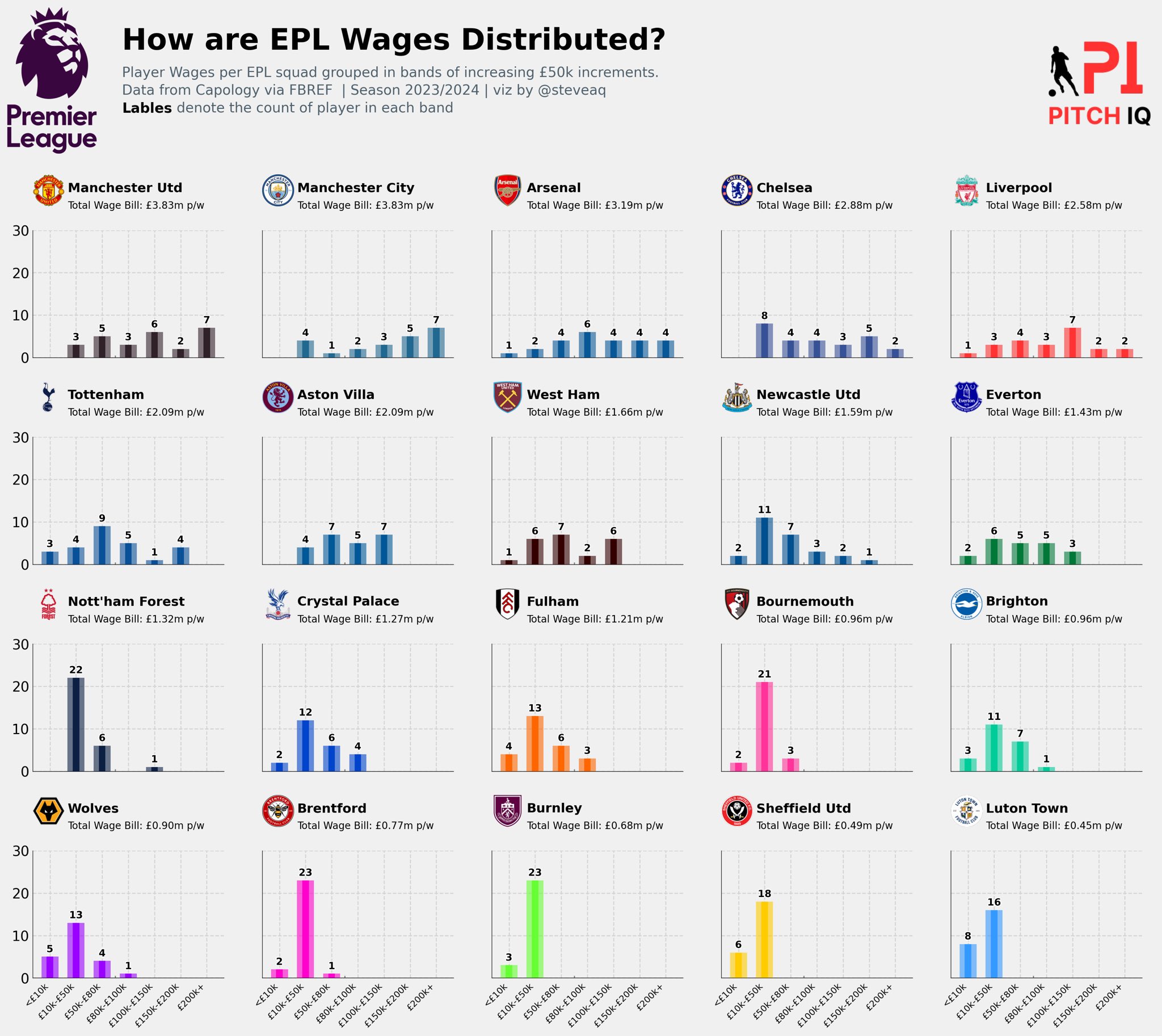
The final code block orchestrates the creation of a complex Matplotlib figure, presenting visualizations of English Premier League (EPL) player wages. It utilizes custom functions to plot bar charts and display team logos, incorporating dynamic data such as team names and wage bills. The figure is aesthetically styled, including a consistent visual theme and strategic placement of annotations. Additionally, external logos are integrated for added context, resulting in a comprehensive and visually engaging representation of EPL wage distribution.
Here are steps required:
1: Import Libraries:
- Import necessary libraries, including Matplotlib, Matplotlib-related modules, Pandas, PIL (Python Imaging Library), and others.
2: Set Plot Style:
- Set the plot style to ‘fivethirtyeight’ for a consistent visual theme.
3: Initialize DataFrame and Figure:
- Assign the
aggregated_dfDataFrame todf. - Create a Matplotlib figure with a specific size and dpi.
4: Define Grid Layout:
- Define a grid layout using
gridspec.GridSpec, specifying the number of rows (nrows) and columns (ncols). Adjust the height ratios for alternating row heights and set the vertical spacing (hspace).
5: Initialize Variables:
- Initialize variables such as
teams,plot_counter, andlogo_counter.
6: Loop Over Rows and Columns:
- Use nested loops to iterate over rows and columns in the grid layout.
7: Plot Bar Charts and Team Logos:
- For odd-numbered rows, plot bar charts using the
plot_barchart_wagesfunction for each team in theteamslist. - For even-numbered rows, display team logos and additional information (team name, total wage bill) using PIL and Matplotlib text annotations.
8: Add Text Annotations:
- Add title and subtitle text using
fig_textand specify their positions, sizes, and styles.
9: Add External Logos:
- Add external logos to the figure using
fig.add_axesandax.imshowfor enhanced visual appeal.
10: Display the Plot:
- The final plot is displayed with the specified layout, visualizations, and annotations.
The full code is shown below:
import matplotlib.pyplot as plt
import matplotlib.font_manager as fm
import matplotlib.ticker as ticker
import matplotlib.gridspec as gridspec
import matplotlib.patches as patches
import matplotlib.patheffects as path_effects
from matplotlib import rcParams
from highlight_text import ax_text, fig_text
import pandas as pd

from PIL import Image
import urllib
import os
style.use('fivethirtyeight')


df = aggregated_df
fig = plt.figure(figsize=(18, 14), dpi = 200)
nrows = 8
ncols = 5
gspec = gridspec.GridSpec(
    ncols=ncols, nrows=nrows, figure=fig,
    height_ratios = [(1/nrows)*2. if x % 2 != 0 else (1/nrows)/2. for x in range(nrows)], hspace = 0.3
)

teams = team_list

plot_counter = 0
logo_counter = 0
for row in range(nrows):
    for col in range(ncols):
        if row % 2 != 0:
            ax = plt.subplot(
                gspec[row, col]
            )

            teamId = teams[plot_counter]
            teamcolor = df[df["team_id"] == teamId]["teamColor"].iloc[0]

            if col == 0:
                labels_y = True
            else:
                labels_y = False

            if row == nrows - 1:
                labels_x = True
            else:
                labels_x = False

            plot_barchart_wages(ax, teamId, teamcolor, labels_x, labels_y)

            plot_counter += 1

        else:

            teamId = teams[logo_counter]
            teamName = df[df["team_id"] == teamId]["team"].iloc[0]

            wages = df[df["team_id"] == teamId]["new_pound_value"].sum()/7000000


            fotmob_url = "https://images.fotmob.com/image_resources/logo/teamlogo/"
            logo_ax = plt.subplot(
                gspec[row,col],
                anchor = "NW", facecolor = "#EFE9E6"
            )
            club_icon = Image.open(urllib.request.urlopen(f"{fotmob_url}{teamId:.0f}.png"))
            logo_ax.imshow(club_icon)
            logo_ax.axis("off")

            # # Add the team name
            ax_text(
                x = 1.1,
                y = 0.76,
                s = f"{teamName}",
                ax = logo_ax,
                weight = "bold",
                font = "Karla",
                ha = "left",
                size = 13,
                annotationbbox_kw = {"xycoords":"axes fraction"}
            )

            # # Add the subtitles for each side
            ax_text(
                x = 1.1,
                y = 0.18,
                s = f"Total Wage Bill: £{wages:.2f}m p/w",
                ax = logo_ax,
                weight = "normal",
                font = "Karla",
                ha = "left",
                size = 10,
                annotationbbox_kw = {"xycoords":"axes fraction"}
            )

            logo_counter += 1


fig_text(
    x = 0.15, y = 1,
    s = "How are EPL Wages Distributed?",
    va = "bottom", ha = "left",
    fontsize = 30, color = "black", font = "DM Sans", weight = "bold"
)
fig_text(
	x = 0.15, y = .94,
    s = "Player Wages per EPL squad grouped in bands of increasing £50k increments.\nData from Capology via FBREF  | Season 2023/2024 | viz by @steveaq\n<Lables> denote the count of player in each band",
    highlight_textprops=[{"weight": "bold", "color": "black"}],
	va = "bottom", ha = "left",
	fontsize = 14, color = "#4E616C", font = "Karla"
)

ax2 = fig.add_axes([0.06, 0.55, 0.07, 0.85])
ax2.axis('off')
img = image.imread('/Users/stephenahiabah/Desktop/GitHub/Webs-scarping-for-Fooball-Data-/Images/premier-league-2-logo.png')
ax2.imshow(img)


### Add Stats by Steve logo
ax3 = fig.add_axes([0.87, 0.55, 0.09, .85])
ax3.axis('off')
img = image.imread('/Users/stephenahiabah/Desktop/GitHub/Webs-scarping-for-Fooball-Data-/outputs/piqmain.png')
ax3.imshow(img)
From the code above this is the visual we’re now able to produce. A multi-plot of bars showing each EPL teams wage distribution.
Conclusion
In conclusion, this tutorial serves as a comprehensive and pragmatic guide for Python enthusiasts looking to navigate the intricacies of Premier League wage data. By establishing effective functions for data extraction, performing crucial cleaning and transformation tasks, and generating informative visualizations, users can gain valuable insights into the financial landscape of the English Premier League.
I hope you found this useful and again thanks for reading
Steve

Comments